Designing a Main Menu That Fits Your Game
|
Hello. In this blog post I will talk about creating a menu that connects with your game in terms of it’s visuals and mechanics. If you would like to learn more about this project you can check my previous blog post “An Easier Sprint Overview” where I talk about changes given to a template that we received from our teacher when first introduced to a project methodology called Scrum. While thinking about how the menu would be like, I thought about incorporating one of the main mechanics in our game. You as a player have the ability to reveal the area in front, top or down from you in order to navigate through a maze like level and avoid enemies along the way. Below you have an example of the mechanic in question:
At first I started out by creating assets for the menu, using CorelDraw (a vector based image editing software), that incorporated the colors used in the game.These colors were, the colors our Lead Artist used for the creation of the moth character shown in the previous photo. Bellow you’ll see the colors used and the asset for buttons in the menu:
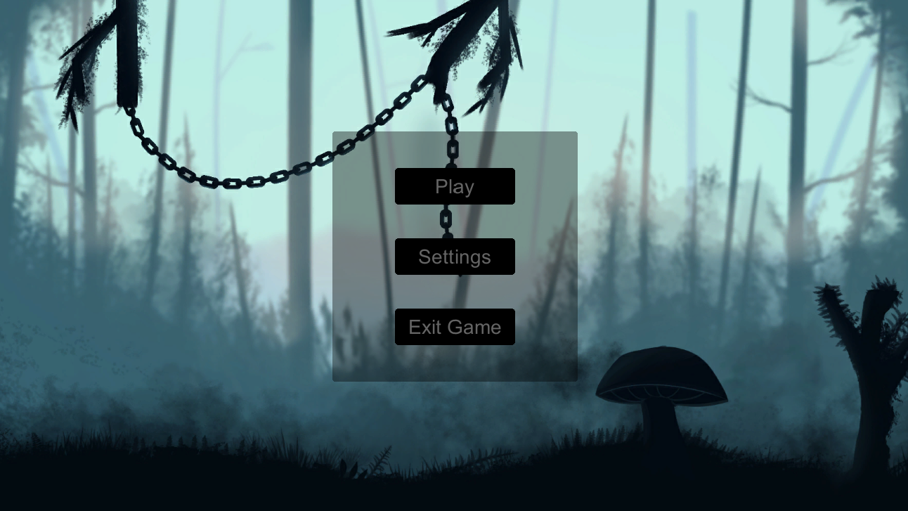
In this Case the second color from the left is the color which was used to cover the button in terms of color and allow for the reveal effect to take place in a manner I will explain further down. Now for the actual menu. I will continue by showing the reveal effect of said menu in stages, which is the way a player would interact with said menu by hovering the mouse over it. The background is provided by our Lead Artist and is used throughout the game. You can see the stages bellow:
In this case the menu has it’s buttons and panel that encompasses said buttons covered in the second color mentioned earlier.
In this case the menu panel has been revealed showing a second asset for the menu which was done using the same colors on the button asset shown earlier.
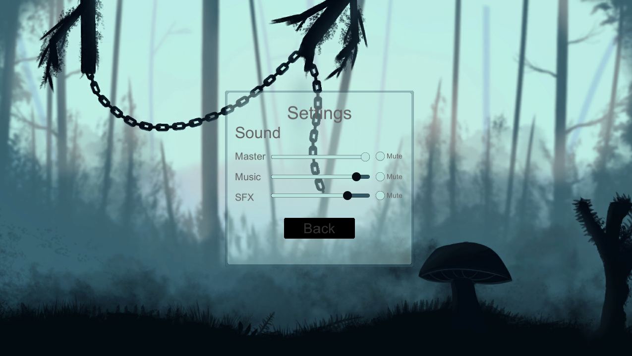
In this case the player has hovered over the “Play” button with the intention to press it. It is at this point that the button is revealed trough a fade effect which I will explain later on in this post. One final part of the menu is the “Settings” sub-menu in which a similar effect has been repeated with audio slider handles. Bellow you can see a photo of said sub menu and one of the handles revealed after the player has hovered over it:
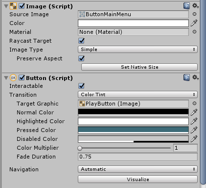
In this menu the colors have been used in such a way to help represent a “filling” effect of the slider bar. The “filling” would involve the player changing volume levels by grabbing the handle and moving it left or right. The lighter color represents the bar being filled and as such in the “Master” volume case be at maximum. The darker color represents the empty section of the slider. One thing that I was contemplating adding was numbers above the handles showing the value of the volume the player would set on a scale of 1 – 100. At the moment that is not a priority as we have other matters to focus on in our project. One other thing I realized is an issue is, one of the chains in the background making the “Settings” text unclear. That is something that will be resolved by removing the chains from the background. Moving on to how the fade effect was realized. At first I had no idea how to make it. I was thinking that animations and scripts would be required which would have resulted in extra time required to be spent on it. Time we didn’t have. After fiddling for a while in the unity button settings I realized I can do it in a much easier way. Bellow you have an image of how the settings for the button look. These settings allowed for the fade effect to take place.
Under the standard “Button (Script)” component that a Unity button comes with if you add it in the project I was able to create the fade effect. First of all I changed the Normal color to the second color shown earlier in the post. That resulted in the button itself (including the asset) being covered by a black overlay. Then I did not change the highlight color which meant that when a button was hovered over it would show the asset and would give the impression of a reveal. This is when I was worried as the reveal effect was too fast and did not match with the speed of the mechanic in the game. However I discovered that I can change the duration of the effect and by going from the standard 0.1 time to fade in the highlight color to a 0.75 time to fade in the highlight color I was able to recreate the reveal effect on the button. All of this was done using the Color Tint, transition method available in the settings shown in the image. Overall making this menu was a lot of fun. It allowed me to learn a great deal about adapting UI to fit your game. I’ve also learned some basic scripting (as the menu interactions button have also been done but that’s an entirely different topic) and more about Unity and it’s systems which will hopefully help in the future to better work with my teammates on creating our game. Thank you for reading and see you next time. Next time, Presenting your game – Alpha. |