Fishy concept art
|
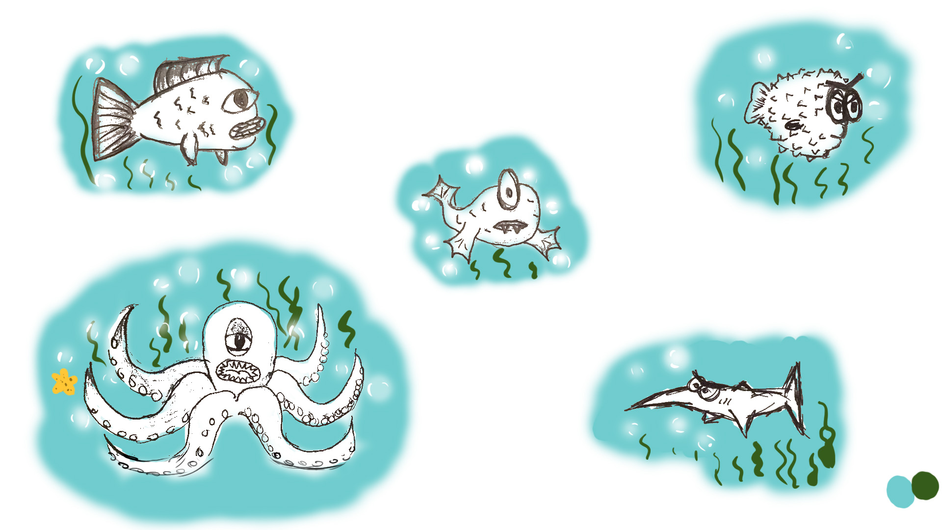
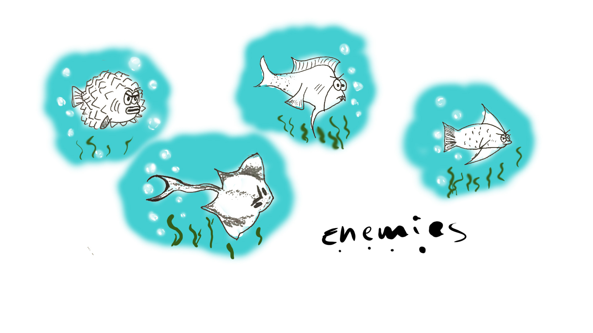
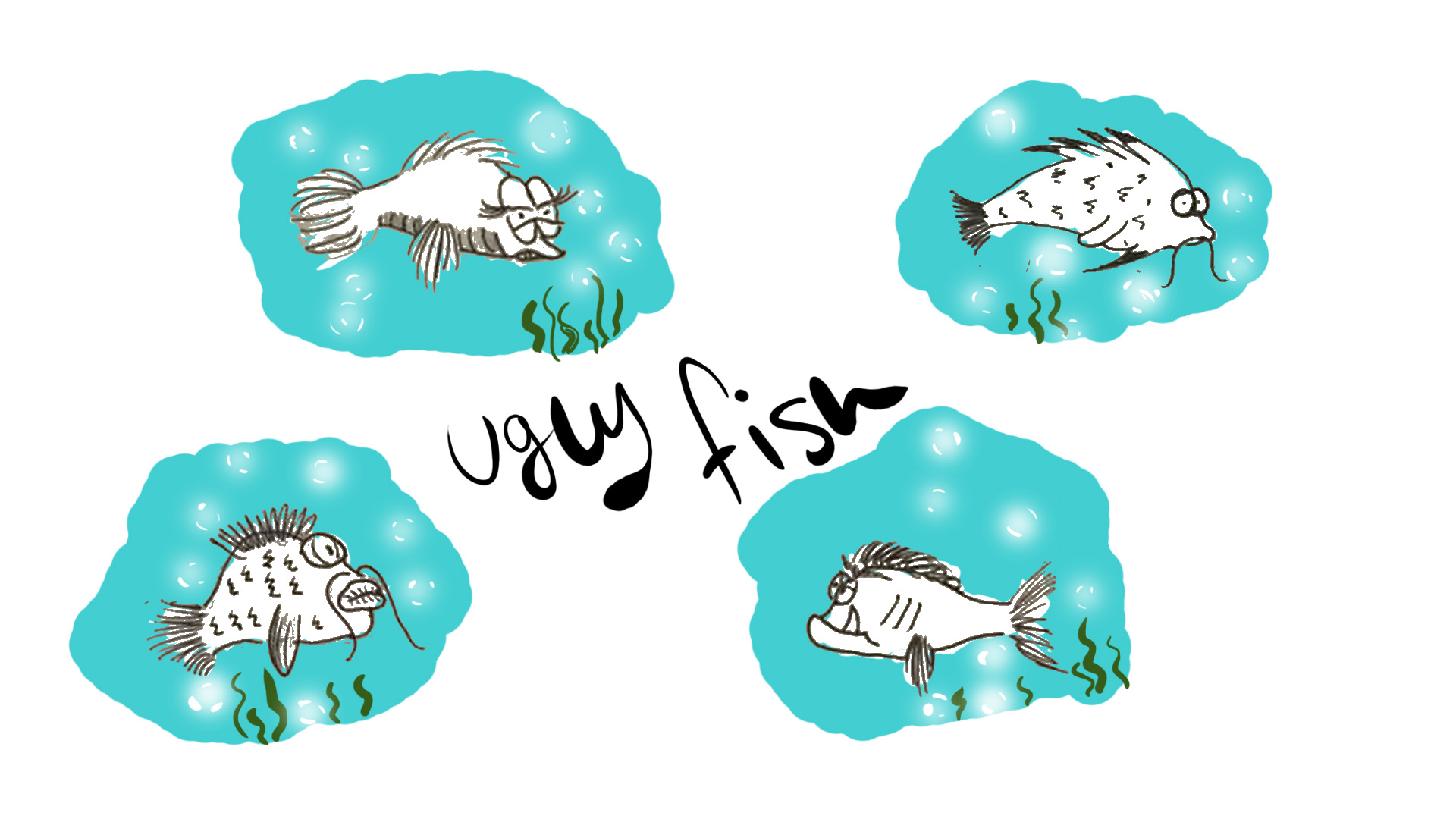
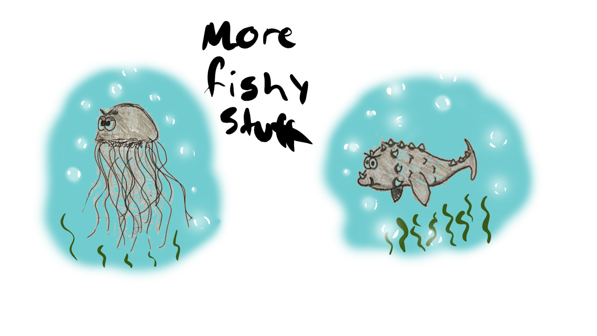
This week I will be writing about and show the concept art I made in a very early stage of the project. I had responsible for creating concept art for all the fish, both Stephen and the enemies. What I mostly did was to quick sketch different ideas with traditional pen and paper, I did not do very detailed concept since it is just concept. Since we discussed what style the group wanted to go with, which was a cartoony style, I had to apply that to my artstyle and try to figure out what my group actually was looking for and I wanted to deliver a lot of different concept to choose from. My first delivery of concept to the group was made digitally really quick, it was not a lot of concept at the time, but I wanted to start somewhere just to see what style/shapes they wanted the fish to be. The very first basic concept art
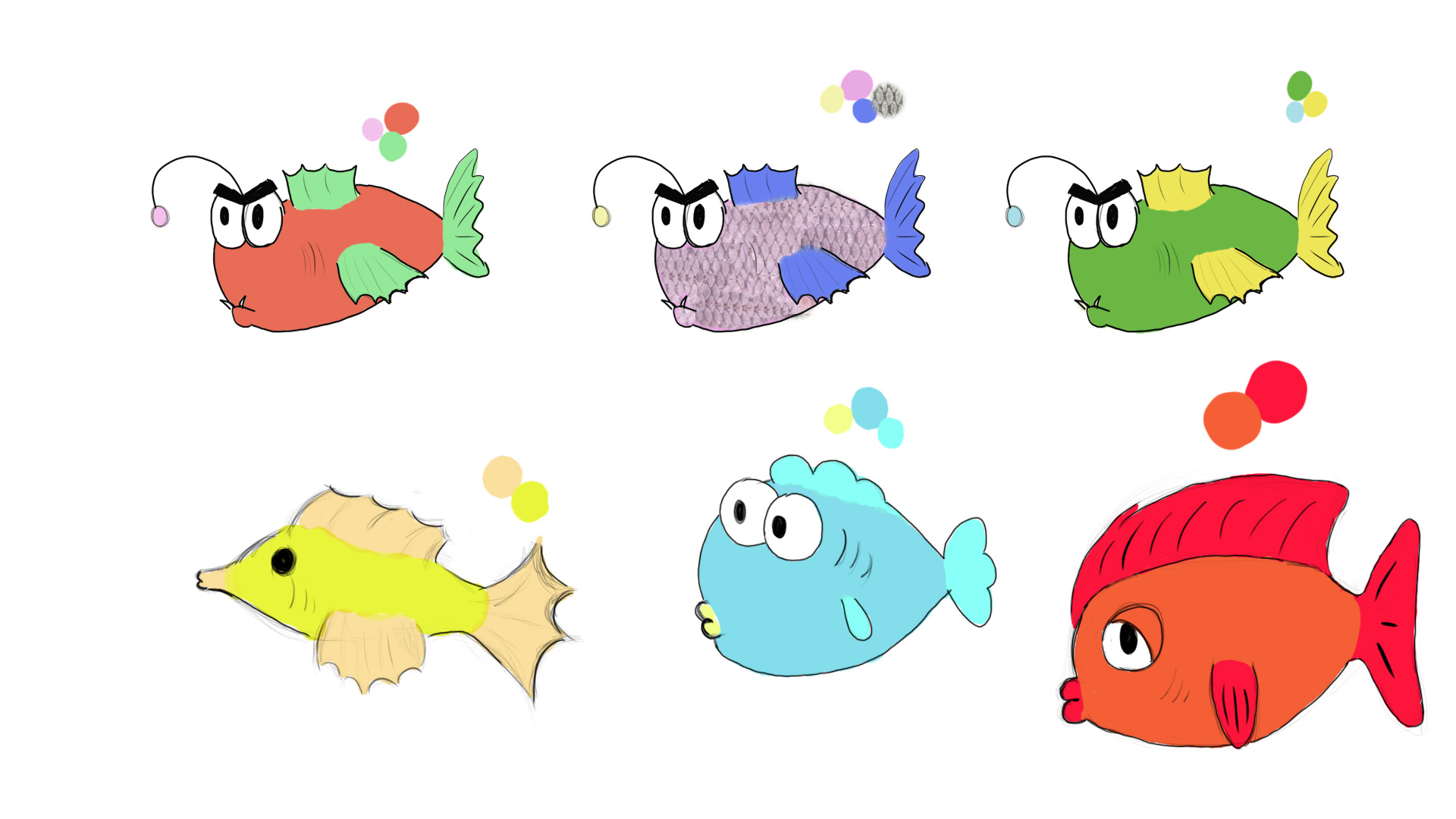
When my group looked at what I got, they came up with ideas of what they were looking for and what they wanted, and that was my ulterior motive, so I knew in what direction I should go at the time. I continued to figure out how the fish should look, especially Stephen since he is the main character in the game. I knew that he should have more round shapes, that symbolize ”kindness” and works well for a protagonist. I carried pen and paper around wherever I went so I easily could sketch down whenever an idea popped up in my head. And by doing that, I ended up with various fishy concept to deliver to my group.
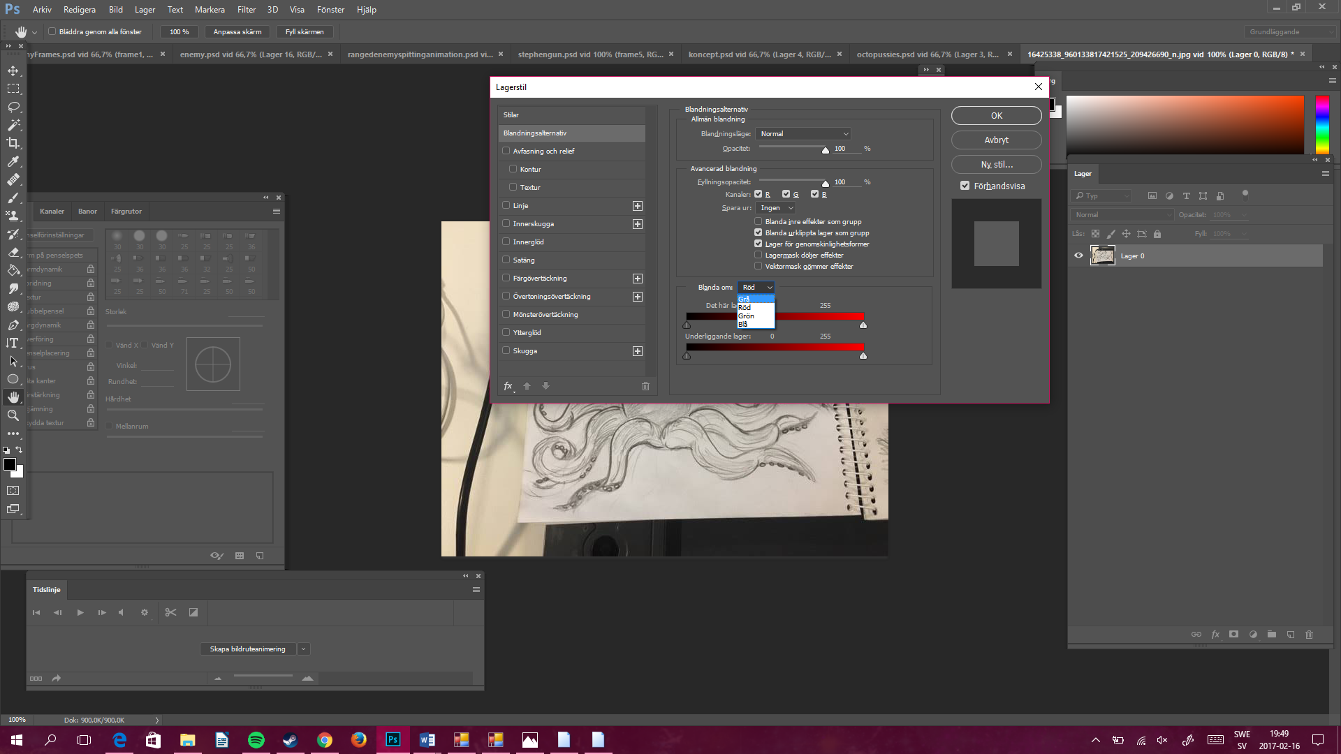
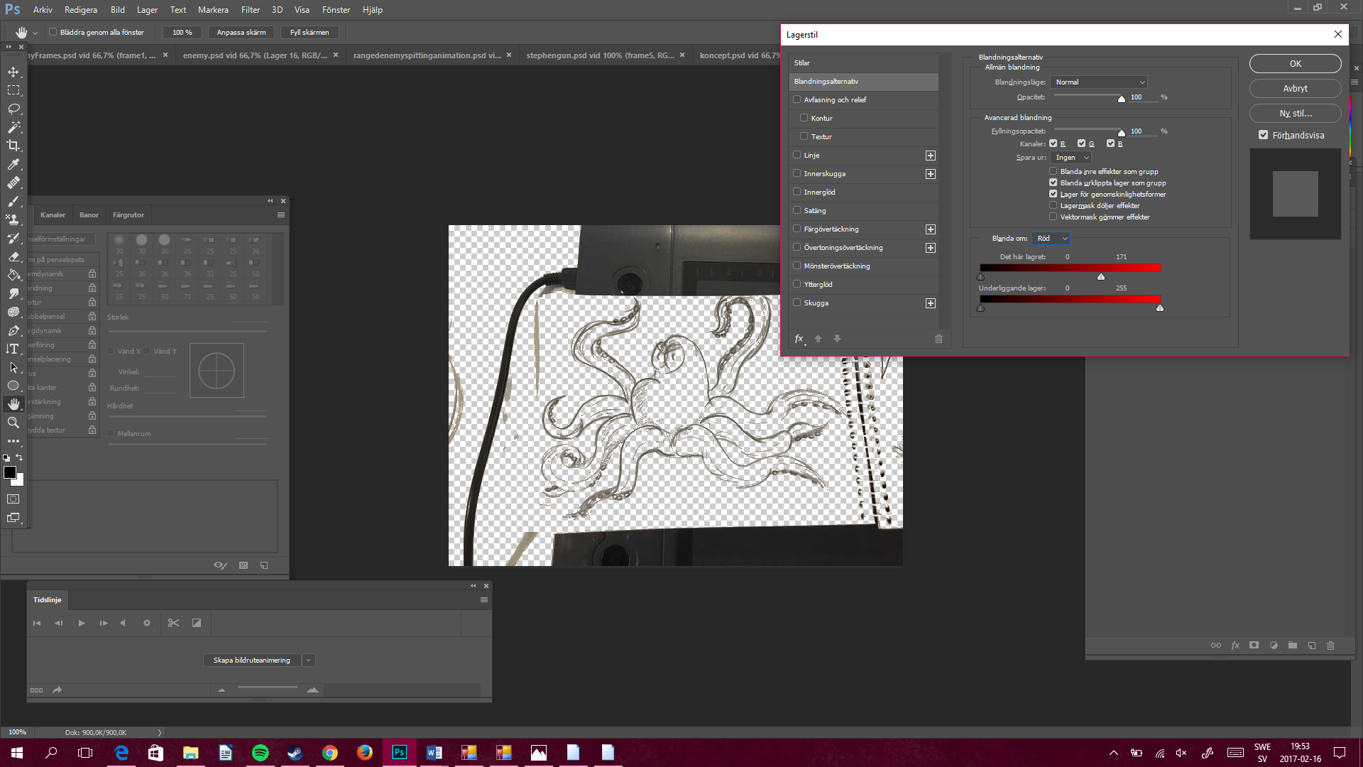
One thing I did to gathering some inspiration was to watch the movie ”Finding Nemo”. I got a lot of inspiration to my concept art, and also the movements for the animations (I wrote about that last week). There are not a lot of concept of Stephen as you might can see, but that is because we knew what we were looking for and I got it right relatively early. That is why the main focus on the concept is on the enemies. What I did next was to clean up the concept because it felt messy to only have them in a sketch book, so I added these pictures in Photoshop and erased the background so only the line art was left. How? you might wonder. What I did was just do double-click the layer in Photoshop, and then change the alternative from grey to red in the window that pops up.
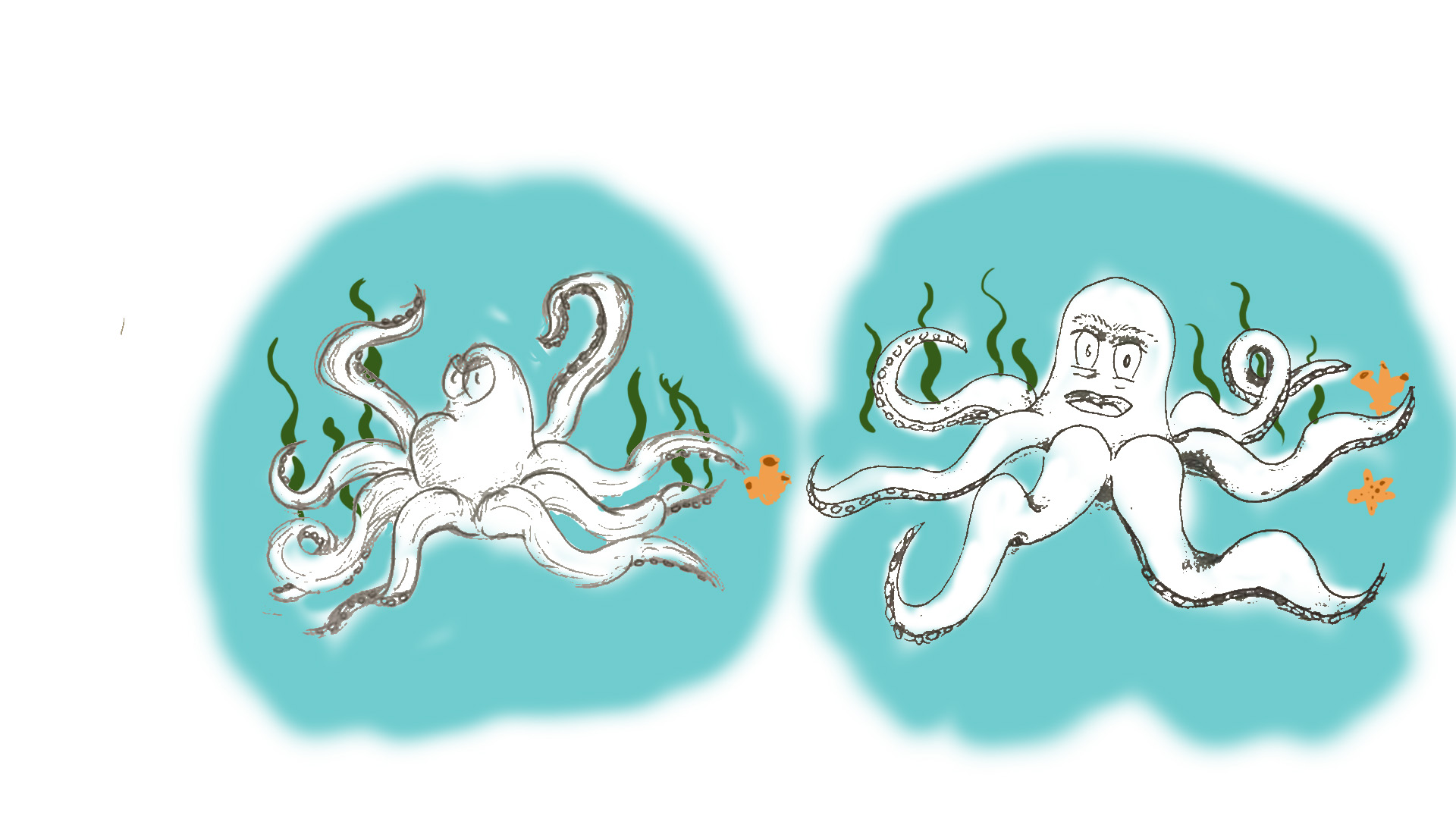
The next step is to move the ”Arrow” to the right in the top bar, closer to the black until you can see how the background is getting transparent. (You might need to erase some parts that does not disappear with this method). The last step for my concept art was to make it look ”attractive” and nice, so I added a simple background to each character, although the characters in question are not in any color or texture.
|