2D3 – Candyland Remastered
|
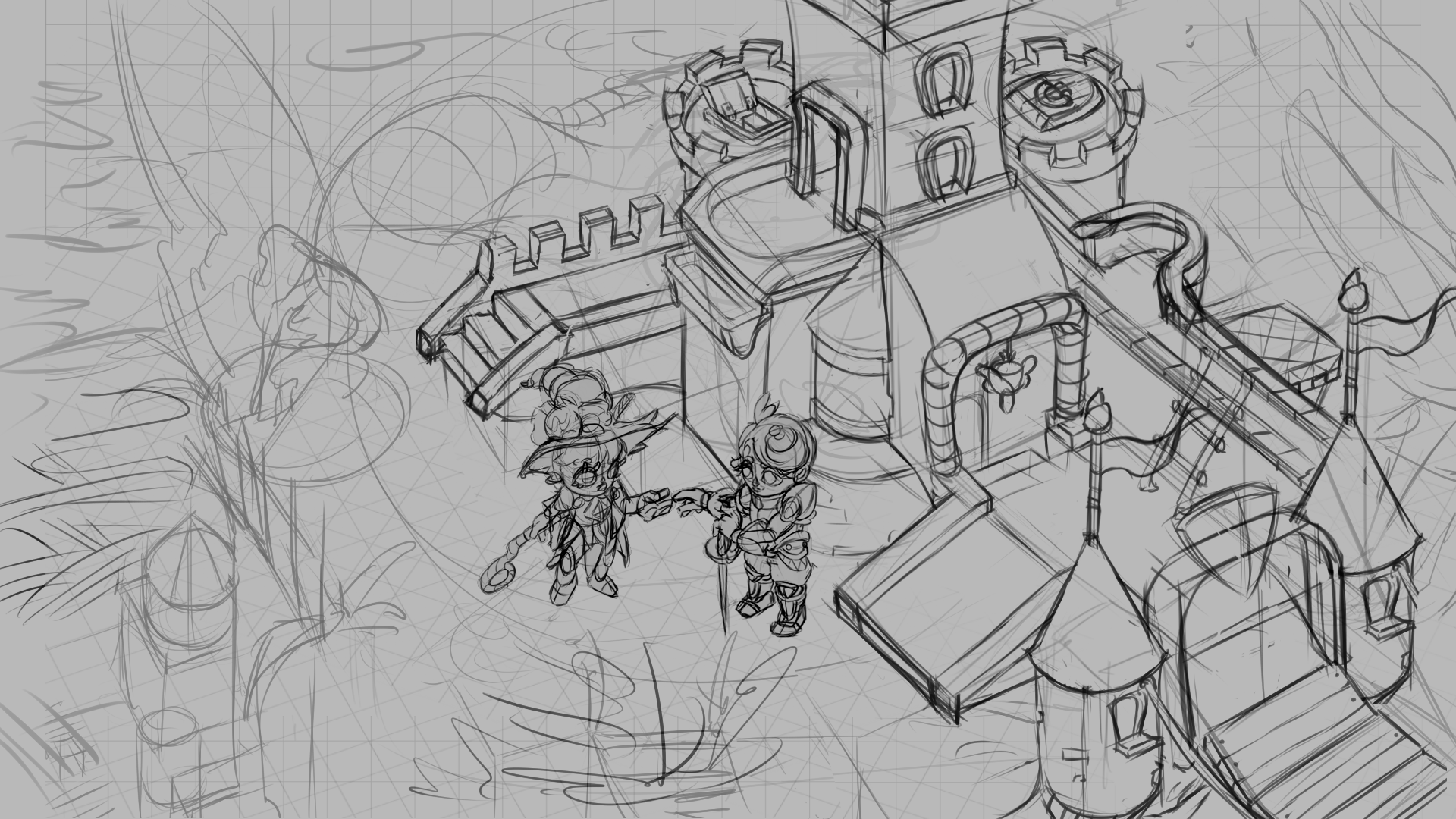
Inbetween animation, Zbrush, projects and battling my two old foes – Value and Color, there hasn’t been much time for blog updates but I figured I’d do a quick process art dump for our 2D course. Our assignment here was to create a fully lit and rendered painting as a faux “screenshot” of a game we’d like to make through the phases of gathering references and thumbnailing, creating a clean lineart, flat colors and basic textures to lighting and rendering. My idea was for an adventure game about a traveling witch with a candy aesthetic. I wasn’t very used to working with full scenes so I did a lot of research, looking at, for example David Harringtons asset concepts for HotS on Artstation and how he conveyed different types of materials in his line drawings. Started out playing with some very basic shapes and ideas to get the basic layout going…
…Aand some cleanup. The balcony wasn’t working for me so it got a little more flair and the garden got some extra refinement. I also added character “banners” as the moment was initially intended to have that visual novel dialogue system with character avatars but it ended up obscuring too much of the environment. Still like the character designs though. The ice cream witch is so adorable!
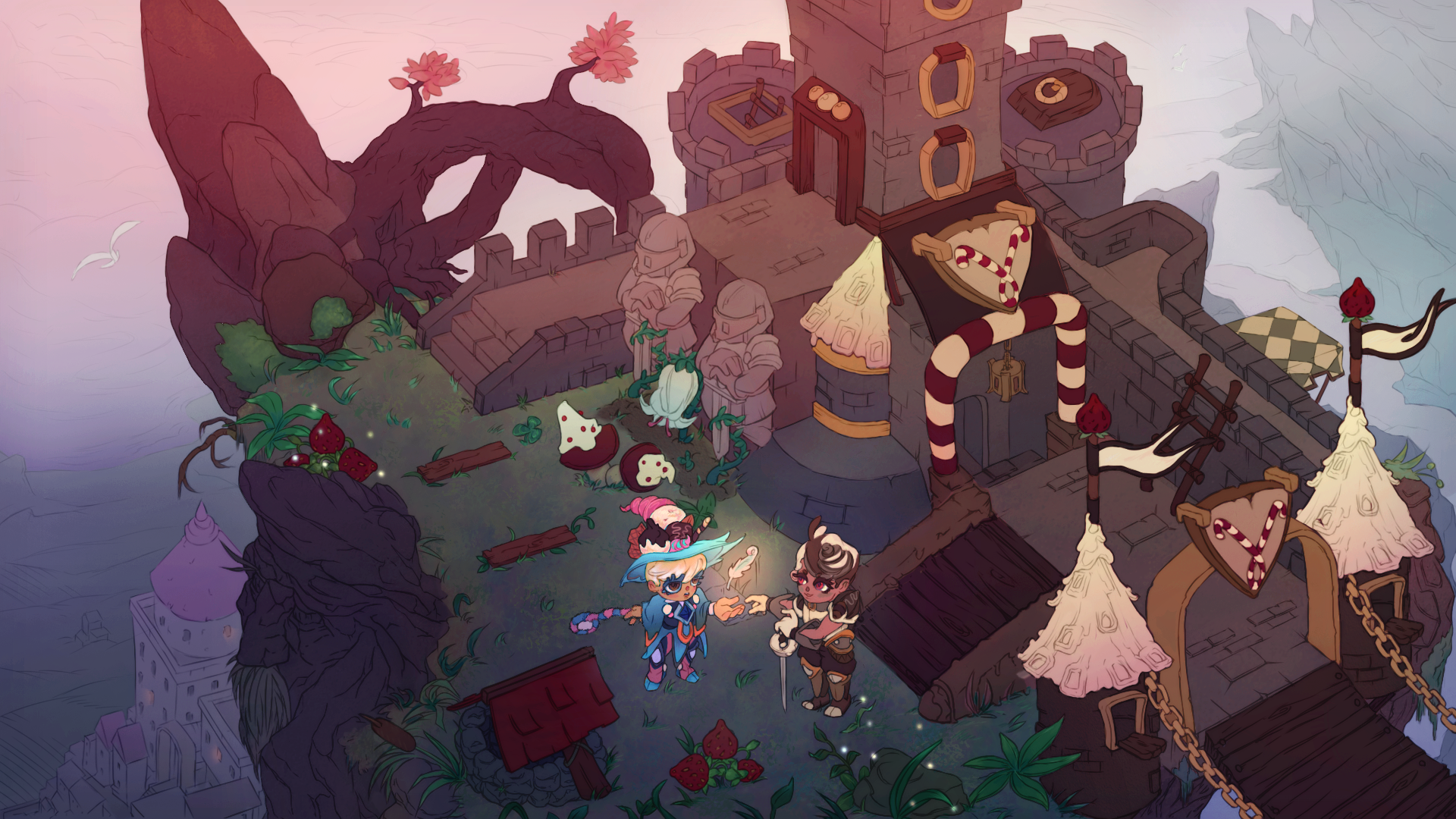
So for the flats: I was trying to go for a sunset-vibe but after receiving some feedback I realized I wasn’t letting the light pink of the light bleed into the green, which made the blues and reds seem washed out so this stage got a second pass. I also moved her hand away from the well for clearer storytelling and shape language.
And now to the tricky part, rendering. I found Leo Sandberg’s book Imagine to be of great help at this stage, especially on understanding the basic interactions between light and color, the color of the light and the color of shadow. I also found Jen Zee’s work on Bastion to be a great inspiration with her opaque-yet-subtle painting style and confident handling of color. I also learned to keep a close eye on the values during this process and not make snap judgements about saturation and contrast before the entire piece has received the same treatment. Our perception of color, contrast and saturation of something is after all very relative to it’s surroundings. I’m very glad I pushed myself to get over my lineart-itis with this piece and actually “paint” instead of relying on outlines and sharp rimlights to do the defining for me (even when it didn’t make sense for them to be there *cough*).
…And after some time, trial and error and “no seriously, just one more final touch”-touches, here’s the rendered result. I also learned the truth of “Art is never finished, just abandoned”. This was the 2D course where some basic concepts finally clicked for me.
*Level up noise*
|