Health and Oil packages
|
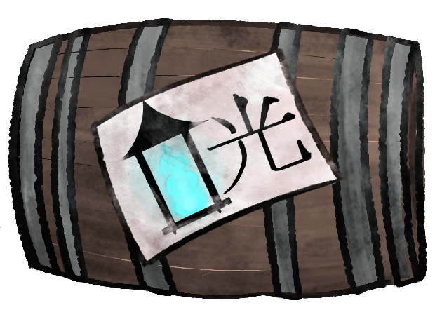
The original placeholders and the idea to first have in the game as assets where barrels, that would fit the nautical setting and aesthetic, and to have these barrels color coded with details of blue and red to correlate with the two bars for health and oil on the GUI. This idea changed rapidly, since we decided the barrels would look too alike to each other and too hard to spot. Instead they were given a bit different shapes to make the silhouettes a little easier to read. To just have colour coding was also scrapped after some testing, simply because the design language simply wasn’t strong enough to communicate their purposes. So instead of just having that, the packages now have more signs alluding to their GUI counterparts. For the Oil package, there is now a symbol of the lantern that will be used in the GUI as a bar to show Oil depleting. More than that, there is a sign for the japanese word “light” (Or at least I hope it means that, I used google translate – should probably get somebody who actually knows japanese to check these…) . I don´t assume that every person playing will be speaking japanese, and want to explain that this is simply an aesthetic choice to further localize the game to be in the area of Japan and building on japanese folklore. Oil package:
I choose to keep the barrel silhouette for this package, since it fit the aesthetic so well, and also logically fit having oil in, and instead only change the other package.
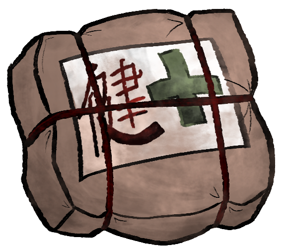
Health package:
Since I made a conscious decision of not putting a red cross to show health, because that is a symbol closely connected to the organization of the red cross, I made the cross, that semiotically is connected to hospitals- and through that, health green, instead of taking the GUI colour of the red health bar (a color semiotically connected to health), choosing the colour green to show health, since that too is culturally and semiotically connected to health – And instead incorporate the red GUI colour in the japanese sign “health” and in the package rope.
There is a pretty big possible problem with both these designs, that in the game, the packets will have to be so small in regards to the rest of the game, that the player won’t be able to see the symbols on the package and will have to go on a small spot of colour alone to understand the purposes of these packages. This could have been averted by designing the silhouettes and shapes better, or incorporating the colours of the GUI´s into all of the design of the packages, and not just in symbols in them. |