Entry 2: The Background
|
Thank you for your review last week, black Jesus! This will be a very image-dense entry for you to enjoy. This was an imposing challenge for me. I have no experience creating landscapes or anything larger than characters, really. I began by drawing out roads to create a kind of grid that I can build on. I had issues at first understanding what exactly we wanted for the game, but after a few attempts I received clear instructions and references from the Lead Artist and could get to work. The background will be 256×256 px and loopable. Since the image isn´t very big, it´s very important to keep the design subtle and even bland. This is to create the illusion of an infinite world, while it´s in reality a rather short repeated pattern. References and guidelines:
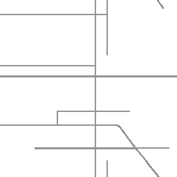
As I mentioned above, I began by making a grid out of roads. They must be small and low on detail. I based the shape of the grid on a Google Maps satellite shot of some Danish neighborhood I found.
Next step will be to make indications of buildings. It´s a densely packed city, it will probably have some different types of buildings but everything must blend together and appear non-unique. I began by putting pixels here and there in an area, then do the same with two other colors to complement. Very quickly, this started to look like nothing, a military pattern. Then I had a realization and basically discovered a nifty way to do it, so that if you were to look very closely, you can see the individual houses while it looks like nothing at first glance. Perfect. In the images below you can see how I essentially copy and paste sections of the original, hand-crafted shapes to build new blocks, then copy and paste markings from them to make even more. Side note: All images for now are rotated 90 degrees to the left. The houses are supposed to be standing up but I worked on them from this angle because I felt it was easier at the time.
In the right picture you can also see two new blocks with other colors. This was to create some kind of dynamic in the background so it doesn´t look like an anthill. Repeating to copy-paste over and over, while also adding a third color variation, I slowly began expanding the city and making it sprawl. After completing enough to get a good idea of how it will look in-game, it´s time to tone down the colors. This is most easily achieved with hue/saturation and color balance layer masks.
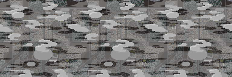
I also added some bigger buildings as generic, repeatable landmarks. These will see a makeover soon as they stood out just a bit too much, at least with their white bases. Also, the images are now turned the right way. This is what it will look like in-game. Moving on! The top layer is simple: just put a bunch of happy clouds there and it´s done! But yeah, I did a lot more. I want the parallax effect to be very visible, so two layers is not enough in my opinion. I planned to have a total of four layers (which turned into five): clouds, smoke, shadows of clouds on the city, and the city itself. Later the cloud layer was split up into upper clouds and lower clouds. I wanted round and simple clouds and started experimenting with what looks good in the game, same as for the lower clouds. The smoke/fumes/mist/smog layer will have at most 30-40% opacity to still show what´s underneath, yet partially obscure. Lastly, the clouds cast big dark shadows on the city, also with a low transparency. All of these layer were done using nothing but the Ellipse Selection Tool. Putting it all together, it looks like this:
Of course, at this scale it´s easy to see how a static image loops and repeats. But imagine just a third of this image fitting over your entire screen, and the layers move and shift independently. Now we´re talking! Of course, since we haven´t had the lecture on parallax yet for whatever reason, this is all I can do for now. After the alpha play-test we got a lot of feedback on the game looking a bit dull and grey, and it does. I´m polishing the colors to make them a bit livelier but still discreet. I´m very happy with the results and can´t wait to put this baby into motion! Thank you very much for taking the time to read my blog (not that you have a choice)! I´m looking forward to updating our true Lord and Savior on the current going-on´s next week. Peace. |