Concept Art – Week 5
|
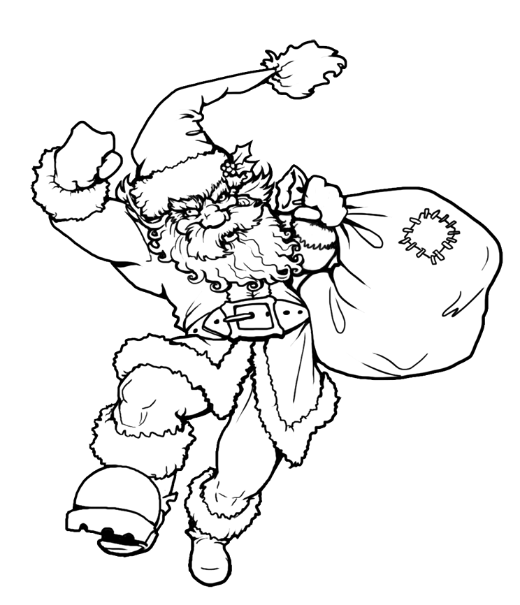
So during these past weeks in the Concept Art course we’ve been talking about character design, shot design inbetween the basics of art like perspective and colour theory. The good thing about that is that even if you’ve heard it before, you can always find something new to take away. This week it’s been rendering and while the final assignment is to create and render our own character designs for a given script (which is supposed to be our own take on a Alice in Wonderland-themed car commercial), we got an in-between exercise to colour a finished lineart.
We tried two approaches, either painting with grey values and then overlaying colours on top or painting with colours directly. Usually, I find that painting with greys underneath kills the colour quite a bit but that can be remedied by fiddling a bit with photoshop layer and colour adjustments to saturation and contrast and just painting in the stronger colours.
I’ve finally learned to get rid of the lineart! And defining different materials! Greatly helped by the magical acrylic brush which feels more reminiscent of traditional oil painting. Still got boggled down in the details a bit but for once the whole thing is actually done (painting a background was not part of the assignment). Have a good one! |