Blogpost II – Fancy Mansion
|
The ”stealable” items continues New week, new challenges. I have continued developing and designing the items that the protagonist is going to steal. Not only have I made the design on the finished artefacts better and given then a more equal look to each other.
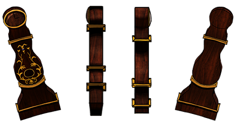
To make my fancy clock I decided to use the typical ”Moraklocka” as reference. Most other designs on this type of clock are almost always pretty square, but I thought the round shapes would make it look more fancy and antique. At first, I stood between the choices of making it white with golden details or brown with golden, but when I decided a wooden pattern would enhance the fancy feeling I trashed the white design. White on wooden texture looks cheap. Since i am pleased with my art piece I kept working with it during the week and made it ready for the thief to carry around. The clock will be almost as high as the walls, and the protagonist is much shorter, i realized it would look stupid if he carried it straight up as it was standing. This would make it higher than the walls, resulting in it ”hitting” the roof. To fix this i did two things. First i tilted it, which also would make it look heavier to carry, like the thief have problem carrying it straight. I also shrunk it, to make in look more proportional to the avatar.
The trickiest challenge I met during this project was to make the shape look clear even from the sides. Since we had agreed on the stealables to be clean (so the player can easily spot them) I did not want to work too much with shadows. I tried several different methods but all of them made them look clean but more or less square. I finally gave in and made softer shadows because even if it does not fully fit into the art style, it keeps it roundness. Ciao! |