Making Art out of Words
|
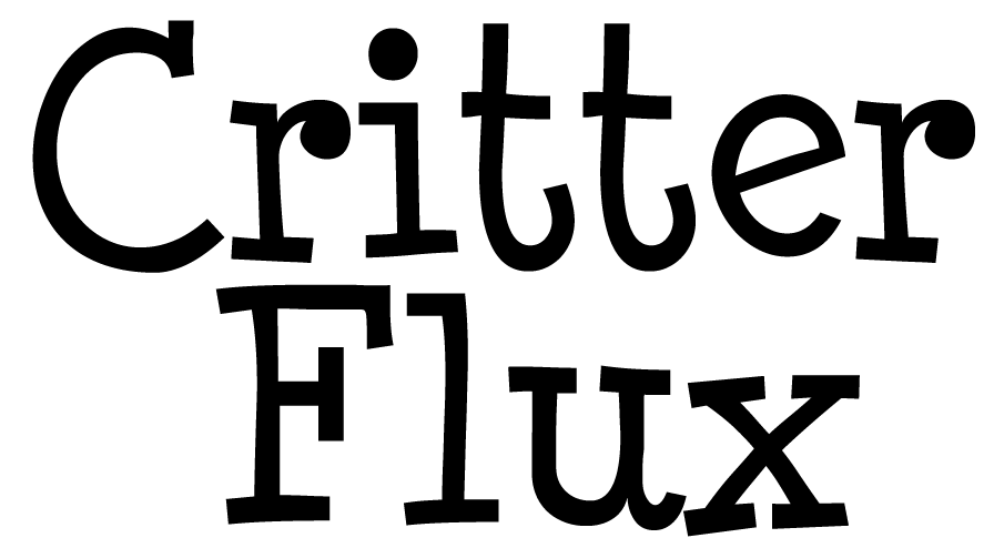
Can’t believe how fast the weeks go by, panic is starting to set in. However, rather than expressing my current state of hysteria, I was actually intending to go through how I went about designing our logotypes. I am actually quite fond of working with banners, emblems and symbols. Using my drawing tablet and Photoshop I start of with trying out various fonts that I like. You can say a lot with text and in a logotype the shape and colours are more important than the actual letters – that’s what I find so interesting! Positioning of the words help build the image as a whole, it needs to be balanced but it also needs to feel alive, as if something is actually happening in the text to draw the eyes in. This is what I started off with when I created the logotype for Critter Flux, I used a font called Minya Nouvelle:
The first thing I did was fattening out the text and figure out placement of the words. I liked the straight lines marking the each letter’s top and bottom, I wanted to make use of them to create a feeling of unity between both words, as if they were stuck to the same line inbetween them. I moved up the bottom letters and re-shaped most of the letters to fit my idea, Our game is about the critters and the various personalities they inherit, it is playful and wild. I wanted this to be reflected in the logotype, I imagined the letters themselves as live critters, I drew on features such as eyes and teeth. As for the colouring, I wanted something in the background to frame the whole text, I needed something vibrant and colourful. I opted for use of the colour green and turquoise, which are usually colours considered to be expressing happiness, growth and openness. To make the text pop, I applied filters such as bevel and emboss, gradient and stroke. Finally, the green background is meant to slightly resemble grass, to complement the animal-like letters. You may have seen the result in my previous post already, so for you this will be a re-cap, this is the final result:
Next time I’ll be discussing our growing anxiety as the dreaded deadlines are steadily approaching as well as some more 2D art! |