Leaves Until You Leave
|
During this week I was in charge of making leaves that would be used as assets for the different levels within the game me and Team Kraken are working on. While the concept of leaves itself can seem like a bland and easy subject at first, there is a lot more that goes on behind each detail of how a leaf is designed. The first point being what kind of leaf it is going to be. When deciding on what kind of leaf the game was going to have, the group suggested that a shrubbery type of leaf would be the most ideal choice. This made sense since the Moth (the Player Character), was mostly flying low on the ground. I’ve made different concepts of different leafs until we came to a decision. We chose the leafs that closely resembled rose leaves. Rose leaves themselves have spiky edges at the edges of the leaf. However despite that I didn’t feel as though the leaves looked more rough, but rather have a more organic and exotic look to it. It fits in rather well with the game’s aesthetics given on what we already have. I planned on making leaves that would be connected to a stem, that would eventually be connected to different branches. The reasoning for doing this is to focus on the level design aspects. We, Team Kraken, is planning on doing level design that would rather have a varying space occupation. Simply put, we’re doing level design based around space being used within the level.  It falls to me to create leaves that will be connected to branches. My main goal was to create the branch with leaves that would occupy a certain space needed for level design. While I wasn’t in charge of the actual level design, I had to make assets that didn’t have any sporadic shapes while also making it look organic. If the branches and leaves don’t have any crazy shapes, it would be a lot easier for the people in charge of level design to use. While making the leaves, I’ve created multiple versions of different leaves. I’ve made 3 different versions of a leaf, which is only minor shape modifications. Spotting the differences between the leaves is very difficult, since I only changed their shape slightly to make them slightly longer or wider. I simply just did this by transforming the shape of the original leaf and then tracing over it to form a slightly different lining than the original. To be completely honest this is quite a bad habit of mine. My reasoning for doing this was to have different versions of the leaf so they didn’t look symmetrical to each other. However in the end this would have a near to 0 effect to the actual experience to the game. The player would still think the leaves looked the same anyway since there isn’t any distinct features to tell them apart. If I didn’t do the extra versions of those leaves I would have saved time. 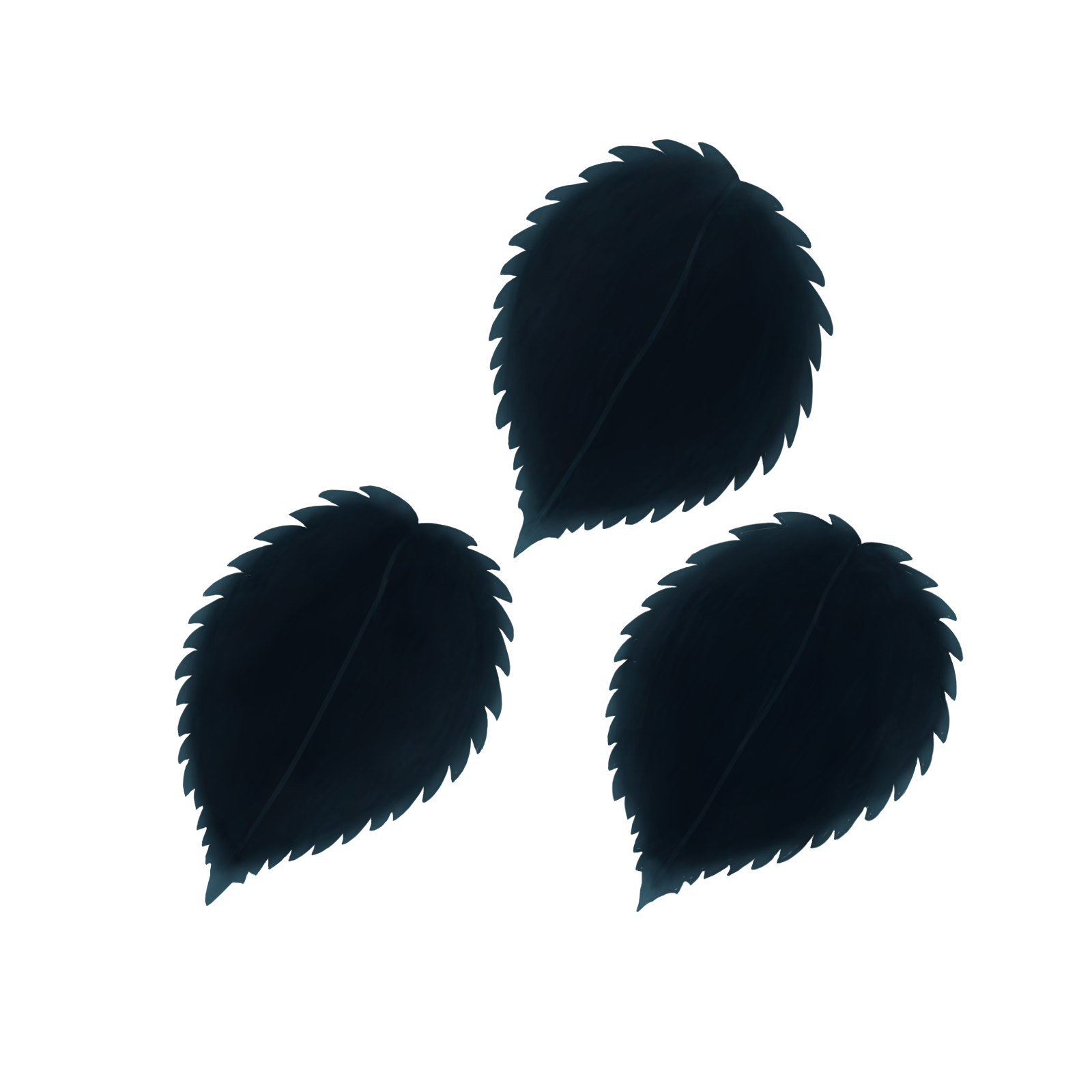 I also created different versions of the stem and how the leaves are connected to it. The main three categories are:
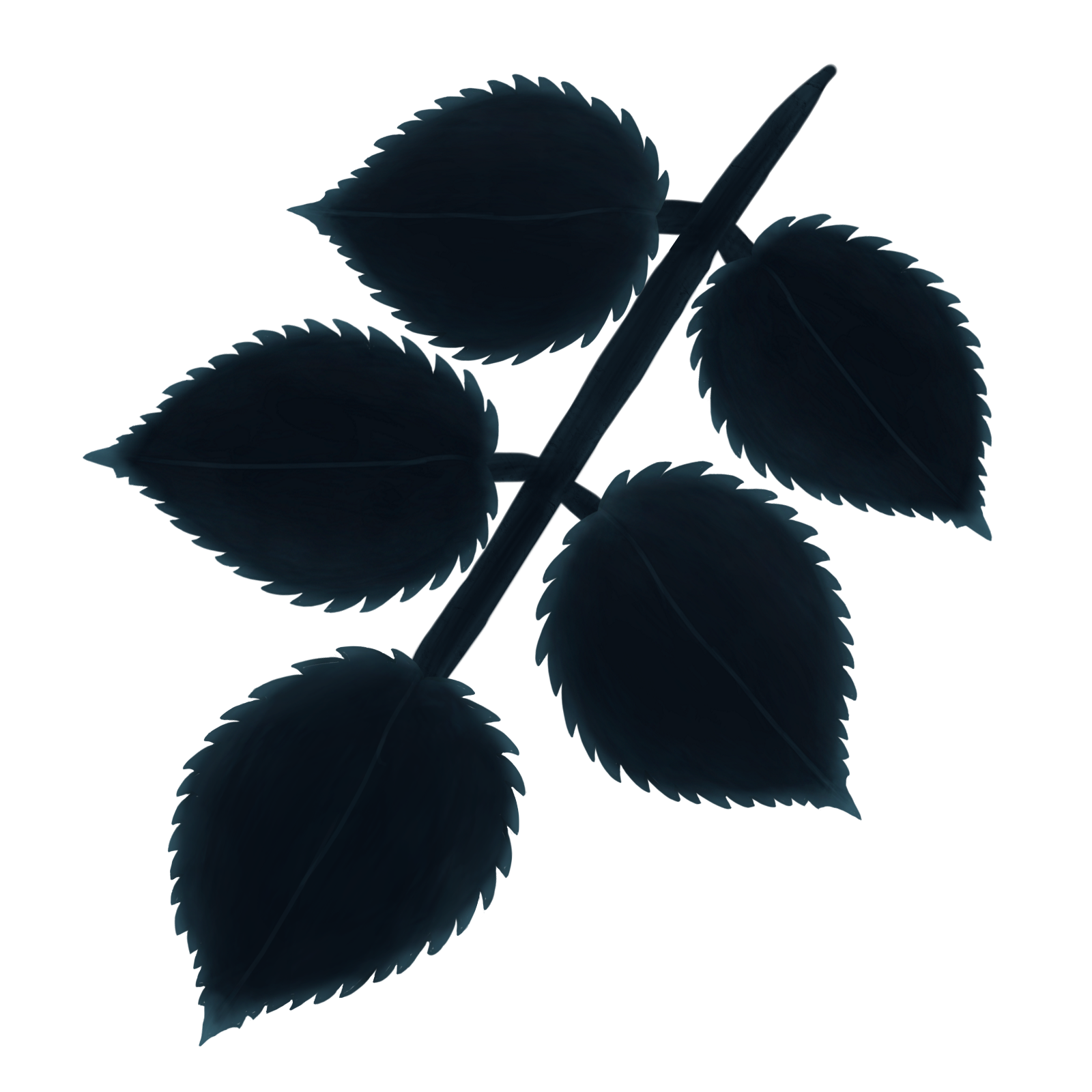 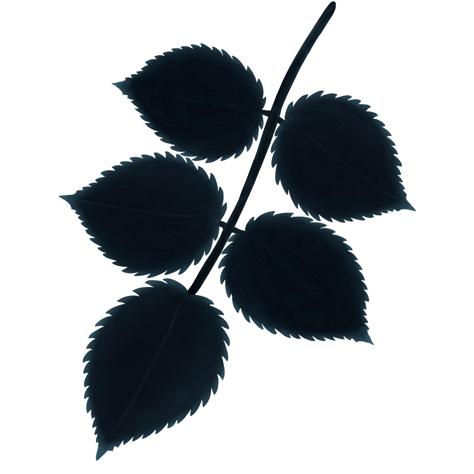 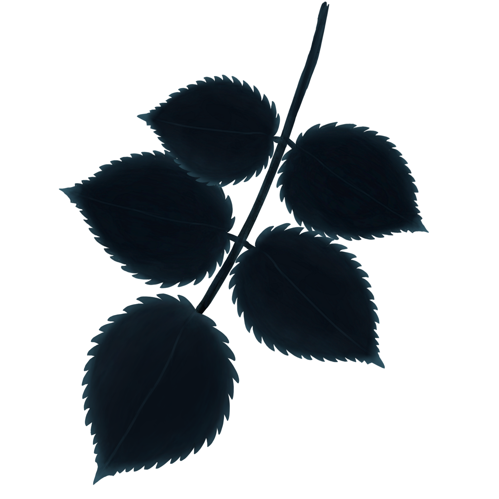 All of these different categories have 3 slightly different versions in terms of the shape of the stem and leaf placement. The reason for this is to have different types of stems that would give different options of how they are placed on the branch. By doing this I can make it look more natural in how the stem is placed and also be unsymmetrical in the process. Symmetry in nature is nearly non-existent so I try to avoid that as much as possible. The Thick Stem Leaves had a different slightly different function compared to the others. The Thick Stem Leaves were used on the end of the branch so it could occupy the space needed without a thin lining connecting the leaves to branch. This in the end made the leaves at the end of the branches look less awkward while still occupying space needed for the level design. After I’ve created different leaf assets, I started the process of connecting them to branches that were going to be implemented to the game. The branches themselves weren’t made by me but rather the Lead Art Designer of Team Kraken. He provided them for me since we already had branches as assets within the game. They came in three different sizes, which were Short Small, Long Medium and Long Large. When I came to connecting the stems of the leaves, I focused on occupying space while also making it look natural. For the short small branch, I focused on making the actual leaves themselves small. Doing this is self explanatory considering the size of the branch. However another thing I did for the short small branch was to space out the stems more compared to the other branches. I felt a need to do this because it physically made more sense to have a less densely packed branch for a small branch that is more feeble. The process for the long medium and large branches were quite similar. I tried to cover the area around the branch and also keep them somewhat densely packed. I made them more densely packed since overlapping leaves made it have more of a organic and natural representation. However I didn’t try to stuff the areas around the branches with leaves and rather keep them evenly spaced while have slight overlaps with each other. The only difference between both of those branches is the branch’s ends. Both the short small and long medium branches had only one ending, the long large branch has multiple ones. I had to make multiple small leaves to cover each ending of the branch.  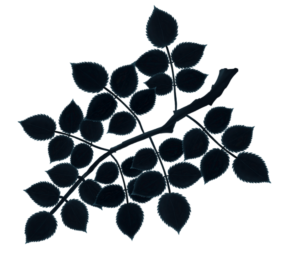 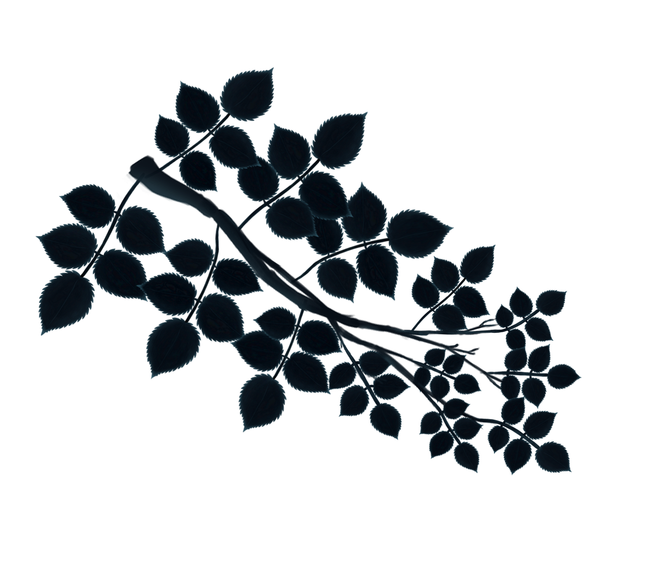 When coloring the leaves I focused on strictly using color to bring out specific features of the leaves. I felt as though the main features of the leaves that are the most important are the spiky edges. The spiky edges is the key features that makes the leaves unique. As a result I colored the edges with a lot more blue compared to the rest of the leaf. I also attempted to color the midrib (the visible line through the middle of the leaf) of the leaf with a with a sharp pen tool to give it a sharp look. However I didn’t come out the way I wanted it to. I made the line a bit too dark and therefore as a result becomes nearly impossible to see to the player. This is due to how small the size of the leaf is.  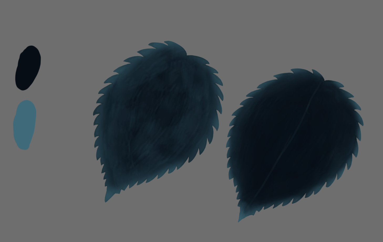   However, there’s also another big point for the edges having a very definable blue color. This comes down to the color design of the game, and to help explain this some references to my other blogs are needed. On the previous blog posts I have uploaded, they were all regarding the artistic and aesthetic choices about the design of the spider. While the spider is done for the time being, it’s concept can still be used for the rest of the art assets within the game. More specifically the color palette I used on the spider. The spider has a slight blue coloring throughout it’s body. However I would say it’s most definable feature that makes it stand out is it’s red eyes. While a spider in itself is threatening, those red eyes help further enhance that feeling. Red in itself can be determined as a meaning of danger. Also I feel like creatures with red eyes usually is an indication that there’s something sinister about them. Red is the only warm color being presented to the player throughout the game, which makes it more eye popping. Since red is corresponded with danger as far as the player knows, I feel like that red can be used on other assets within the game. More specifically lethal obstacles. Currently the only real lethal obstacle we have in our game is the thorns. One critique that we got for our game was the lack of clarity between what obstacles are lethal and which ones are not. This wasn’t exactly clear since the only defining trait that shows that the thorns are lethal is that it has spikes on it. However thorns aren’t the only obstacles in the game that have spiky edges. This created confusion on what can harm you and what can’t.  Although it hasn’t been modified yet, I’m planning to create a defining red coloring on the edges of the thorns in which it is a lot more clear to the player that it is lethal. With red being the main trait of danger till this point, making rather lethal threats such as the thorns red will overall create a better experience for the player. This brings us back to the leaves again. The defining trait of those leaves were the spiky edges. If we were to leave the assets the way they are, it might even confuse the player that the leaves are lethal. This is the main big reason why the edges of the leaves have a lot more coloring compared to the branches and other obstacles within the game. I try to make sure that the player doesn’t get confused about leaves cause of them being ‘spiky’. In the end I believe that using the color red to represent danger will unquestionably clarify the player about the surroundings of the level. |