|
The HUD (Heads-Up-Display) is an important element of any game. It serves to relay information, not seen inside the game world, to the player as a visble element inbetween the two. They come in various forms depending on what it is the HUD needs to display. I had already established what the parade bar is supposed to look like from before. 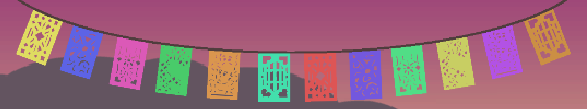 However, I wasn’t how it looked in the first iteration. It was too stiff, the colours had no harmony with the other elements on the screen, and the patterns were perhaps a bit random i.e. they didn’t work well together with the theme. To solve this I went back and started sketching to find something that would fix the issues I had with the first iteration. However, I wasn’t how it looked in the first iteration. It was too stiff, the colours had no harmony with the other elements on the screen, and the patterns were perhaps a bit random i.e. they didn’t work well together with the theme. To solve this I went back and started sketching to find something that would fix the issues I had with the first iteration.
 I started out by grabbing a screenshot of what the game currently looked like. I had to stretch the image to fit the 16:9 aspect ratio (my play window in Unity had the wrong aspect ratio when I grabbed it). Then I started sketching ontop of it. At first it was only black outlines, but when felt I was nearly done I added in the white to get a feel for how it was blocked out. I decided that the parade bar would be decorated with skulls or faces, and the healthbar would be lanterns decorated in a similar way. I added structural support to give the player the impression that these hanging thing werent just hanging in the air. The bubbles on the left is a very simple outline for the new shape of the parade. Since it is another visible element in the game I had to take that in to consideration. I started out by grabbing a screenshot of what the game currently looked like. I had to stretch the image to fit the 16:9 aspect ratio (my play window in Unity had the wrong aspect ratio when I grabbed it). Then I started sketching ontop of it. At first it was only black outlines, but when felt I was nearly done I added in the white to get a feel for how it was blocked out. I decided that the parade bar would be decorated with skulls or faces, and the healthbar would be lanterns decorated in a similar way. I added structural support to give the player the impression that these hanging thing werent just hanging in the air. The bubbles on the left is a very simple outline for the new shape of the parade. Since it is another visible element in the game I had to take that in to consideration.
Unlike when I started working on the background, I am now armed with the knowledge of how to create visuals for this particular artstyle we went for. The square brush, and the shift key are now my primary tools to create the hard edges and the flat simplistic textures. The textures don’t even take that long to create, so it’s also fairly time efficient.
How ever, for the hanging ropes/wires/cables this technique didn’t work, so I had to figure out a new way to create texures for them. After not too long I accidentally stumbled upon “noise” in gradient types. Unlike “solid”, it creates random points in the no longer gradient, and the colour of these points are based on the colour model below it, to create coloured points within a defined colour range. It then uses the rougness value to soften the points and create a more flowing transition between the various colours on the “gradient”. ever, for the hanging ropes/wires/cables this technique didn’t work, so I had to figure out a new way to create texures for them. After not too long I accidentally stumbled upon “noise” in gradient types. Unlike “solid”, it creates random points in the no longer gradient, and the colour of these points are based on the colour model below it, to create coloured points within a defined colour range. It then uses the rougness value to soften the points and create a more flowing transition between the various colours on the “gradient”.
This discovery allowed me to create simple textures for the hanging ropes. I used the  “luminosity” blend mode to quickly and easily restrict the colourrange of the texture on the rope. Otherwise these ropes would be rainbow coloured, which wasn’t what I was looking for. I used the same “gradient” for the parade bar items, to make it less flat without giving it a complex or distracting texture. “luminosity” blend mode to quickly and easily restrict the colourrange of the texture on the rope. Otherwise these ropes would be rainbow coloured, which wasn’t what I was looking for. I used the same “gradient” for the parade bar items, to make it less flat without giving it a complex or distracting texture.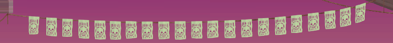

For the glowing lanterns wasn’t sure how I would make them more visible without being distracting (because of how important it is for the player to know how many lives they have left!). At first I just placed a radial gradient behind it to create the glow around it, but it really only looked good when the glow was larger than what was practical, because it otherwise didn’t looke like it came from the lantern. I considered to just paint it around the edge of the lantern instead to make it appear to glow, but I like efficiency, and would rather try to come figure out a better way (time and effort wise) to create the glow. During the following break to reset my head, I watched a speedpaint of someone who used the “effects”/”layer style” to automatically create the glow effect while painting for a sci-fi scene. I hadn’t considered using this before for anything other than text. I usually stay away from these effects because it can look cheap or amateurish, but I tried it out and it did pretty much what I was looking for. edge of the lantern instead to make it appear to glow, but I like efficiency, and would rather try to come figure out a better way (time and effort wise) to create the glow. During the following break to reset my head, I watched a speedpaint of someone who used the “effects”/”layer style” to automatically create the glow effect while painting for a sci-fi scene. I hadn’t considered using this before for anything other than text. I usually stay away from these effects because it can look cheap or amateurish, but I tried it out and it did pretty much what I was looking for.

This is the end result of it. It’s appealing and it performs its function in a more interesting way, in my opinion, instead of just displaying numbers, icons or stright bars to show the values to the player.
About André Tingvall
2016 Graphics
|