Presentation’s Where I Wanna Be
PowerPoint on the beach where the slides are free.The Alpha Presentation was a perfect subject to put too much effort into instead of doing more important work. I do, however, think it paid off. I decided that it would be easiest to make the structure by simply copying the topics that were listed as requirements, each slide being on one of the requirements. While I would have preferred to do something more original, it would make the task easier. It would be much easier to include the necessary items in the presentation without straying into more superfluous topics. Also, going off the guidelines may not have sat well with my group. However, I still used my own wording for the slide headings, so I did retain some creative control. Google Slides provides the convenience of collaboration. It seemed like an obvious choice for making an exhibition of our alpha. Everyone would be able to contribute. Nevertheless, our programmer, Natasha Mangan, made quite a good point: Google Slides does not look very great. We needed the right aesthetic. Personality. PowerPoint would make a much better option. I, however, do not have PowerPoint on my PC. But then I only use that computer for a little something called “video games,” anyway. I have my MacBook for everything else. This was actually a benefit. Apple’s “keynote” is much easier to use and more stylish right out of the box. PowerPoint may provide more control and options, but I do not want to deal with that mess. I have a Mac for a reason. I needed a good theme for the slides. Our game is sci-fi, futuristic, space-age. On the other hand, it is also cute and colorful. There were no themes that really fit the visual aesthetic of the game. So, I took a modern theme and changed the color palette, using pink, sky blue, and white. The color combinations had to read well, and so I tried out a few before deciding on the final hues. I then made sure to include lots of pictures. No one wants to look at slides without pictures. Fortunately, we had more than enough unique art to fill the slides. Using my expert skills in composition. I made sure the images and text boxes were harmonious, paying close attention to the blank space. The weight of the slides must be balanced. While at the same time, I had to make sure the placement of items in the slide was interesting and dynamic. I swapped between the sides for where I placed the images or text and alternated the colors of the slides. Almost nothing was centered. Boring is what I say to that. Now we get to what some would describe as the important part. The words. I wanted to make sure that I was not the only one working on this masterpiece. I made sure to emphasize that we did not have to use my layout, it was simply a suggestion. I did not want to be dictatorial on the assignment. I may have ended up being very nit-picky though. It was my baby, can you blame me? Mangan and I went to writing out what we needed in the slides. We made sure to not include to much. People do not want to read long slides. Bullet points were what we needed, with short talking points. Then we could focus on our talking points. The words being simply talking points that help the audience follow along. With such a small amount of words, though, each one is made more significant. Much care went into choosing what we wrote. As far as the content itself, that was easy. We have been working on this project for weeks. We can talk about every aspect with expertise. 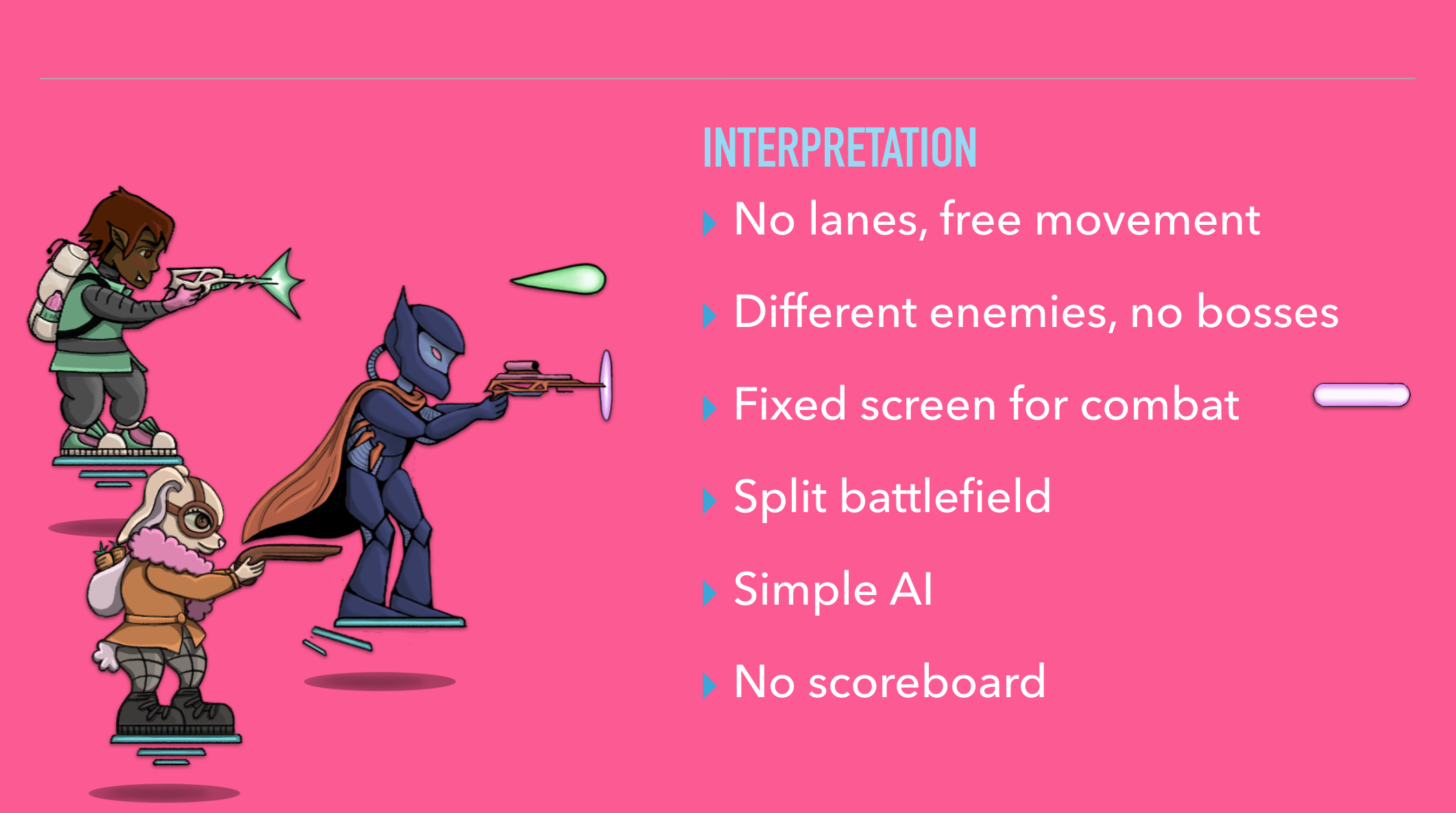 You may notice that I’ve only mentioned two people in this, when I started out with collaboration as a priority. Well, it was not essential that everyone be engaged in creating the presentation. Everyone was given the opportunity to review the document. Everyone chose or was given a different section to present. Mangan took a very active role. Having the strongest opinions (and presentations being somewhat more in my area as a producer), I had final say. I may not have done as well as I could have in this role. The results, though, oh baby. We had animations, we had music, we had a video, we had a second video (which may have been last minute since we did not show that you can “die” in the game). The other presentations were simply uninspired when compared to ours. How can you call yourselves designers like that? As far as what we said, it seemed like it was informative, thorough, and clear. At least I hope so. We only briefly prepared what we were going to say. Luckily, Poltergeist is a flexible team of innovators and improvisors. Some may not have thought our presentation was as exceptional as it truly was, but one cannot live their life trying to please other people. It is quite clear that people generally have bad opinions. Finding something to put passion, which I rarely feel, into is enough of a reward. Though it is exhausting, I do wish at points that I could do activities like this more often. It is a good change from the normal monotony. You know what? Who says I can’t? We don’t need a holiday, it’s time to presentate.‘Cause I need a break, I need a presentation. |