Development blog 1:Perspective in our game
|
Good morning all. As one of the artist in group Zombie. I am excited to announce the out newest game Umibozi. Before I start talking about every single feature in this game, I will be showing off the development of the design of perspective and the color in Umibozu.
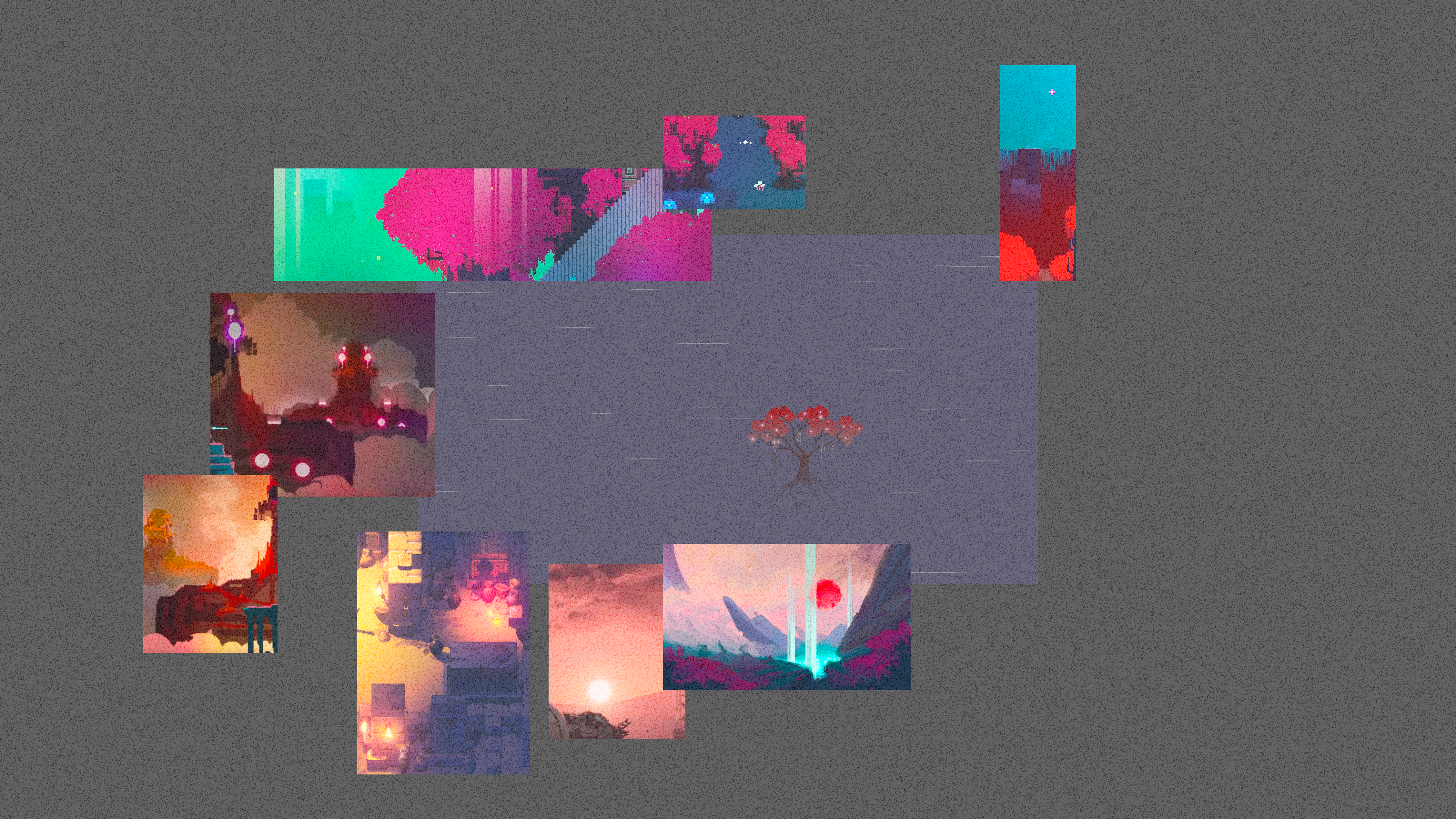
In order to solve this problem and make our game more appealing, our artists agreed to make Umibozu a Zelda like an isometric game. We made this decision because we learned from the perspective in Diablo 2, Diablo 2 was played as a top-down game but the isometric perspective can trick the players into thinking that every game object actually has depth. Objects with depth are simply much more pleasant to look at in games generally so we designed our playable background, game objects, enemies and UI based on this perspective. I will talk about how our game objects were designed in my next blog. This drawing shows the change of perspective in our game.
Art style wise, we wanted to make Umibozu a monochrome game that narrates a mysterious atmosphere to players at first. But since the game happened in the ocean, a monochrome style couldn’t really depict the ocean well in top down because the whole screen will be filled with gray scale that represents the ocean. If that happens, the level of contrast between the game objects and the background will be quite low. Another solution was to make the ocean white(increase the value for the ocean). However, by doing so the game lost its mysterious dangerous atmosphere. We scraped the monochrome idea and decided to make the game colorful. However, we decreased the saturation of all the colors we used. The decreased saturation of the color will create a misty environment for the players. The colors used in our game also followed a single color palette-the orange environmental light. Every game object in our game should be colored in a warm color while the ocean and backgrounds were depicted with cold colors. This color palette will focus the player on game objects that matters and intractable. In this drawing, you can see how did the color usage changed from the 2 drawing I have shown you before. In the next article, I will talk more about the design of enemies and our approach to achieve our exploration aesthetic goal. Finally, thank you for following the development of Umibozu.
|