BGP – 3
|
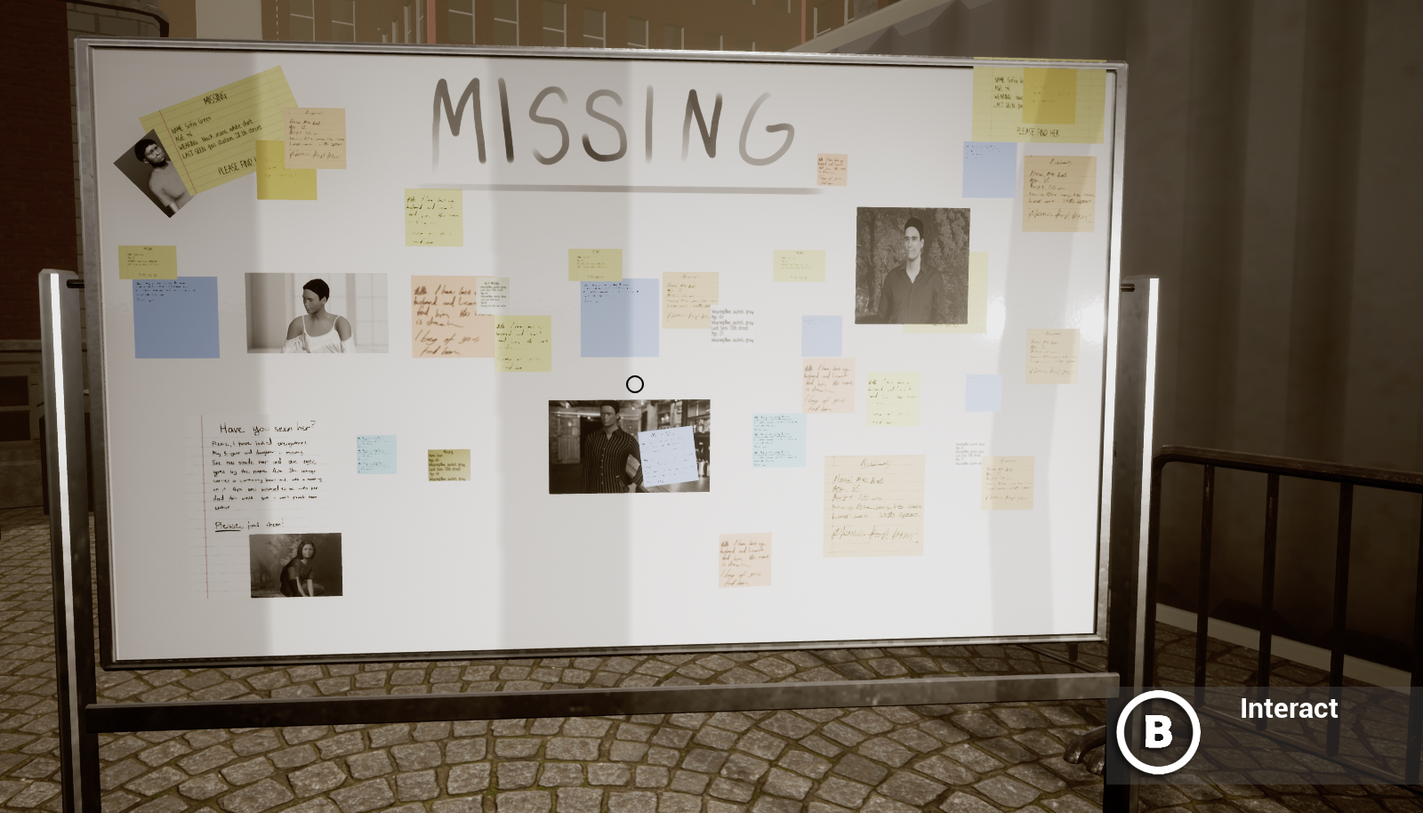
It has been extremely busy couple of weeks so my blog updating hasn’t been the number one on my priority list. Last time, I explained about our characters for the game. This time, I want to write more about it! Okay, the progress of creating characters for our game got very much easier when I found out that MakeHuman has website called MakeHumanCommunity where people share clothes that they have created for MakeHuman and they are easily downloaded into the program. This saved our lives. This time creating the characters didn’t feel so terrifying because there was variation to the clothing. Last time I was scared that our game would have an army of people wearing jeans and plain T-shirt combination. If anyone who reads this is using MakeHuman, I highly recommend checking that website out Moving onto the next problem… Important part of our game was a noticeboard where the player could see who were missing, some clues of their possible whereabouts and maybe where they worked etc etc. Our graphics team discussed for a long time of how do we want it to look. Naturally, it has to have pictures of the missing people. None of us was very excited of drawing character portraits, especially when there was SO much to do and we were running a little bit behind the schedule.
In the end, we were leaning towards the idea of sketching the characters and using the character models that we had used in MakeHuman as an under layer. However, for me it seems a little bit silly that the characters were sketched. Of course every human being has a photo taken of them nowadays and sketching isn’t really a believable option. After this, an idea occurred to us, why not use the MakeHuman itself, change the facial expressions, poses and the background in MakeHuman and then work a little bit with Photoshop magic?
Well, to be fair, the end result was rather weird looking… Every character that we had done, seemed very very white (that was not the idea but MakeHuman uses orange as the skin color and it appears quite white when turned into black and white portrait) and extremely stiff. Not the result we were aiming for but I think it still worked better than the original idea. Also, in the beginning we only had the pictures of the people in the board, meaning that the player could see the pictures in high detail. And that of course was not good with the pictures that we got. In the end we changed the look of the noticeboard to more information clutter, notes everywhere, the pictures were scaled down and the notes appeared bigger and that actually worked quite well… No one mentioned the characters looking weird anymore. That was good!
|