BGP 2017 Fast Gear: Lighting and Post Processing.
|
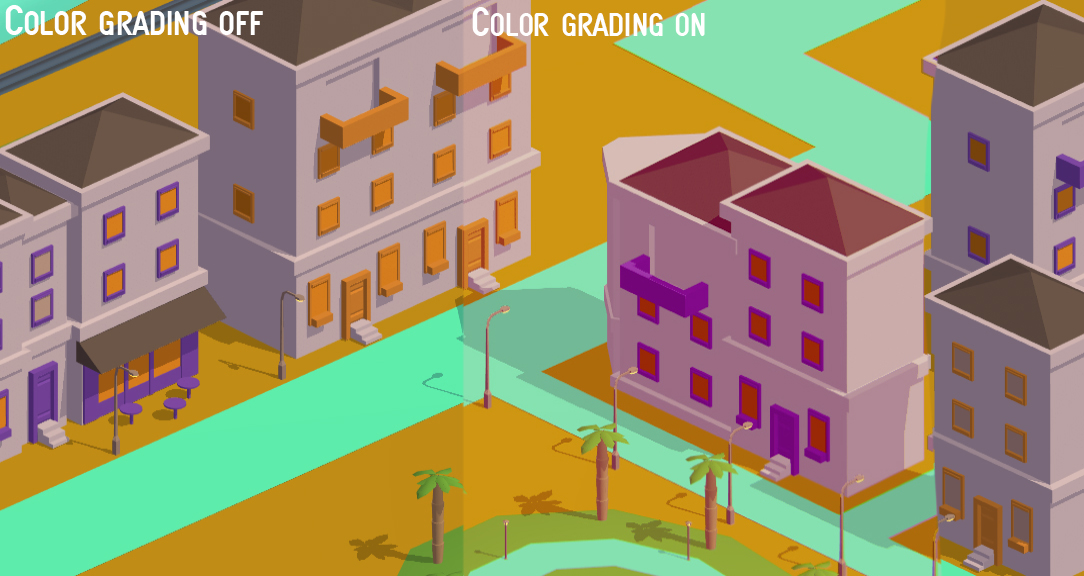
This week I’ve continued working on lighting and post processing, making everything prettier and more fancy with other words. Last week we were also given the opportunity to get some assistance from Jona Marklund, an alumni here at Campus Gotland and is here to help us mainly with lighting and shaders in Unity. The meeting was not that long but we still got a much better insight on what we could improve on in our current game scene, he also explained how we could go about making the water and grass/leaf shaders we’ve been planning on adding. We also discussed some new minor ideas, mainly some graphical details we could add to improve our graphics even further. As for the work I’ve been doing, it has gone pretty well. Most of the lighting and post processing is being done by tweaking and balancing with premade scripts. The thing I’ve been playing around with in order to get the feel we want for the game has mainly been Color Grading. Below you can see how it makes quite the difference.
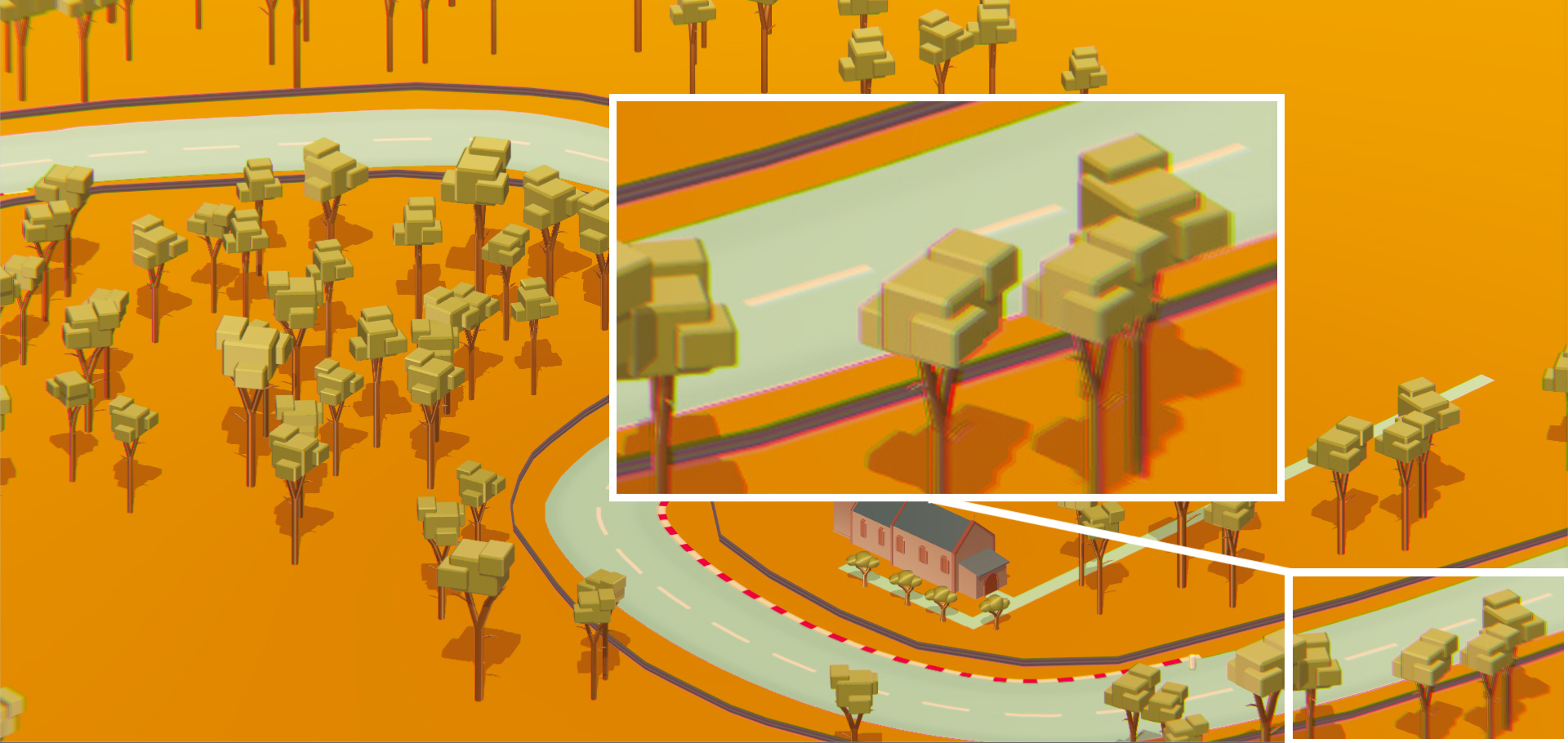
In addition to the color grading I’ve been playing around with other less obvious effects such as adding some minor bloom and chromatic aberration (the sort of ”red and blue 3D effect” you see towards the edges of the screen as shown below). Again, there are some other things I did not manage to get working properly or did not have time to make such as adding Ambient Occlusion and Global Illumination which I’ll leave for when we’re polishing and tweaking everything next week. |
 As of now, we’re finished with making the assets and the track is more or less done. All that’s left is to basically polish it up a bit, add some details or additional props just for the sake of ”filling it out” a bit. However this will be left for later for when we’ve got the time for it since the track could already be considered done. We’ve also had our Beta testing this week which went ok. Mostly because there were still a couple bugs which kept the game from being smooth as well as some AI issues. The teachers however seemed to enjoy it anyway. They did say that they liked the graphics and art style which means that we’ve been doing our jobs somewhat right…right? Right.
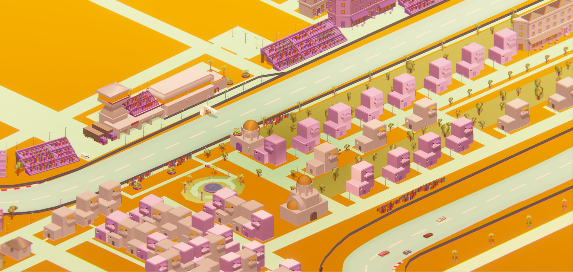
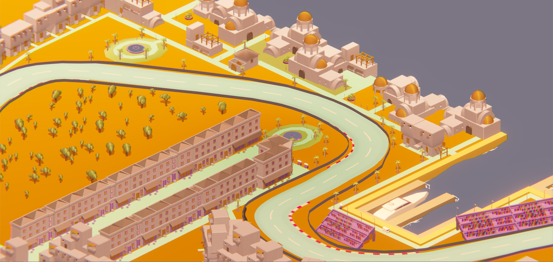
 Since we’re going with the whole 80’s thing we of course want the colors to be vibrant and so on, I also thought it’d be fitting to have a sort of orange tint to it all for a kind of sunset feeling to it which for some reason feels pretty 1980’s.