A moving, but readable text projectile
|
This week, on the game project Revenge of Teddy… Recently, I had redesigned the previously paper planes throwing enemy into an enemy that uses laughter as it weapon to fit a new bullet pattern that was implemented. The projectile connected with the enemy had to be changed as well, from paper planes to something that signals “dangerous laughter”, so that is what I’m going to be talking about this week. 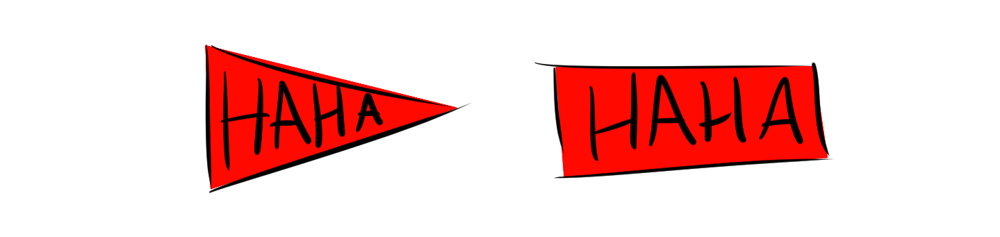 I had two initial ideas ideas for the projectiles that I tested with prototypes in the game and reached to these conclusions: the arrow like form showcased the direction of the projectiles movement better, but the rectangle like bullet made the text in it easily readable (which is important, as the bullet is moving the entire time while it’s visible in the game). The arrow did however not showcase the text very well, and the rectangle looked out of place, as the flat front seemed like it almost tried to stop the movement (in other words, it didn’t support the action). The obvious way to proceed was to combine the two in some way.  I softened the the edges in the front of the of the rectangle and bent the text to make it all look like it was in motion (similar to the arrow). I also added some speed lines to enhance the illusion of motion. However, the front still had the same problem as the normal rectangle, so I switched my approach to the arrow. To fix the readability problem with the arrow, I made the letters more visible by removing the solid form that held the projectile together. Like this the letters stood out more, as they didn’t have to compete with another surface. I also used a soft eraser tool to soften up the hard edges of the letters to make them seem like they are in movement (moving objects are harder to focus on, so blurred pictures can therefore give the illusion of movement).  That’s all folks! |