The Berry Portrayal
|
During this week I was in charge of implementing multiple different art assets to our game. The main art asset I have been working on this week the berry. I did have other tasks, such as recoloring the thorn vines previously mentioned on the last blog. However the berry was one of the main art assets I needed to implement. The berry has a major role in the game. The berry’s function in the game is that once the moth collides with the berry, it would drop down from the obstacle it was connected to. As the berry would fall, it will be able to open up certain areas for the moth to explore and progress. This could happen by the berry falling on a openable obstacle. The openable obstacle basically functions as a door where a certain trigger, in this case the berry, is needed to open. As of now during this week the openable obstacle is still in development. I mainly focused on creating the berry itself, since it seemed like the hardest thing to draw. This was more based on what type of berry I had to draw. There are multiple different kinds of berries, however there were 2 kinds of berries that Team Kraken preferred. One of them being the cherry, and the other the black berry. Those two seemed to be what we were looking for. Cherries usually have a very shiny and bright coloration. Not to mention the berries themselves hang from a stem of some kind to objects such as branches. Due to how it hangs, I feel as though it becomes very tempting to pluck them away from the stem they are connected to. This corresponds well with how the player should feel when interacting with the berry. When the player in the game sees a berry, they should be encouraged to interact with it.
Black Berries usually have a attractive shape. In my opinion, they have a similar effect to what the cherries have. While they don’t have the same kind of stem type feature that connects to branches, they get plucked off by people all the time. The reason for this is that it’s a norm in society to pick them up and eat them, since they taste great.
These are the main reasons why we were considering between those two kind of berries. After making some concept art of different berries, we ended up going with the black berry design. I did make a slight change however to stem like structure the berry has. I wanted it to still feel like it wanted to be plucked off from the branch.
This is the same reason why I made the stem type structure have a zig-zag type shape. I felt as though that if the stem type structure had that kind of shape, it would seem more tempting for the player to break off the berry from the branch. It’s an irregular shape and somewhat indicates where the stem of the berry would typically be broken. I’m referring to the point where the stem type structure is the pointiest. After finding what kind of berry I should draw, it was extremely important to carefully pick what color the berry would be. While it may seem like not a big deal, it is anything but that. This ties in the my last blog post where I talked about the color theory behind the leaves. When I made the leaves, I colored them in a way to make it easier to the player to identify how the moth would interact with it. The Berry is no exception. I had to make sure it was portrayed in a way that would make the player feel encouraged to interact with it. There were multiple different things to consider, such as making the color not too saturated but saturated enough to be identifiable from the background. I had to find the balance between them and had to find the right color in general. I’ve communicated with the Art designer of our group for some help on the subject. I made different rough colorations of the berry just to visualize how it would look like in certain colors.
 Eventually we decided that this (see below) color scheme would be best suited for the berry. The blue colorations would blend in too much with the background while the orange colorations would look too bright and look out of place. Therefore we went with the purplish coloration. It didn’t blend in with the background and also wasn’t too bright either.  There was one worry I had however. I was worried that the color of the berry would be too reddish. The reason for this is that the main signal color for danger in the game is red. I’ve mentioned this in my previous blog post, where the color red would represent danger. The spider has red eyes and lethal obstacles like the thorns will have a reddish tint. Since red represents danger, I don’t want the player to mistaken the berry as something lethal if the color of the berry looks too reddish. Luckily it didn’t turn out to be similar to the red “danger” color whatsoever. As I shaded it become more purplish than reddish. Coloring the berry was actually tedious at times. I’ve never drawn anything like a berry before. Not to mention I had to make sure the ‘pattern’ of the berry looked right. Black Berries have small spheres that make it up. While I didn’t need to make spheres exactly similar to the black berry, I had to color it in a way that made the berry look like it was made up off circular shapes. The berry can’t look like it is all one giant mass, but rather other smaller masses that make it up. I mostly focused on getting the colors in a right place so to speak. I made some parts of the berry have brighter colorations. The brighter colorations would be on the top of the sphere mass. Parts of the berry were it would normally be dark would have darker colorations. 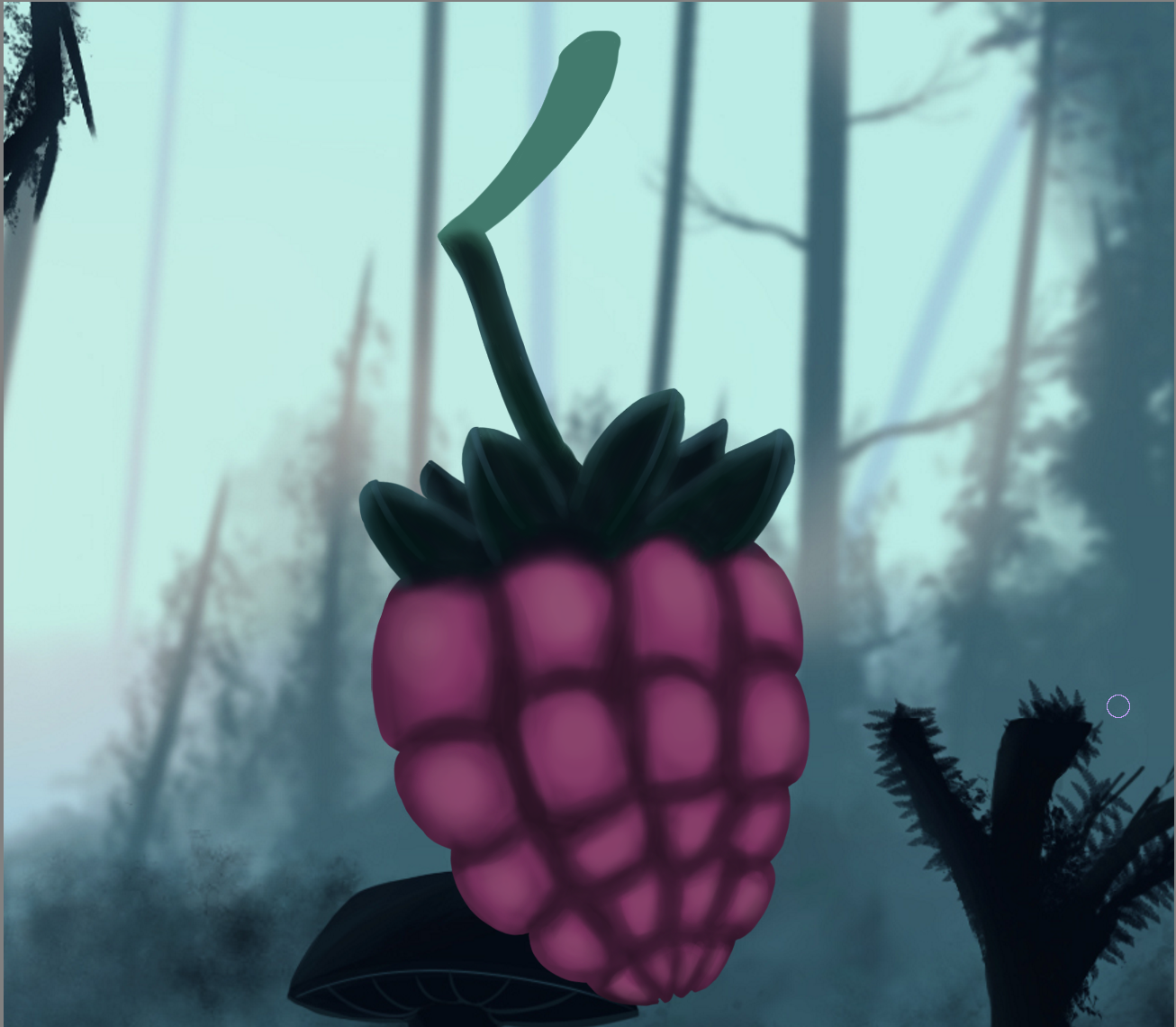 I don’t see it as shading per say, or at least not to the full extent. The berry doesn’t look like it has any 3 dimensions and rather looks kind of flat. There is not actual “shadows” drawn on the berry. The coloration up to this point was based on the color scheme only for the berry. Meaning that nearly nothing from the color scheme used in the game, such as the blueish tints, has been done yet. That, however, was my next step. When applying lighting and shading to the berry, I mostly used the color scheme used for the background of the game. I rarely did lighting and shading based on the berry’s color scheme. I would only do that if it was absolutely necessary. When I did the lighting, I sometimes used the blue coloration from the background. I did it to create a type of lighting effect from the sides of the spherical type shapes of the berry. When shading and lighting the leaves of the berry, I did bright highlights to clearly distinguish them from eachother. I wanted it to be clear to the player that those were leaves. It may not matter too much in the end in terms of the final product of the game. It may be that the player would not be able to see the leaves anyway since they’re so small on the screen. Although I see it more as polishing and adding more details which overall makes the berry look more attractive and interesting.  After I was done shading, the berry came out a lot more purplish than it was before. This is good since now I highly doubt the player would mistaken the colors between the berry and the “danger” red. Overall I think it came out pretty well. The only problem was that it didn’t have too much contrast between the colors. It looked a bit bland in terms of color range. The Art designer, went ahead and did a quick edit on photoshop, which only took like 20 seconds. He made it have more contrast, which solved the problem we had.  This is the berry that we’re going to use in the game. While I did like how the berry turned out, there was one problem I faced that I wish to fix in the future. That problem being that I was way too slow. I feel as though overall I’m quite slow at drawing and therefore takes me more time to create the art assets. It took me about 3 days to complete the final version of the berry, which is bad since I also have other art assets I need to complete for the game in a small given time frame. I’m not suggesting that I rush the drawings, but rather learn how to be more efficient in the way I draw and improve on that. Once I do become faster at drawing, I would become a lot more efficient in creating art assets for different games. |


