Game Design 2: Explosion Animation
|
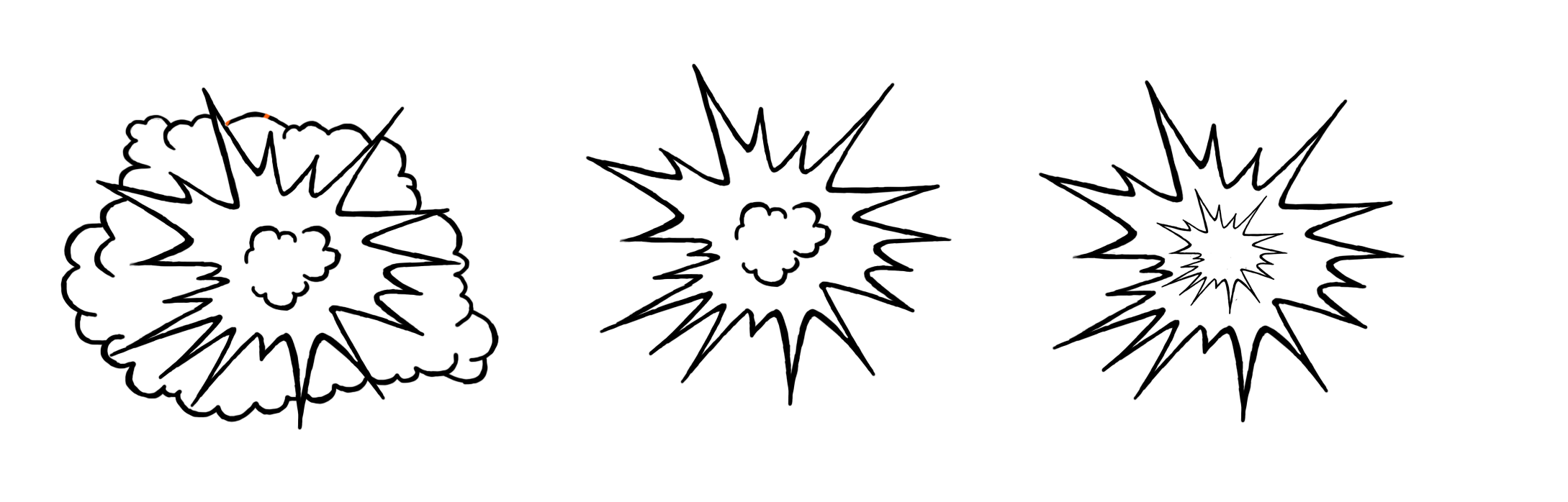
Last week, I worked on creating a explosion for when the bazooka would either hit an in-game object like for example, a platform or rock,or the in-game enemies. Since the bazooka is used to take out numerous enemies at once, we thought an explosion would help communicate to the player that the enemies are being hit with a certain amount of force, hence the explosion. I started by making a few sketches on how the explosion could look, while keeping in mind that the design should lean more towards a cartoon like design. Which meant thicker outlines, more exaggerated features and less intricate details overall. I wanted to make more of a pointy explosion, resembling more of a typical chat bubble in a comic book but without the “BAM!”, and adding a smaller one on the inside so that I could play around with the colors and so it would give the explosion depth rather than just a point edged “circle”. After that I made a simple cartoonish cloud, and around it the same point edges I had used in the previous sketch. Nevertheless, I was still not happy with how it looked and I felt like something was missing, so I decided to combine the two previous sketches into my third sketch, which became the explosion I decided to develop on further.
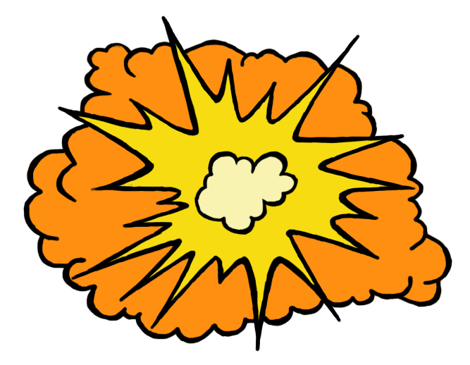
The colors I chose are very typical examples of how an explosion in a cartoon would be colored, or even in a comic book, in addition to the fact that yellow and orange match very well together. Although I didn’t think that way at all while I was coloring and only kept in mind what I knew from how explosions were depicted in cartoons color wise, yellow, orange and red being the primary colors of almost all cartoon explosions.
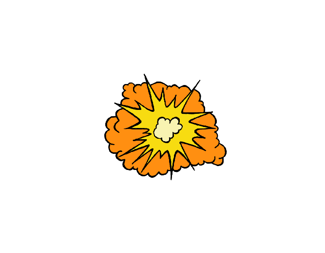
When it came to the actual animation, I simply had to use the transform tool in Photoshop to minimize the explosion each time which in this case was twice, since I decided to only have three frames to create a quick and simple explosion. Each smaller explosion was placed in the middle of the previous explosion to avoid having a hacky animation. When I first saw the animation, I thought it worked surprisingly well but I still felt like something could be improved, so I went back to my second frame, tweaked around with the color contrast and made it darker and gave the cloud more of a reddish hue.
Ultimately, this was good way for me to get a better understanding of what goes into creating animations, even if they happen to be “simple”, I learned more about where to place the animations to prevent it from looking hacky, and that small color differences in the different frames can change the animation for the better and give it the feeling of being more alive or at the very least giving some depth to the animation itself.
|