This week I’ve focused a lot on the menu we want for our game. We do have a menu in our current game already but it is very basic and you can only press the “start” button.
We hadn’t really discussed what we wanted the menu to look like, or even what buttons we thought were necessary. We wanted the basic choices such as “start”, “exit” and “options”, but we talked about adding other choices as well.
We also had to decide what sort of options they player would have in the “options” menu, and what was actually manageable in the timeframe we are currently working with.
For now, we’ve only planned on basic music settings, but we would like to add other things such as sound effects.
Since we are trying to implement a short interactive cutscene to teach the player the controls of the game and how to switch weapons etc, but we aren’t sure that we will be able to implement them in a satisfactory manner. So, for now, we’ve also decided to add a “controls” button in the main menu. These will explain all the controls with an image, especially those that aren’t as obvious to the player since we noticed in the playtesting sessions that a lot of people have no idea how to switch weapons or how to activate the power-up.
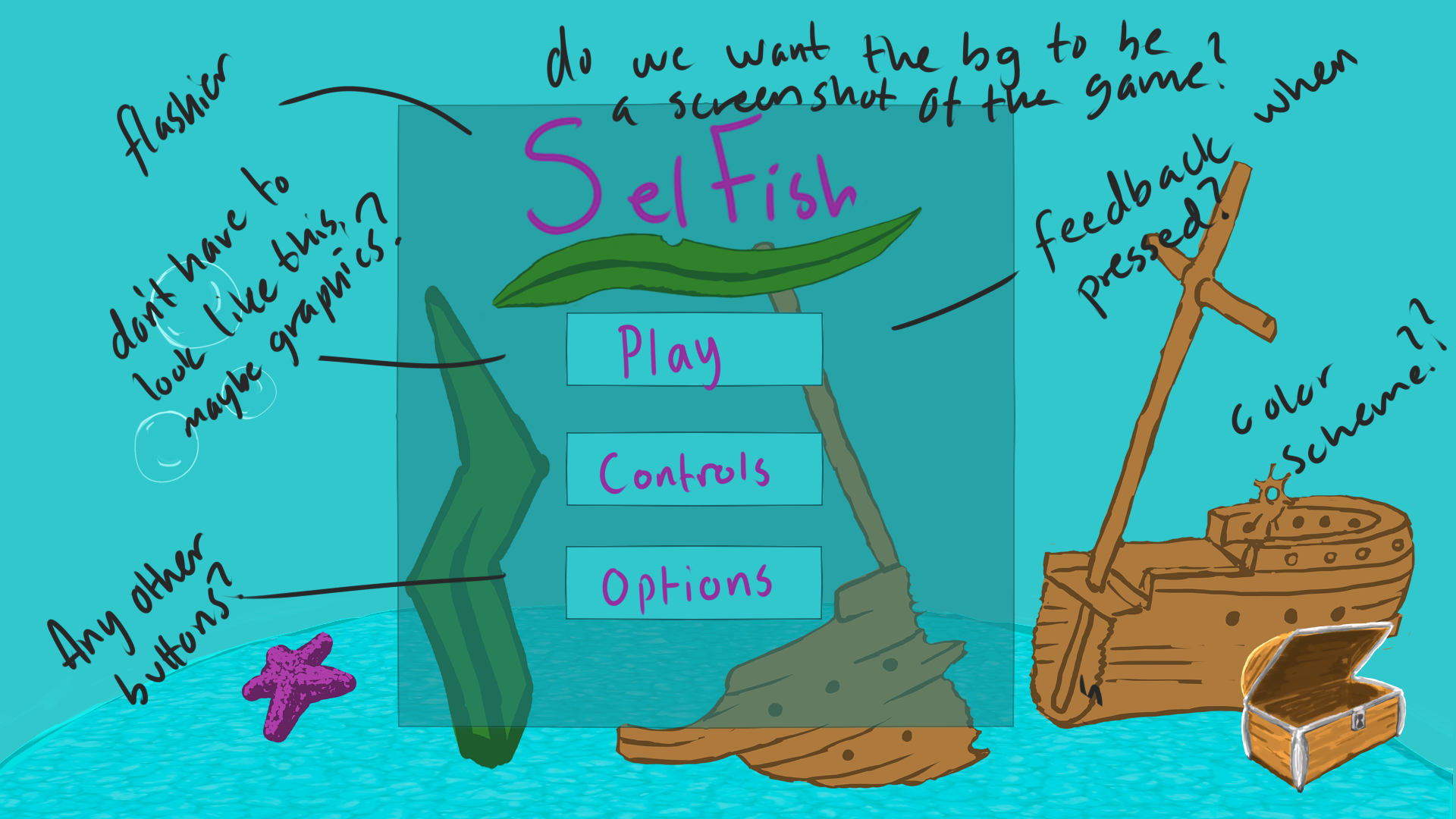
I made a very quick mockup of how I thought the menu should look, and I met up with an artist to discuss changes and if anything needed to be added or removed. I’ve also taken it upon myself to attempt to make the menu in unity since we only have one programmer.
I’ve had some difficulty with this since I’m not used to working with unity at all and I’ve relied heavily on a video tutorial as a guidance.
I am also going to work on a pause and “game over”/end menu, and I want these all to have a slightly different look to one another.
The mockup that I made in the beginning of the week.
After talking with my team, we decided that this look will be more fitting to a pause menu since it would make sense for the player to just see the paused scene/a screenshot of the background when you pause.
For the main menu, we want it to stand out more and invite the player in, and we are most likely not going to have the darker blue square in the middle of that. Instead, we’ve planned on moving different background elements to the sides of the screen, and keep the middle part clear. I think that this will make the title and the choices stand out more to the player.