Achievements and Medals
|
Author: Hanna Hagenmalm Many games include some sort of score to give the player a sense of progression. Draxl’s Journey is aimed mainly at new, 40+ gamers, and so we decided that the score should be easy to understand and encouraging. Our thinking was that receiving a low score could be discouraging, rather than inspiring, for players who are not yet converted. The result was a simple system of achievements. Instead of receiving any punishment (other than the failure prompt), the player is rewarded with a medal for accomplishing various feats. The emphasis is placed on achieving the goal at all, rather than how well it is achieved, in order to hopefully encourage further play. My task last week was to design the medals. Due to the current scope of our game, the only achievements that made sense were: 1) Clearing the level We have other achievements planned, such as surviving without hurting any enemies. However, as the levels are still under construction, and no code has been implemented yet to support that achievement, we have decided to leave it on the back-burner for now. So, onto the creation of the medals. The first step was to design icons to represent each achievement. One thing I have noticed while playtesting with our target group, is that they lack an understanding of conventional representations in games. This presented a challenge, and prompted me to look outside of the gaming world for inspiration. Turns out, there is no such thing as a universal language of icons. Instead, I decided to go for simple pictures and add text to support their meaning, hopefully creating an association over time. For the first icon, I chose a star. Stars can be seen as a throwback to school; receiving a gold star for completing an assignment. I am not sure if this is a global association, but I remember my parents talking about receiving stars when they went to primary school, and as they are part of the target group, I thought it was fitting. Additionally, given that Draxl’s Journey is meant as an introduction to gaming, I felt that it should also give an introduction to the language of icons used in games. For the second icon, I was hoping to emulate speed lines, common in comics and cartoons. I was also contemplating slanting the circle to represent the stretch of fast movement. However, the graphics of the game are simple and make no use of squash and stretch elsewhere,so I decided against it. The last icon I wanted to be reminiscent of the avatar’s three lights that represent the player’s lives. I am not sure how well this association will work; during playtesting, almost no players seemed to notice the three lights. However, I am hoping that further visual feedback will draw attention to the lights, and create an in-game concept that will work once the player has been introduced to it. (Apologizes that the concept art is not in the correct order. In the picture, they are 3-2-1.)
The next step was to brainstorm and draw freely. I produced a few different medals, trying out various ribbons, obverses (front of the medal) and colors. The colors were partly chosen to be optimized for people with color blindness, but I also wanted to try bringing some of the background colors into the medals. Ultimately, my team and I decided to keep the medals in line with the color blind palette I had created. We felt that the background colors would be a little out of place, and perhaps more appropriate if we would have had the time to design both a color blind version and a non-color blind version.
Looking at the various designs I had drawn, I distilled them down into three ribbons and two obverses. With the ribbons, I was implementing the idea that patterns help color blind people distinguish between different artifacts, but also that proportions are important to create different feelings. There is a trend in games that more complexity equals more of a thing – more dangerous, higher score, more powerful. Following this trend, I wanted the more difficult-to-achieve-medals to have more detailed ribbons. I chose the rightmost obverse simply because a team member thought it looked like an actual medal.
I made a quick assembly of all the choices I had made up until this point (barring the different ribbons) and presented them to the team for an OK.
Before I started drawing the final versions, I also tried out three different shapes for the ribbons. It looked a little strange to me when they were cut-off, and the diamond-shaped one reminded me of the kind of medal that is attached to a uniform. I had envisioned it to be a hang-around-your-neck type of medal. Also, because we only have three medals currently, I thought they should take up some space to appear more important. I cannot say whether that trick will have an impact or not, but cramming three small medals together in a corner will most likely have the opposite effect, at least.
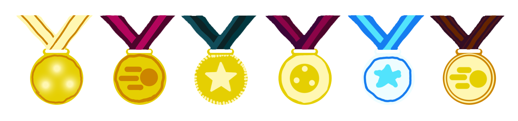
And finally, the first finished versions of the medals! Just as I tried to use the patterns on the ribbons to convey a sense of increasing difficulty, I used more colors from the palette to indicate the same thing. I will know if the design worked once we show them to the target audience.
|