Tutorial Screen
|
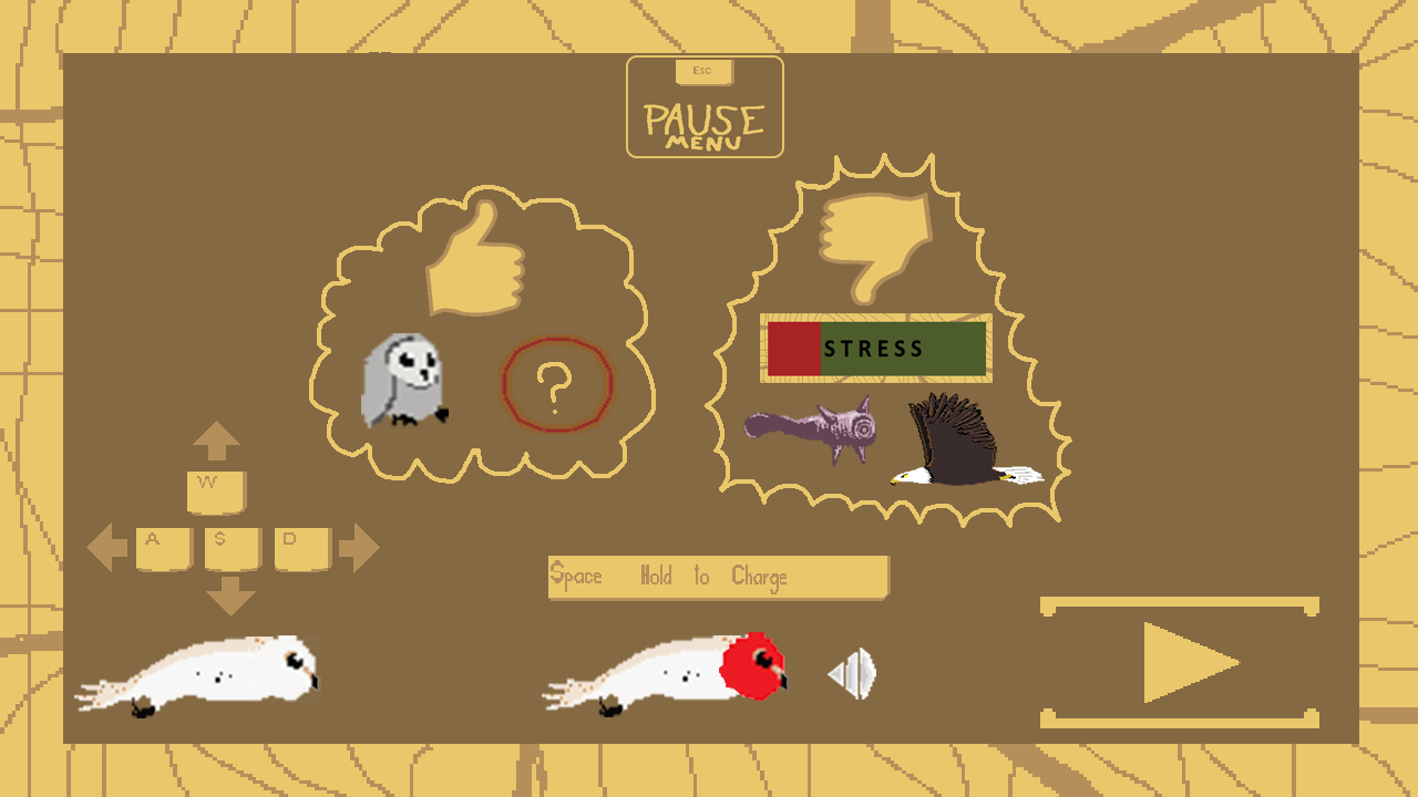
Hello everybody! This week I have been working on a turorial screen for our game Trowl. The game is about an Owl family who lives on top of a train. The train starts rapidly moving, displacing the owlets and wrecking the nest. Now the Owl mother protagonist has to save all her owlets on top of the moving train. The skies are not safe though, they are filled with predatory birds such as eagles, falcons and hawks who prey on the little owlets among other hazards. For this tutorial screen I had to go through the basics of the game. What is the point of the game, what is the goal? What are the hazards and do nots? What are the controls? It was not as easy as I expected it to be to make a concise tutorial screen. I started to make a tutorial screen in which the only information the player gets are the controls written with words.
This was after some feedback changed to a single screen with icons as direction pointers, dos and do nots. I iterated a lot on this screen because it is not obvious what is the least amount of information to show the player for him/her to get what the game is all about. For example I had WASD printed out and the owl protagonist under it. This looked unclear to me so to make it more educational I made arrows in the direction the player flies on press. Another thing I did was a thumbs down, followed by a spikey cloud looking encirclement to make it have an ominous appearance so the player will go “aha this may be the things I do not want to fly into and/or avoid completely”. The thumbs down itself was painted such as having the look of sawed wood. This was later iterated and changed to the warning color of red to make it even more obvious that they are bad things and you should at all costs avoid them in game. The last thing I did was a thumbs up, followed by a round, fluffy, harmless looking cloud which indicates good things, including power ups and owlets both of which are picked up by the player to lose stress, come further in the game and get a powerful temporary boost. This had to be shown in a non-threatening looking fashion and I personally think I did a good job at it. The tutorial screen is not finished as of this blog post but here you can see a preview of it:
This screen was later split up into 2 more manageable looking screens in which one displays the good things and the other the bad. Both display controls and the player has to click through them both in order to play. I made this choise because it would be easier for the impatient player who just click through the tutorials to snap up at least something in the corner of their eyes. The tutorial will not be shown in game after a restart has been initiated. The style of the page itself remains largely the same but with a lot of added detail and quirks to make it look professional and consistent with the rest of the menu pages. That is all folks! Take care! |