Weapon concepts for Otto
|
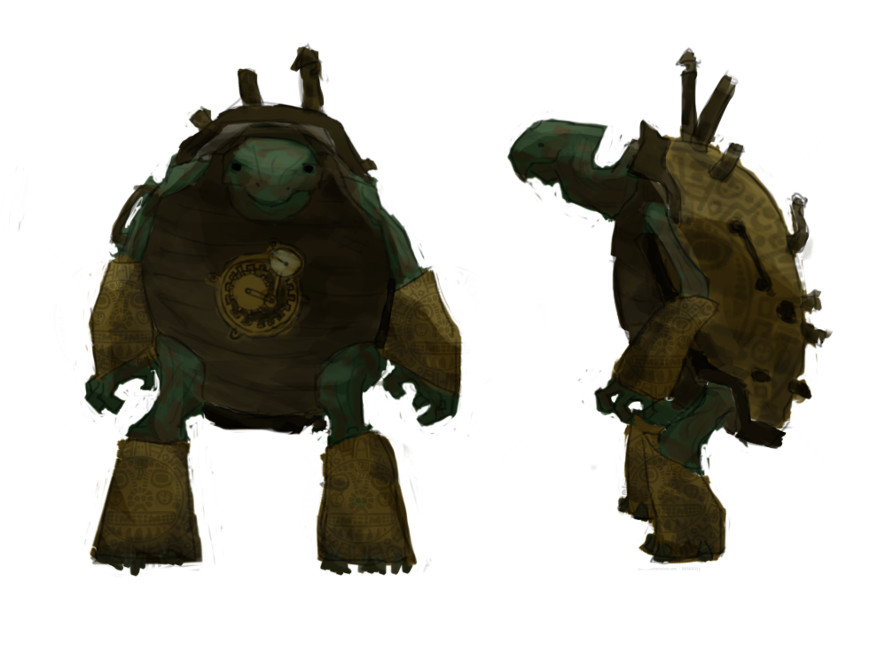
As the sixth week is now coming to an end, we are closing up on the beta. With three weeks to go, there is lots to be done. For this week, I have been working on some weapon concepts for our protagonist, Otto. If you are not familiar with it, the theme we chose for the game is steampunk with characters as personified animals. Otto is the great old turtle inventor, tall but slow paced, with a shell coated in brass and lead pipes giving away smoke from the engines working within.
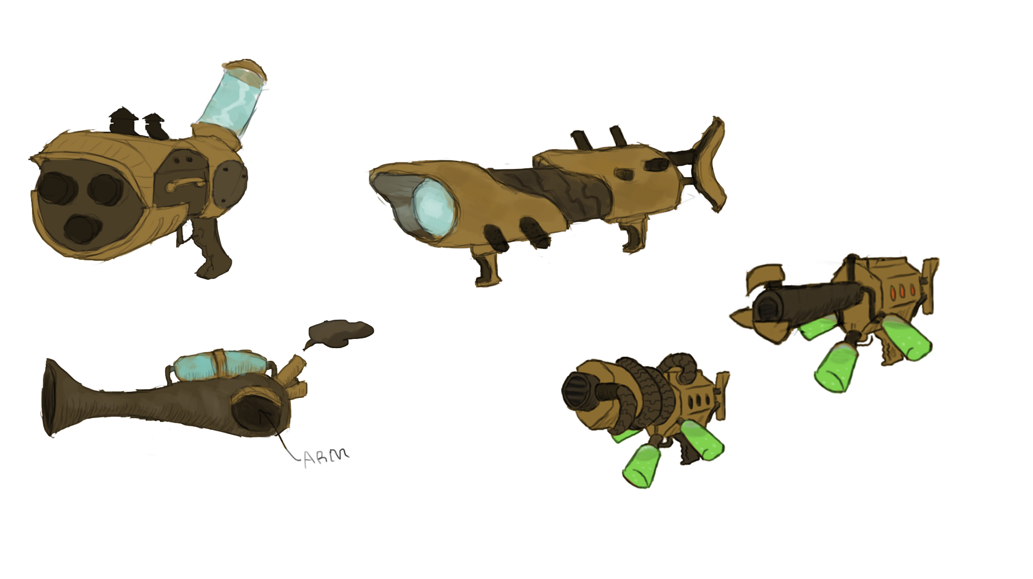
To give Otto a suiting weapon, I´ve come up with a variety of different designs that might be used to create or inspire the final version. I used existing concept images of Otto to give me a sense of what might go well with his design. I tried to use similar colors and details, to make the designs look coherent. Here is the result of nearly an hour of weapon sketching.
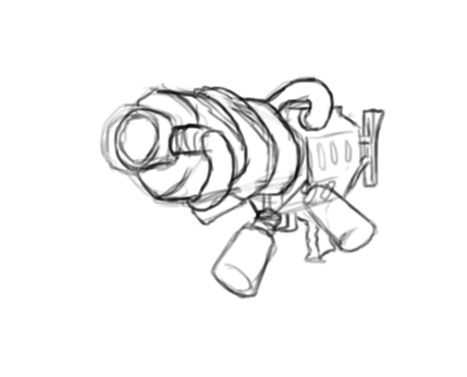
When I have a set of different weapon designs, I send the picture to the group to get their opinion. Once we have all settled for one design, its time to start refining it. Starting from scratch, this is how the initial drawing might look.
Although I didn´t use any reference images this time, it´s usually a good idea to find some before you start drawing. This time I already had a clear concept in my mind, but the key is to know what you want to create before you start creating it. Then, I loosely sketch the shape of the weapon. I don´t worry too much about it looking good just yet, I simply try to describe the basic concept of what I had in mind. When I feel satisfied, I add another layer. I lower the opacity of the original layer, so there is a clear distinction between the two. Now I begin to fill out the lines and shapes that I like and simply ignore the ones I don´t like. Once I´m done I remove they layer underneath, to see how it tuned out. If I´m happy with it, I continue on with coloring.
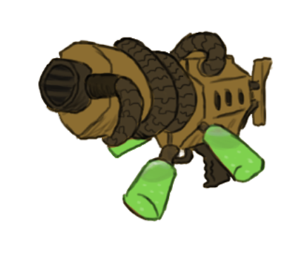
I add another layer for the color and select the white background. Then I go select > inverse to have only the weapon selected. Now I can go crazy with the coloring. I picked my colors to match those of Otto and the concept image attached in this post. Orange/brass color to give a steampunk feel, and some darker industrial or rusty colors to complement with. I also added some details with more saturated colors (the blue and green tubes) to make it look more interesting. Thats it! Thanks for stopping by |