A Knight in the Night
|
Hi! Its time again for another blog post and this time I’m going to talk about yet another character creation. The time has come for the knight in not so shining armor to pick up his shield and sword and join the hunt for the witch. The knight is a slow moving enemy with a shield that blocks attacks from the front. In comparison to the farmer enemy he cannot throw projectiles. Instead, he performs a sweeping attack in an arc in front of him whenever he gets close to the player. This attack also has a small charge-up time which gives the player an opportunity to escape unharmed.
MechanicsAll the behaviors of the knight except for the sweep attack were directly taken from the concept document. The shield mechanic in particular is very clever in my opinion. Because the knight always faces the player directly it is impossible for the player to harm the knight without utilizing another mechanic. In order to defeat the knight the player must use the teleport ability to relocate behind him. This causes the knight to get confused for a short time and allows for the player to shoot him the back where he is vulnerable. This not only adds variety to the game play but also a peak in the players learning curve. The sweep attack was added because we wanted even more variety to the different enemy types. It would also be kind of lame if every enemy in the game instantly damaged you on collision. 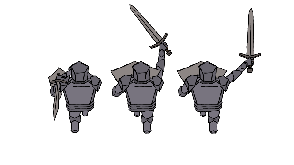 ProductionI started of with a paper sketch as I usually do. I tried to use as many strait lines as possible in order to obey the style guide, soft shapes for friendly things and hard shapes for “bad” things. It was really quite fun to look at real knight armor and then trying to imagine how it could look in cube edition. When I draw or paint in Photoshop I usually use a 50% grey background to better see how light or dark the color I use is. But when I had imported the sketch and started working I quickly realized that a grey background would be a problem once I got to coloring because most of the knights armor would be some kind of grey. I therefor grabbed a color sample from the background art in the game and used that instead. By doing that I also got a better idea of how visible the knight would be in game depending on my color choices. So, the tip of the week will have to be to you who’s new to drawing digitally or experienced but haven’t thought about this yet: Always think of what color you use for background when drawing and painting. This will improve your results. |