3D Computer Graphics: Theory and Application I, Post 4
|
This is my fourth post in relation to course 5SD045, within it are the results of the courses fourth week’s practical assignments, detailed for our benefit during lectures held on 2014-09-24 and 2014-09-25. The first assignment this post covers is that which aforementioned lectures were primarily focused on; to apply UV projections to a game-ready 3d asset – and to then use those UV projections to apply a diffuse map to the asset. In less obfuscated terms; to unwrap and texture a 3d asset. The second assignment we worked with during this week was the next major course hand-in. I described the initial phase of the assignment in last weeks post but as a short recap; we had a field visit to the Gotland Museum during which we chose one of the exhibitions to take photos of in order to model from photographic reference a real-life object. You can see the results of the initial modeling phase further down in this post. Finally before I cover the assignments; if my demeanor seems a bit curt during this weeks post it’s because I’ve managed my time poorly so this post was written literally at the eleventh hour. I hope I’ll manage to cover all the points specified by the instructions and if not and the images don’t fill the gaps then feel post your questions in the comments below. So first off; the unwrapped and textured asset:
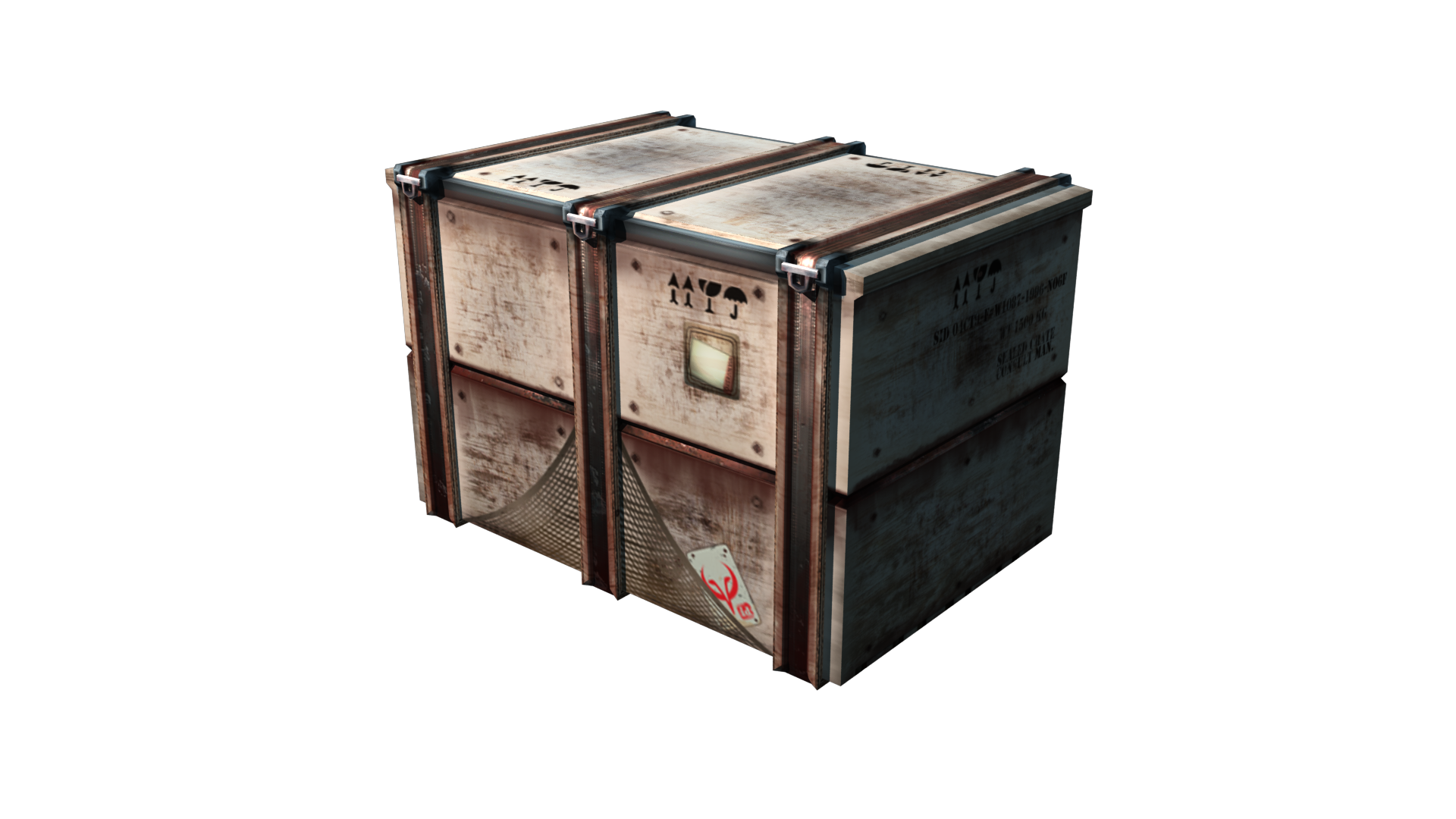
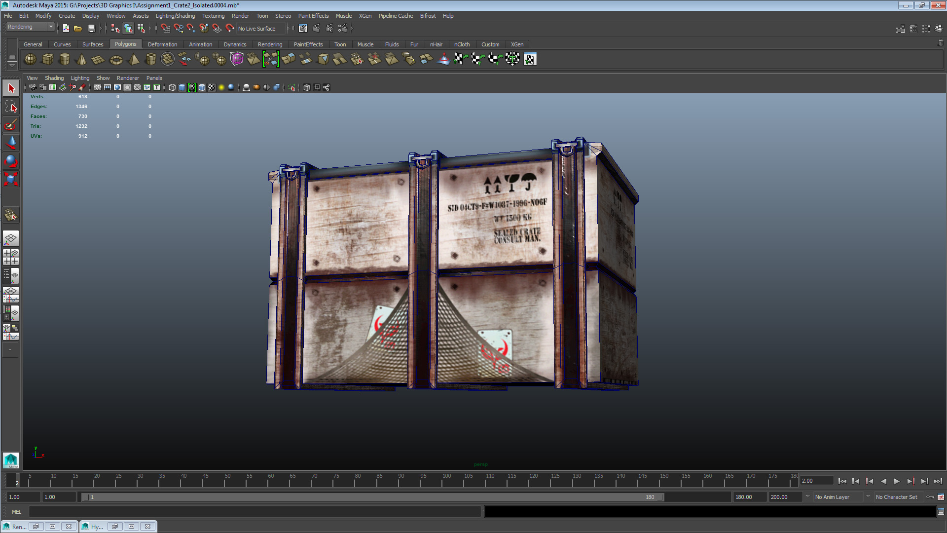
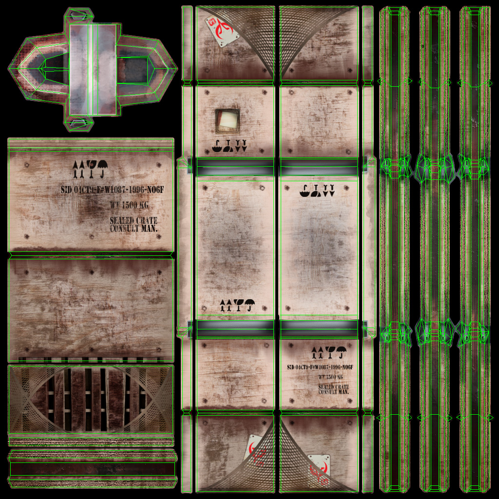
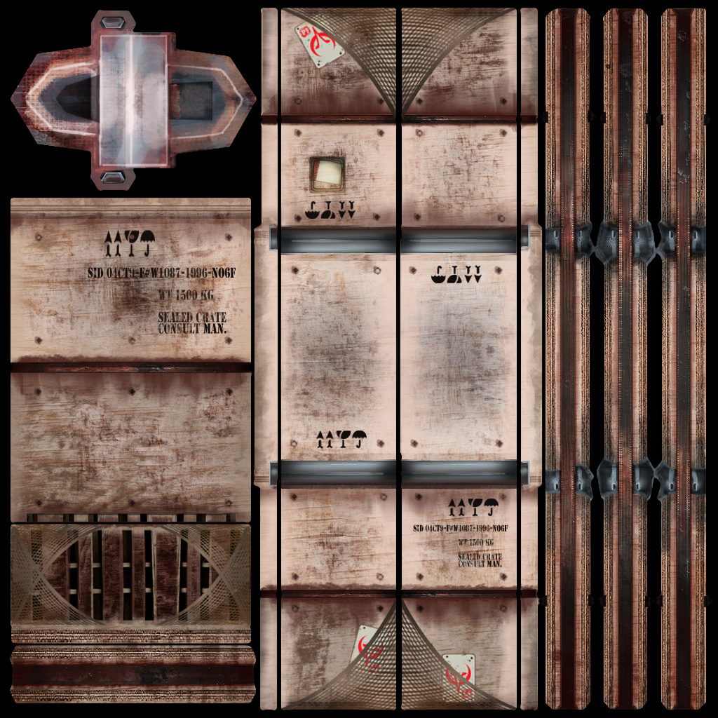
As made abundantly clear by previous posts on this blog, this is Crate 2/3 from assignment 1. In those posts I described it as an asset developed with the contemporary realistic visual style in mind, a description I feel confident in that the texture asset supports. With the texture I wanted to deal with some of the issues I felt the mesh had, issues such as that the small hinges – while believable in scale – felt understated and unused as a feature. Therefore I gave them a lot of space in the UV map in order to detail them as they are meant to be the only dynamic (animated) feature of the mesh. I also wanted to break up the symmetry of the model which I did by unwrapping the vertical elements (binders) separately. This allowed to me introduce some colour variation to the binders which makes the mesh look more natural. On the subject of the binders; I accepted some distortion when applying projections to them, which I could have avoided by splitting in creases or by editing the geometry – but I chose to keep them as they were and to smooth over the pinching with the diffuse. As I didn’t want to reconstruct the geometry to solve such a minute problem (the affected area is the very thin strip on the side of the top binder face) I chose distortion over visible creases at the edges of the binders. Finally the front top and back of the crate body itself is in one continuous piece as this allowed me to add some unique details to the largest surfaces of the crate. The crate short sides are overlapped and the bottom piece(s) as well, to maintain resolution with the limited space I had left after unwrapping the major pieces. For the texture detail work I consulted my photographic references of crates (and also my own work-related experience of shipping crates), but as I dislike using unedited photographic material in my textures I emulated what I saw in the references with graphic brushes to get a consistent level of quality in the texture. Now moving on to the points required by the instructions; I chose a primarily red colour hue as the object is mostly made out of wood and non-galvanized metal strips. This to convey the materials and the wear and grime of the setting. The choice of a light low-saturated blue to complement the primarily red crate body and elements was made out of a desire to highlight the area, and off-set the crate body hue. With the visual style and setting in mind I chose to keep my colours desaturated, but with some saturation exaggeration on highlighted areas to keep the texture visually interesting. Finally, I chose cold colours as that will meld better with any scenes made in the style associated with the asset.
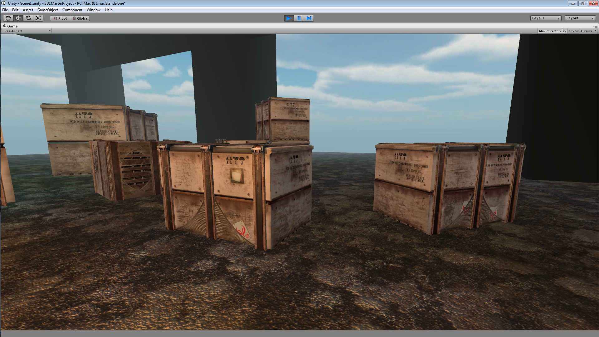
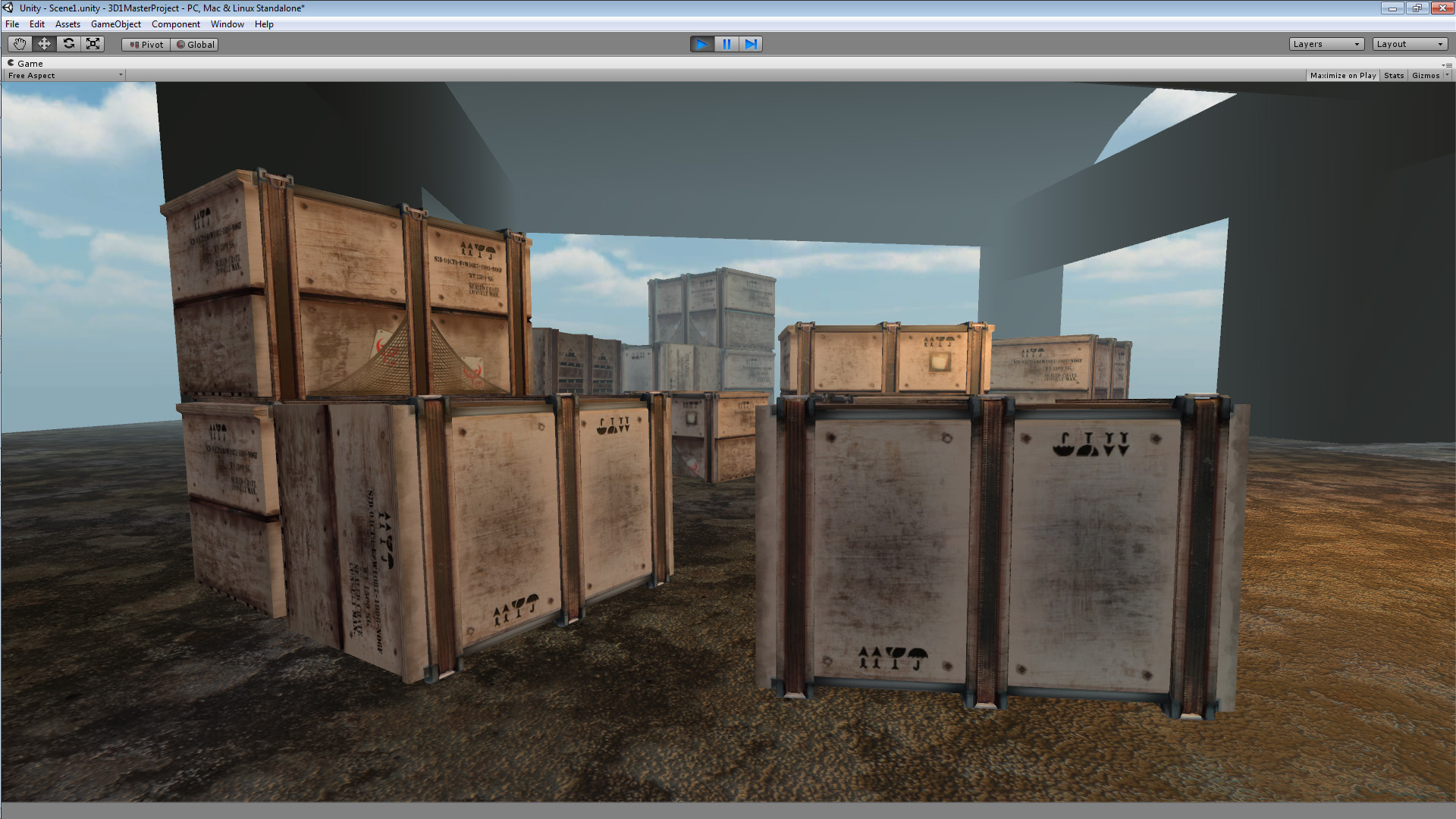
A quick note about these in-engine shots; I had some technical issues with UDK so I took these in Unity 4 instead. I assumed the purpose of the exercise was to see the asset in a real-time environment so I figured this would be an acceptable alternative.
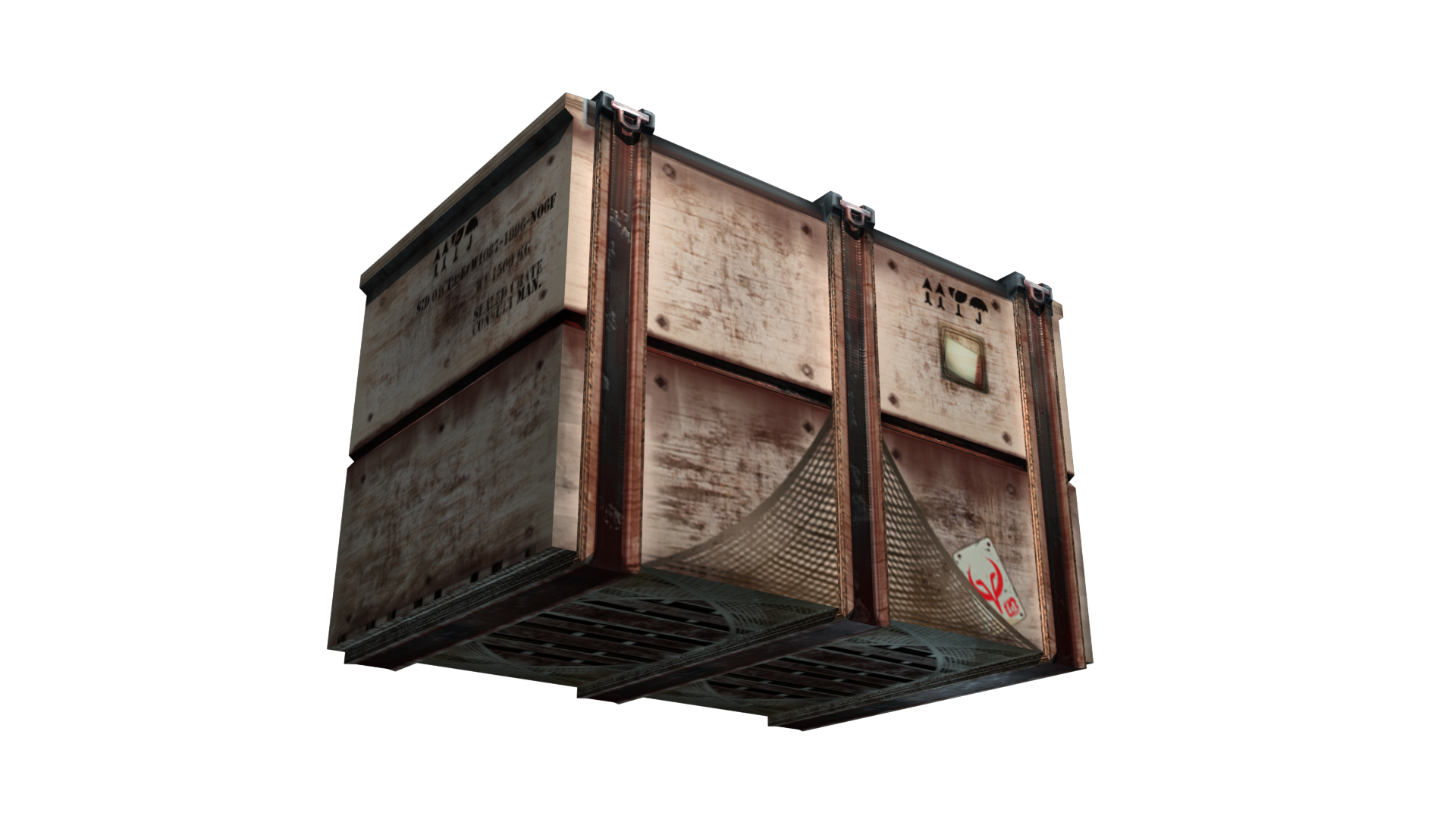
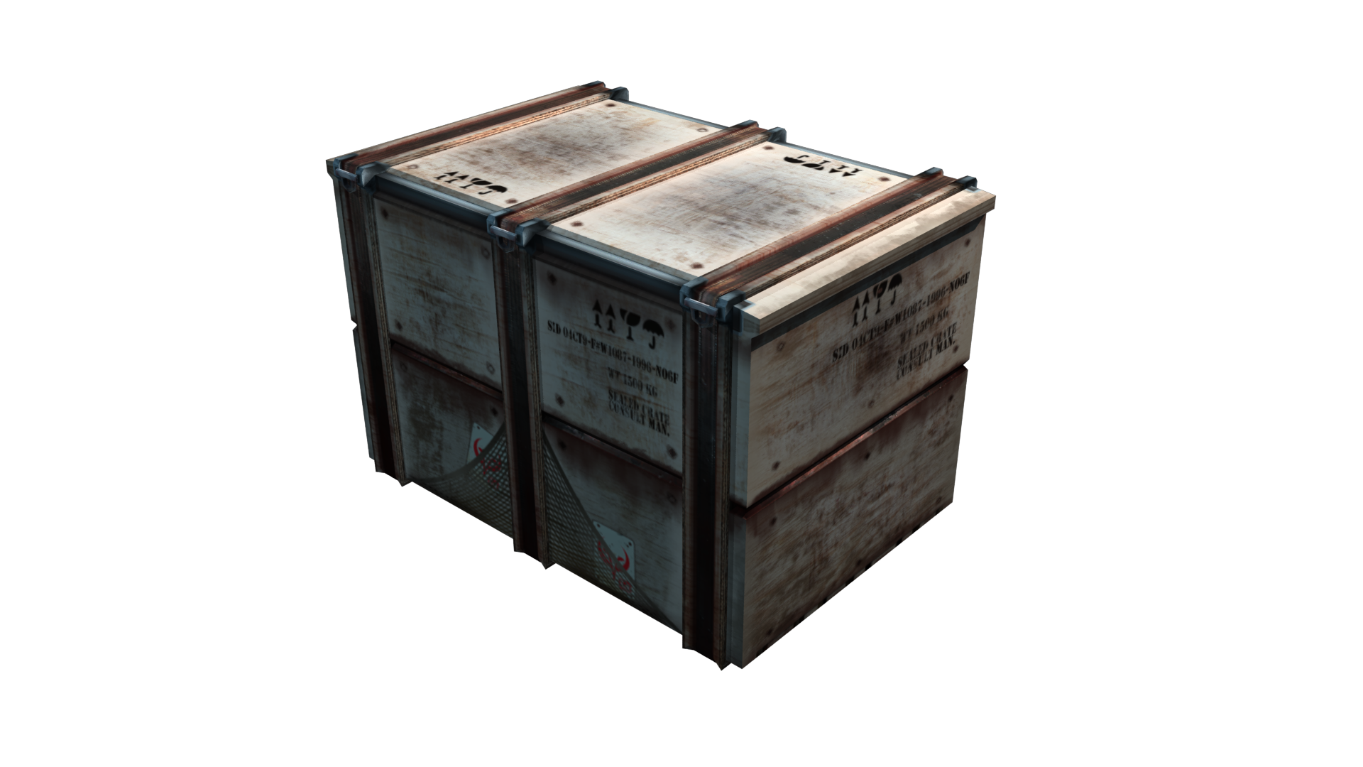
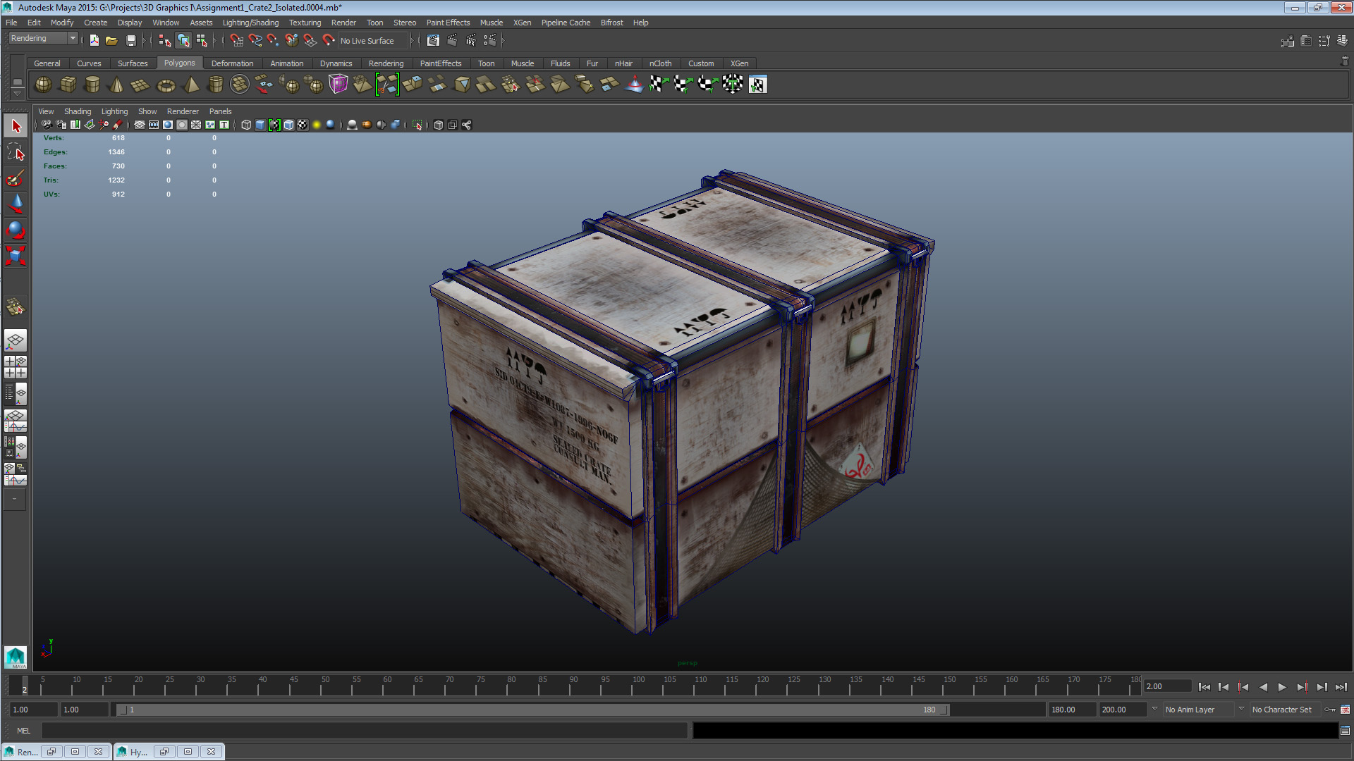
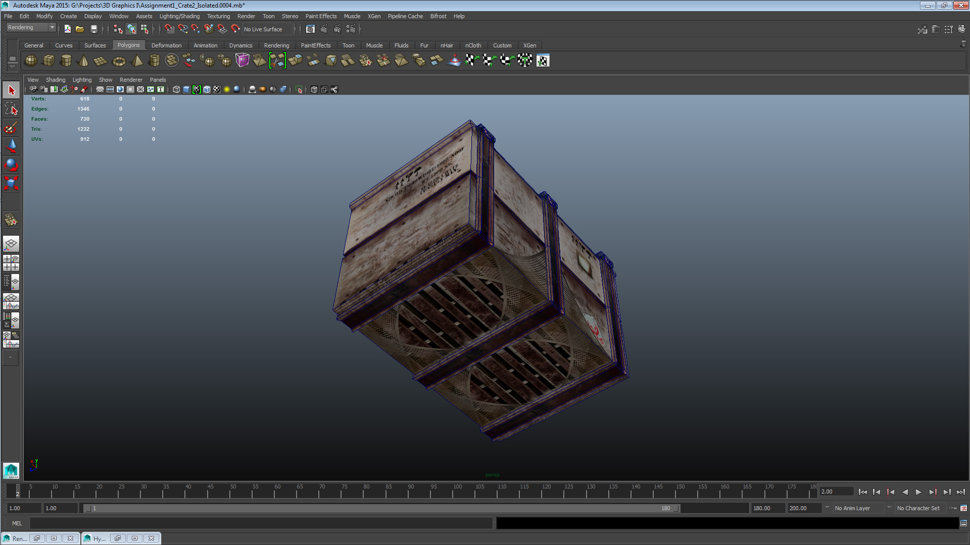
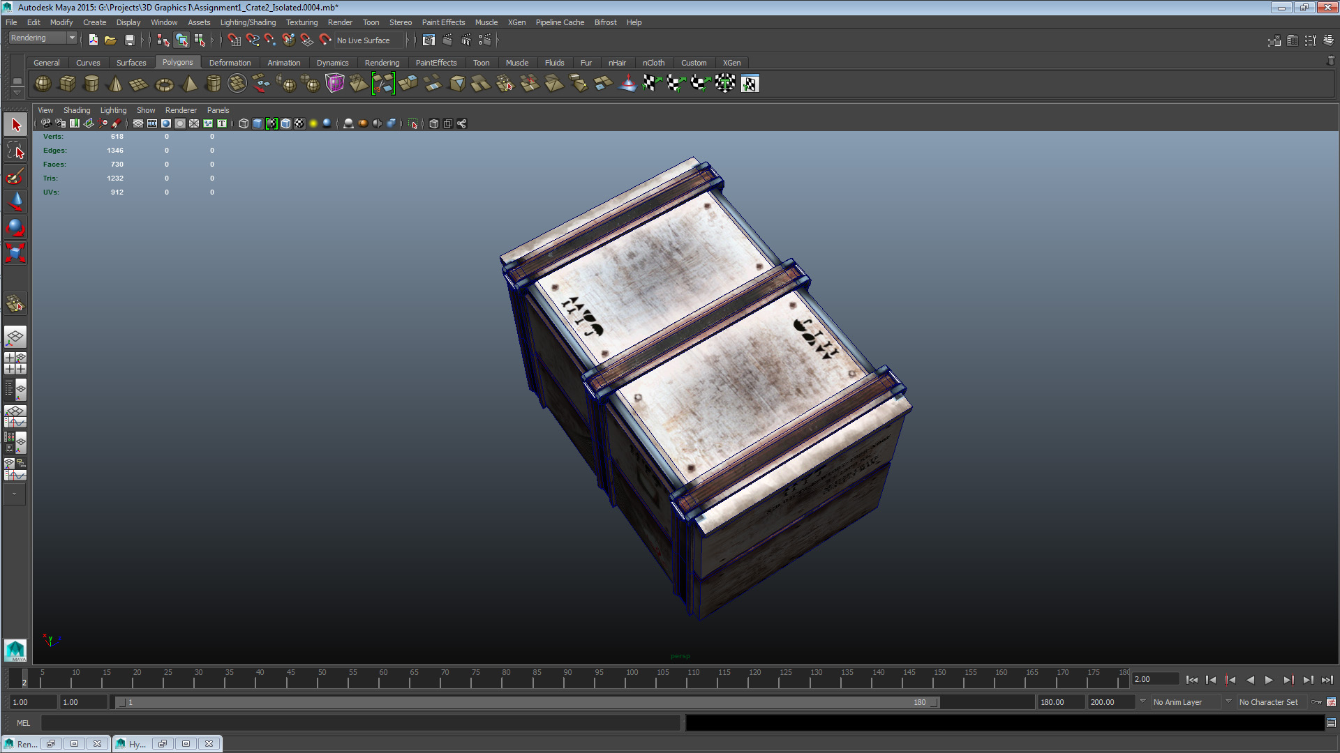
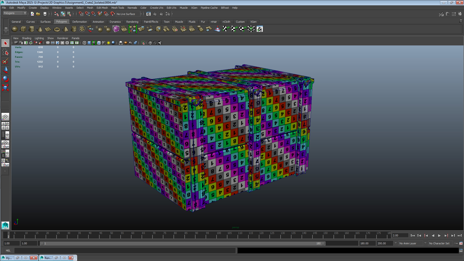
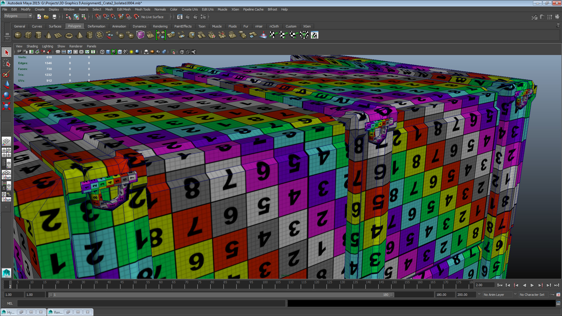
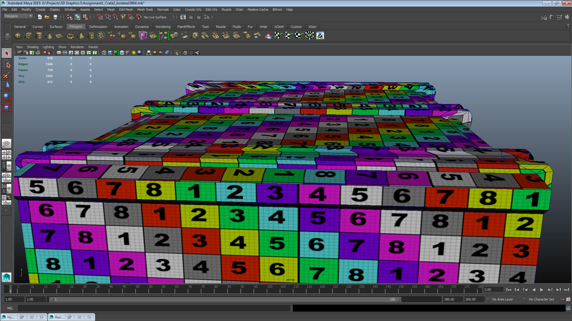
Finally a set with pictures of the asset with its UV checker texture applied, showcasing the projections and geometry. Also the actual texture asset both with the snapshot overlaid and with a different background colour than what I used on the texture I finally used (in case of UV border errors) for readability.
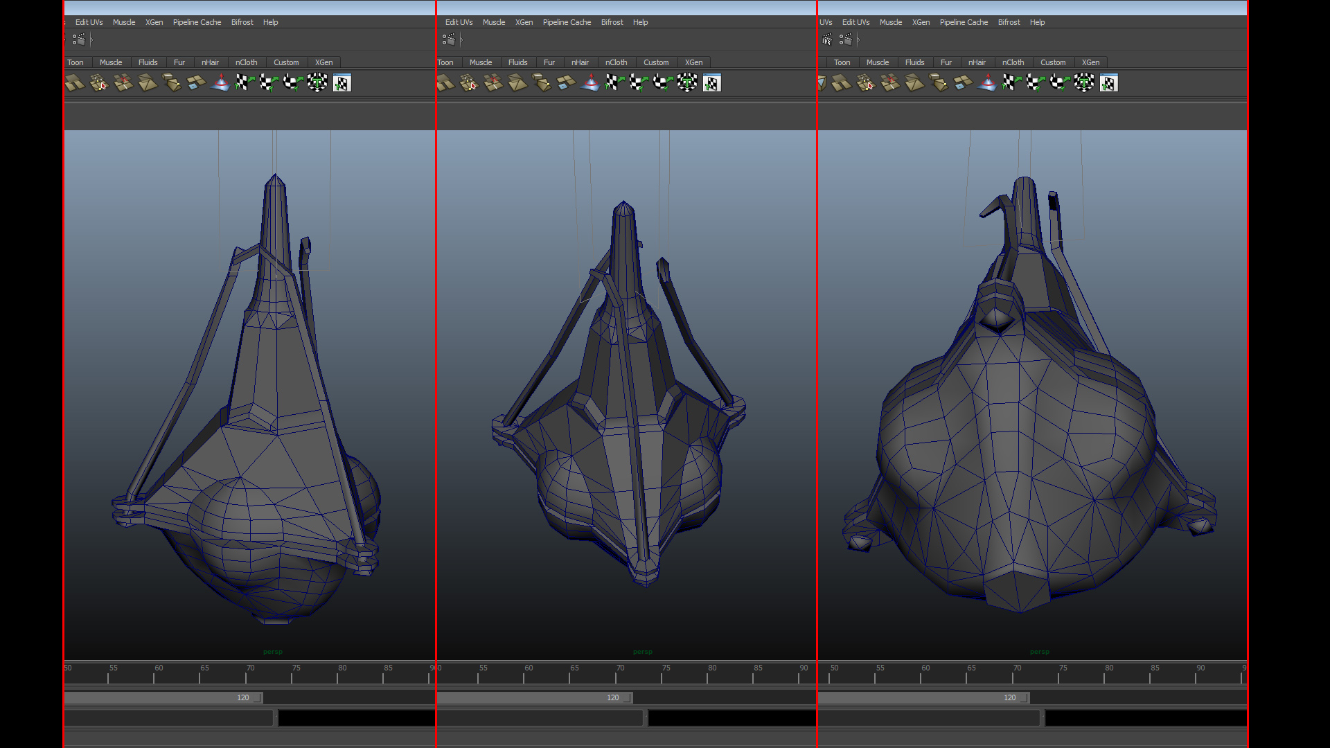
Now for assignment 2, the museum visit and the reference pictures resulted in what you can see in the gallery above. I won’t write much more about it for now as I can see from the course portal that we’ll write at length about the details of this assignment next week, so until then this all I’ll post for now. That’s all the boxes not particularly diligently ticked for this week – just rolls off the tongue doesn’t it? I’ll still be here tomorrow, to high-five you yesterday, my friend. Peace. |