Analysis of Screenshots & 3D Level
|
The first Screenshot to analyze was this one, a picture of batman in a cave with (presumably) the batplane behind him. The first things to take note of in this picture is the tilt and perspective of the picture. The tilt and the diagonal lines in the picture are there to emphasize movement or mobility in the picture making it a ”action” shot. The vertical lines and the perspective are there to emphasize the power of batman, standing on a height looking tall and powerfull.
The second screenshot is of Battlefield Hardline. The picture is made up of mainly diagonal lines to emphasize the movement in the picture, that being the 2 people going down a zipline with money falling out from the orange backpack. The money is blurred to also further emphasize the speed of the action in the picture. The picture is high key with blue being the most used color in the background, this is probably to increase contrast and to draw more attention to orange backpack of the person furthest down the zipline.
The third picture is of Mirrors Edge. Composed of vertical/diagonal lines to strengthen the greatness of the city and to show that the picture is not static, again, showing movement. High key lighting with very little color, most of the city is made up of blue and white to place it in a sci-fi world. The main character in the image is different, she has black, white and red clothing making her pop out from the environment around her. All in all the city is made very shiny, it almost looks like the entire city is made of glass, this is to further emphasize the sci-fi elements of the world.
The fourth and final picture is of The Witcher. The picture is made up mainly of horizontal lines, these are usually used to give stillness and calm to an image, in this case however it is made to make the dynamic lines of the two characters in the picture even more mobile. The lighting is sort of mid-key, looking at the dark foreground and the very bright bakground. The colors of the characters are dark, putting them at contrast with the very bright background.
Part 2
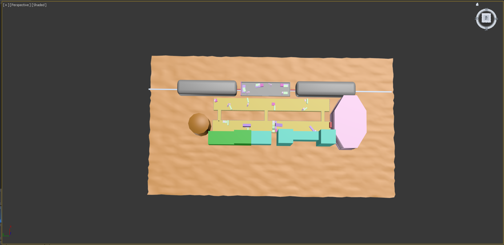
For the assignment to create a level we were given the choice among 3 games and a few feelings to try and convey through the level. The game I chose was Mass Effect and the feeling to convey was Danger. When I think of Mass Effect I think of a couple of things: Space, indoor environments on spaceships/space stations and one of the earlier levels of the game. The level that popped into my head was the one that’s played out on a train station. So in order to try and convey the right setting to be able to give the player a sense of danger, I started creating the walkways that the player will have to traverse. I made them wide to leave space for ”crates” and other sorts of cover for the player. I gave the buildings these colors to keep track on separate buildings, the green one is the starting area of this part of the level and the pink building is the goal. I put down the red ”doors” to highlight the beginning and end, just to make my thought process more obvious. To convey danger, I made the walkways narrow and cover less to make the player feel exposed while crossing. I also made the cover face one direction while at the same time opening up the middle section of the train to give space for further threats since it’s placed to give enemies flanking potential. Now, if I as a player where to enter an area looking like this, filled with covers and having the walkway where I start blocked off I would immediately assume that I am either about to fight here, or I am going to come back at a later point and have to fight then. Either way the scenario would make me think of the area as a battlefield. The player can see where to go from the start and can also see that the most direct route to the goal is blocked off.
When I showed the level to my classmates they understood what game it was from, however the feeling that I tried to convey was not entirely correct. The reason for this, I believe, would be that the level itself could convey more than one of the given feelings. The two feelings that the classmates thought of were Suspense and Aggression, in my opinion these words are, in games like this, closely related to danger. Aggression was guessed due to the covers and the fact that in an area looking like this you are going to have to fight, hence you will have to be aggressive. Suspense was guessed, also due to the covers since you are faced with a situation where you could fail.
Looking at their creations, most of them where of the game journey and used the keyword Solitude. This struck me as an obvious choice, this was also the reason why I chose not to do journey or solitude. It was obvious since Journey is a game that goes very well with the word solitude you are (for the most part) alone in a big empty dessert with large ruins. Even when you are not alone (when another player joins) you are still alone, you are just alone together. |