3D Computer Graphics: Theory and Application I, Post 1
|
Hello world (or specifically; classmates and peers), this is my first post and first time using a weblog. This post outlines the results of theoretical discussion and practical assignments during the course of 5SD045 (2014, w.36-45), lectures covered here were held on 2014-09-02 and 2014-09-03 or in less robotic terms, during the first week. During this first week, our two lectures covered the following; the fundamental elements of art, image composition and some introductory material regarding polygon primitives and the basic controls of a 3d suite (3ds max). In order to work with this material we were both given opportunities for discussion during the lectures and also assignments for further reading and reflection, the latter is that which this blog post falls under.
The first assignment covered here is the one relating to the elements of art. We analyzed sets of screenshots in groups, in order to discuss how the elements of art were applied to the compositions. We had limited time during our discussions and in the group we covered the first two the most thoroughly, and therefore I’ll spend the most time detailing my thoughts about them. Screenshot C01
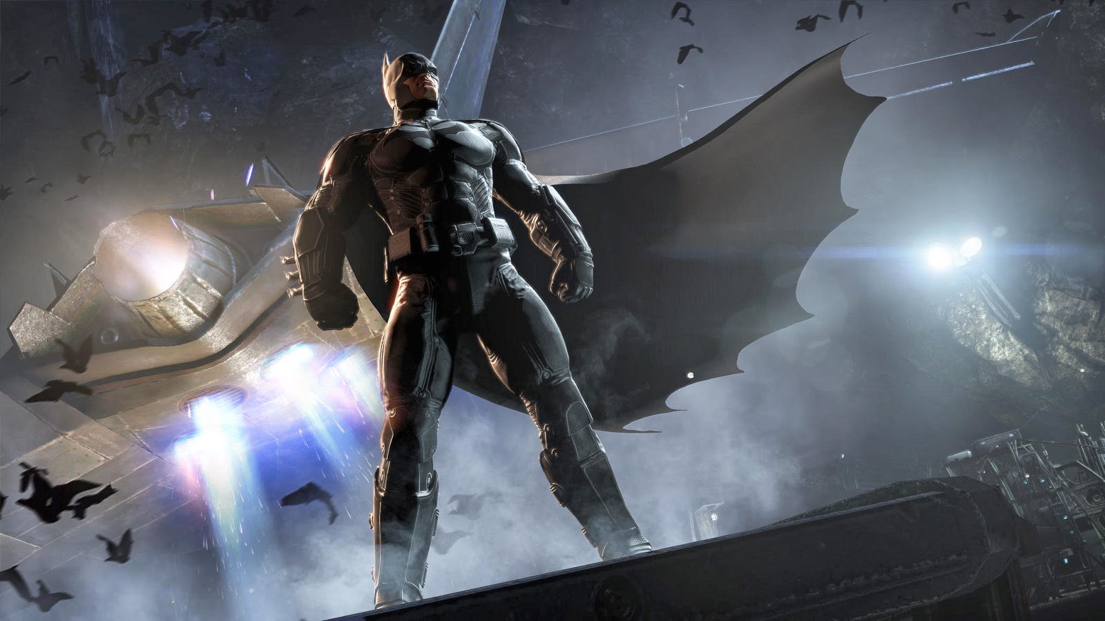
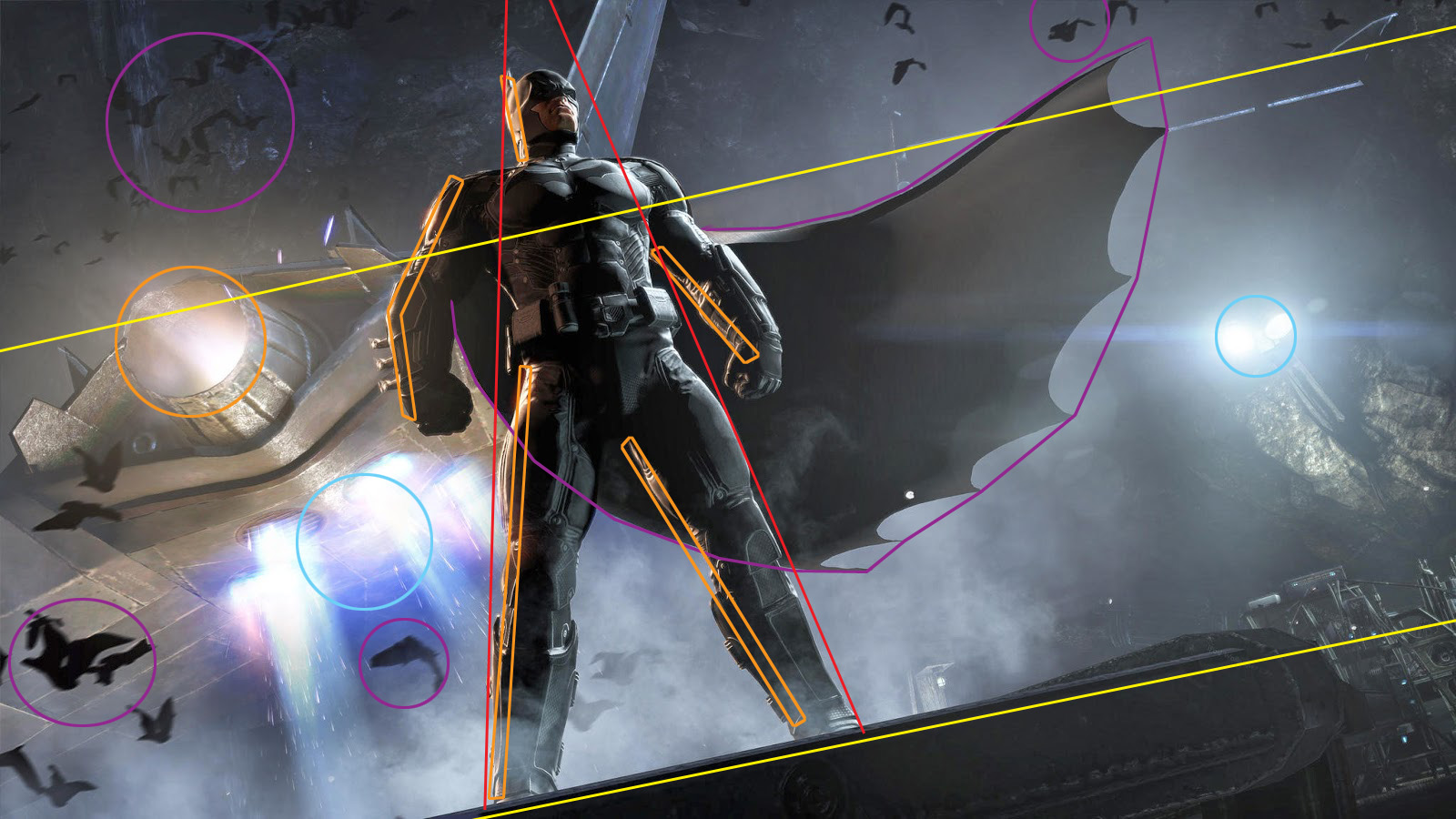
This is a diagonal and horizontally aligned scene – what in our lecture was called an action shot. Even though the focal character himself doesn’t display any action the tilt of the horizon is in this composition used as a technique to reinforce the sense of motion, and works with the other dynamic elements to bring your attention to the in several ways emphasized character. The most significant way the character is telegraphed as the focal object of the composition, is his pose and orientation. The character’s pose and the perspective in which he has been placed in this scene gives him a tapered vertical orientation, demonstrating traits of stability and power, and also drawing in the eye as being the odd one out in an otherwise horizontal composition. In addition to this, the background is filled with suggested movement; groups of bats are made dynamic by deformity through motion blur, the cape of the character is lifted by the wind and there’s plenty of smoke or fog rolling by helping to obscure that which isn’t part of the focus. To further reinforce the focal point – the character – the authors have strategically placed two sets of lights in this composition. The first set is the blue ambient light, for which we can see two sources. Its important for scene because it establishes the general lightning conditions in the scene. The last source is the second set, an orange light. The orange light is a conceptually important part of this composition, because it serves to highlight and define our focal character. It draws the viewers attention to the focal character, with a hue of red unique only to the part where the light reflects of the character’s suit. Strangely, the bats in motion don’t seem affected by the source at all either suggesting that they’re somehow outside its direct influence (and further away from it than what the character is) or that they’re somehow light-absorbant. A final note about the setup of light in this composition is that a fringe benefit of the highlights on both the character and to a lesser extent in the jet streams behind him is that they read as additional vertical lines, maintaining the eye’s focus on the character for longer than on other objects in the picture. Related to the lightning is the values of the image, which are primarily averaging around a mid-range value. The important values in this composition is clearly the low values, which are focused on two objects. One is our character, who has lower values in the portions without direct lightning than any other object in the composition – other than the light-devouring bats, of course. Secondly, there’s the object upon which our character is standing, which being a foreground object and there being no implied light source ahead of it shares darker than average values with the character. This means that even on a value level the composition of the image is geared towards drawing the viewers attention to the focal character. In summary this an establishing action shot in which the towering hero stands vertical and tall – a pillar of stability, to a backdrop filled with objects suggesting action and movement; fog, fire and bats. The composition is meant to reinforce the character traits of the focal character. Screenshot C02
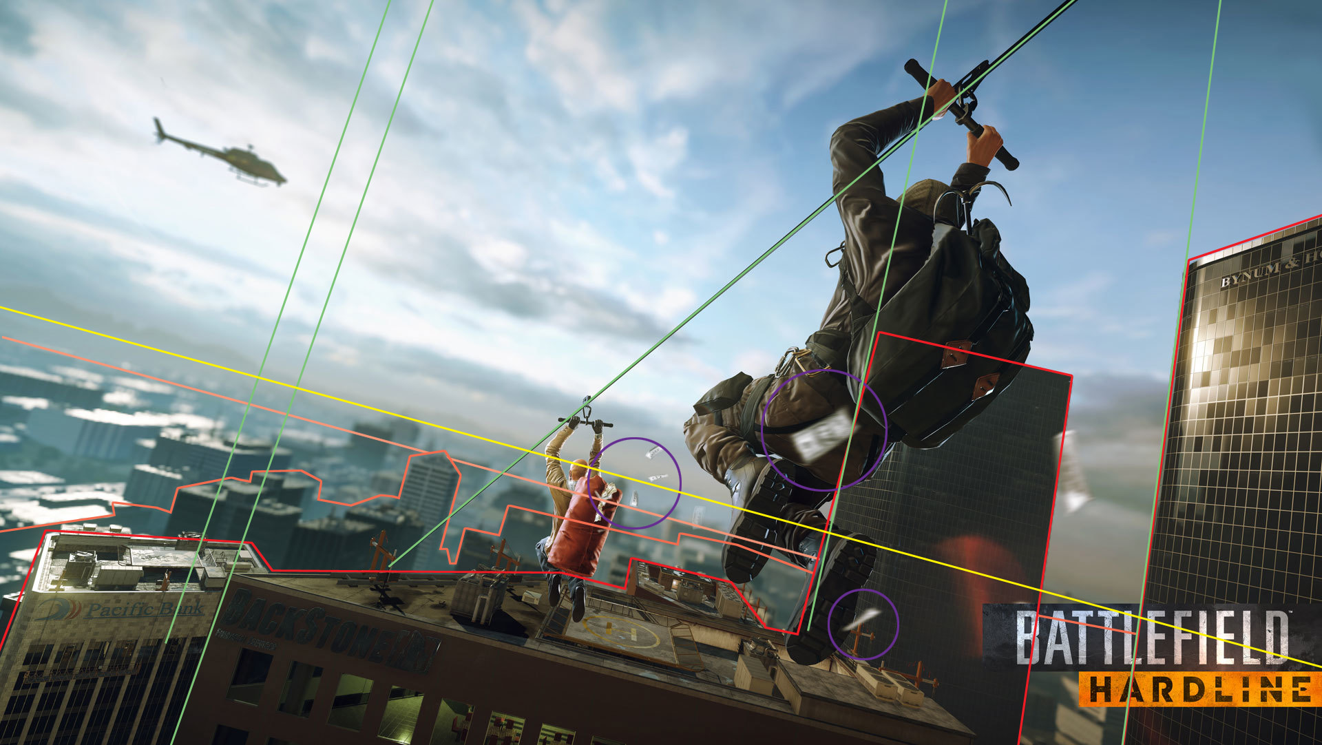
Another diagonal shot with a horizontal alignment. The diagonal orientation is once again used to instill a sense of action and motion into the scene, the difference is that this time the focal characters are set in a lot more dynamic poses and the severity of the horizontal tilt is amplified in order to convey a more immediate sense of action. In this scene the rope being used for zip-lining serves in terms of composition as a guiding element, leading the viewers eye into the scene. The buildings display vertical lines instilling sense of vertigo in the viewer. The organic character design reinforcing dynamic activity, especially when off-setting the quadratic very perfect nature of the surrounding city-scape. In addition to their organic design, elements have been added – the bills falling out of their backpacks – affected by motion distortion, to reinforce the sense of action. Depth of field is used prominently to guide the viewer to the important elements of the composition, and to increase the sense of scale in the relatively small city-scape behind them – about 6 buildings visible in the background as opposed to hundreds of buildings you’d expect in a real city. Conscious decisions regarding texture and assosciated values, foreground objects have darker hues than backdrop ones – even the light beige structure in the foreground is darkened by a choice of a dark blue floor for every floor. Middle field structures dark textures toned down naturally by aerial. Far field is filled with more brightly textured buildings than the mid field, and are more affected by the aerial. These three fields serve to build depth in the image. In summary a dynamic shot meant to highlight the aesthetics of the promotional title by use of light, distortion and composition. Screenshot C03
This is an image with a noticeable tilt, and the character’s details with strong red colour values leads the eye to read it from right to left. Many vertical elements build a sense of height altitude and with the tilt possibly vertigo. Tapered diagonal lines building a sense of depth in the scene and also to moderate the pace at which the image is read. High average values, high saturation on sparse colors – in this particular shot as mentioned previously very strong reds on the focal character. Use of values in the shadows to balance the picture’s vertical tilt and read to the left, in addition to that the far field focal building has not-quite parallel lines to act as a balancing element. There’s more to touch on in this picture but out of respect for the requested word count of a thousand words let us shuffle along. Screenshot C04
A horizontally aligned picture, with two characters at an angle with opposing flows. A bright ambient light offsets the two characters, making them the focal point. The background is obscured by particles and fog, and the colours are muted. The muted colours and choice of a straight horizontal line without any tilt is probably meant to convey a kind of somber cold atmosphere, probably tying in with the featured products aesthetics. In our discussion group we didn’t quite have the time to cover this one in the same way that we discussed the previous three, which is a shame because out of the four we’ve covered this is the one with the most peculiar design decisions behind it.
The second assignment I’m writing about is the one pertaining to introductory material regarding polygon primitives and the basic controls of a 3d suite. In order to work with this material we were assigned with a task to design a mock-up level directly in the 3d suite, using polygon primitives. We were also asked to try and implement the elements of art assignment, – described just previously in this post – in our mock-up as well. We were given keywords to follow when designing our mock-up level and three games – chosen for the likelihood of that we had played them – to try and project our associations with our keyword unto them. The keywords we were presented with were as follows:
The three games were:
I chose Uncharted and Fear, the following is the result.
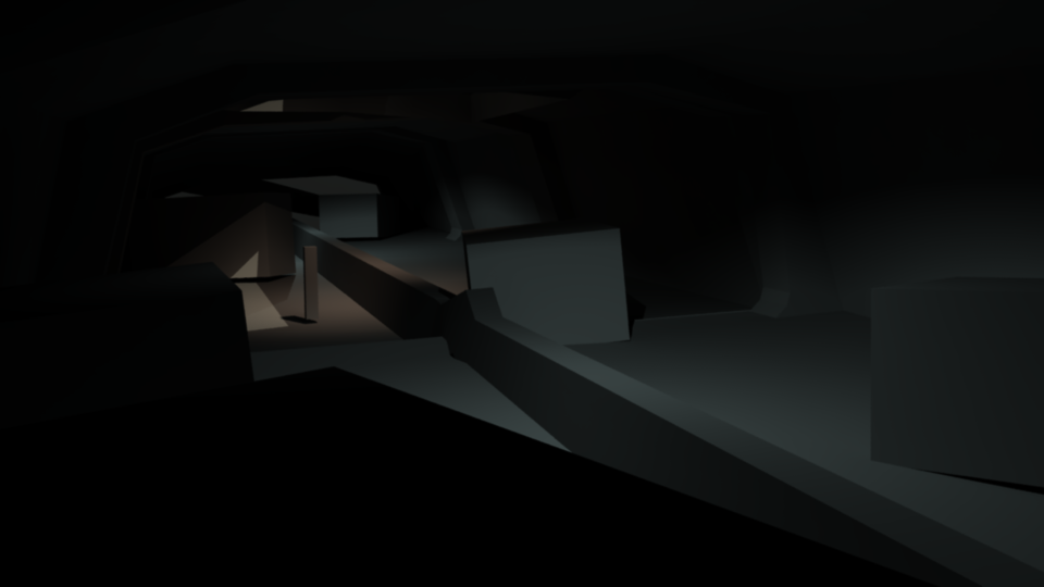
These were the screenshots used during the lesson, for the discussion group.
Improved screenshots demonstrating mock-up light, a simple rendering.
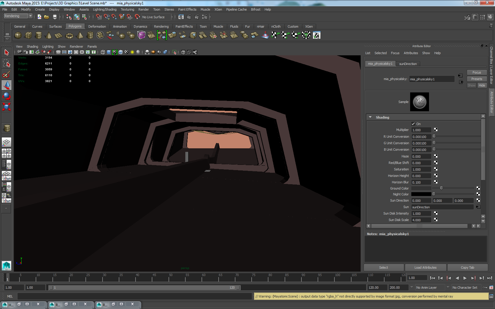
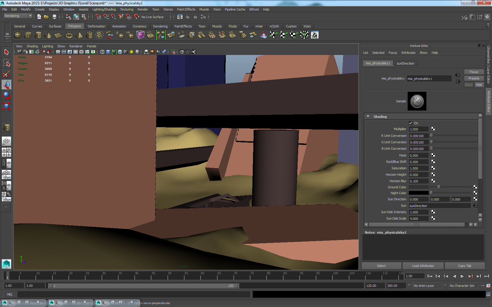
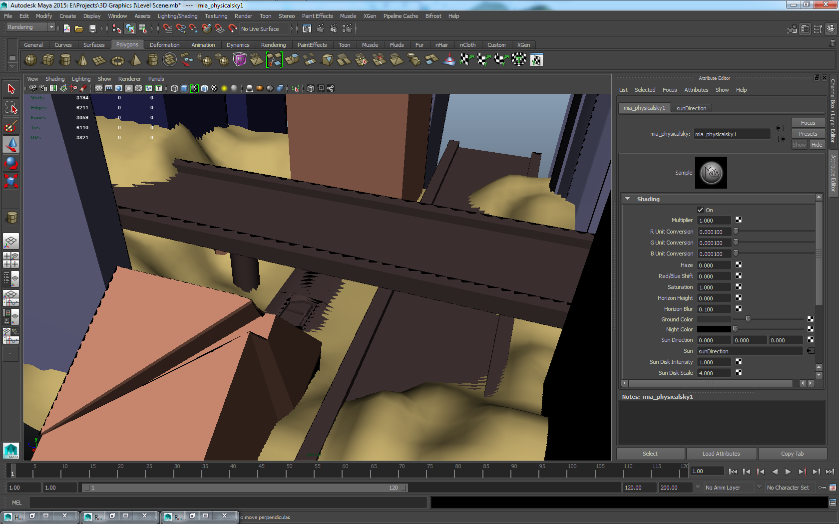
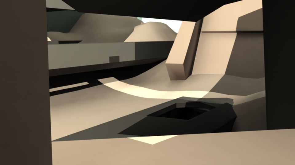
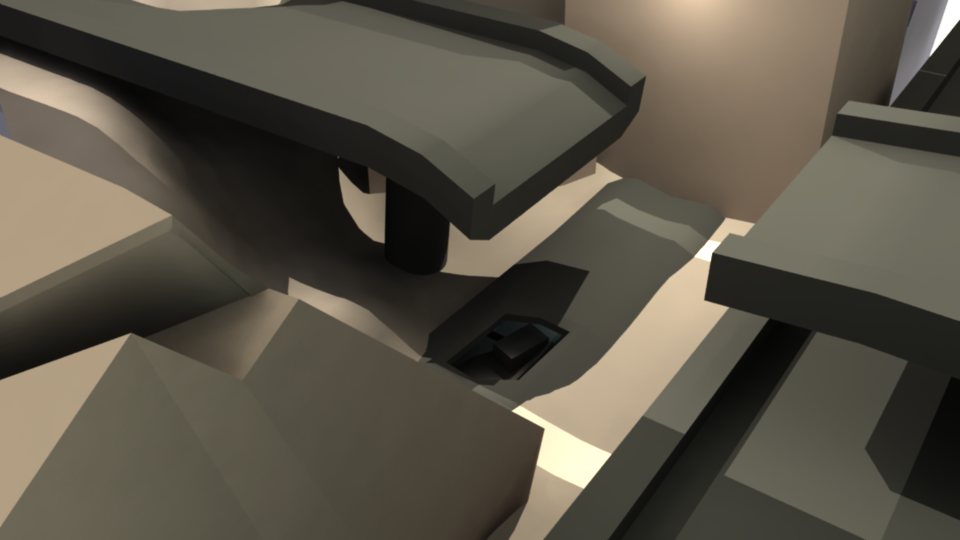
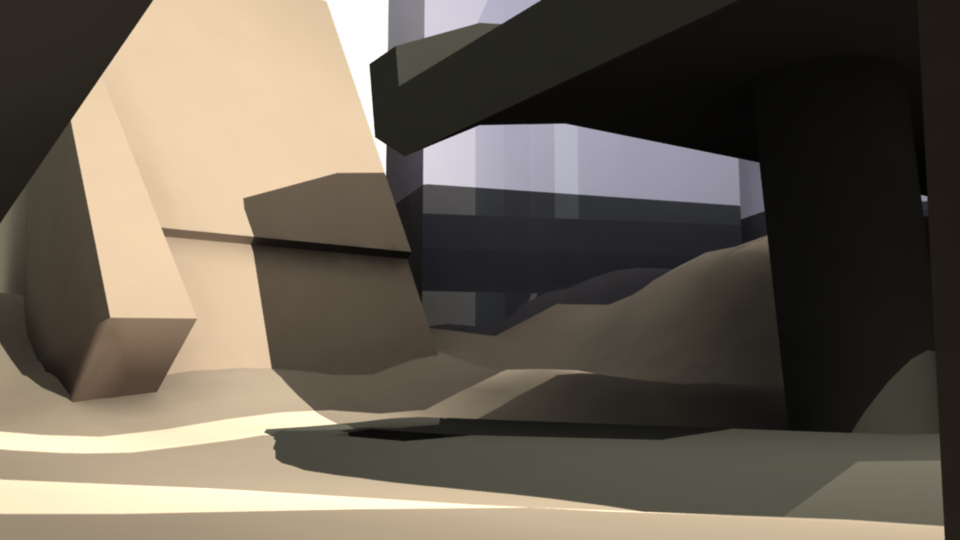
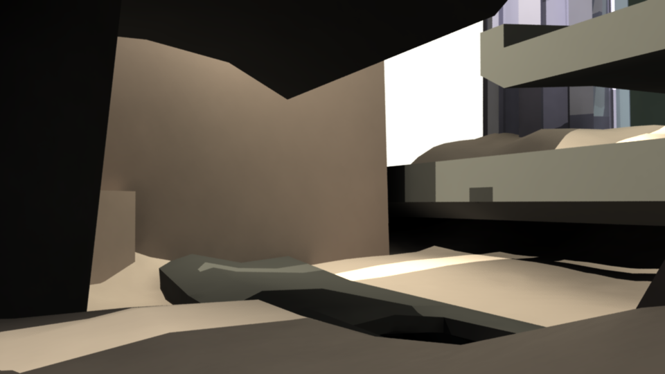
My initial idea was that I wanted to make a tunnel of some sort, and place it underground but with a caved-in roof. I knew I wanted to pick fear but I wasn’t really sure what game I wanted to try and apply it to; Mass Effect or Uncharted. I knew the tunnel would be an appropriate setting for fear because an enclosed space gives a lot of control over the lightning conditions and also evokes feelings of claustrophobia when combined with the unknown. I tried using both the lightning and the geometry itself to create that feeling of uncertainty in the player by making light sources sparse and angling the tunnel itself diagonally and deforming some of its repetitive structures to throw the player off. Later I added placeholders for cars or similar objects in the tunnel to break up the large surfaces and make the player feel more enclosed. To not make the level too confusing I also gave the tunnel a central divider for the player to follow, the intention being that it would act as a guiding element. I eventually settled for Uncharted because I realized that the design was heading more towards something contemporary, and the tunnel with its objects seemed more likely to be a car tunnel than an alien tunnel. I also made this decision because as I moved on I decided that I wanted the player to be able to access the area above the hole in the roof, to create a logical level progression. In order to get the player above the tunnel I added a structure at the end of it for the player to be able to access a stairwell and a way out into the field above. I figured that horror setting I had in mind with the tunnel structure and caved-in roof would work well in a contemporary setting, the the line-work and lightning I was thinking of would fit well with the kind of man-made ruins often seen in Uncharted. Therefore I extended the ruin seen in the tunnel to the city-scape above, I also added an overpass as a dynamic play asset but also to dim the amount of light getting into the deliberately dark tunnel below. The aforementioned city-scape was another element at play – I placed tall leaning structures to make the player feel small, and the accessible area surrounding the tunnel cave-in is in an urban canyon giving the player a way of understanding whats part of the area of play but also leaving them nowhere to go but forwards. Finally I broke up overpass in a way so that it still shades the tunnel cave-in somewhat, but enough for the tunnel not to be well lit. Another reason was of course for the overall theme of ruin, and to create objects leaning in on the player. As you can tell from the above screenshots, I didn’t quite finish everything (or much of anything), because I ran out of time during the lecture. For the sake of presenting my concept I dropped the interior modelling parts for the two buildings connecting the area above to the tunnel below. With this block terribly interesting information about the process out of the way, what was the result? We were grouped up into groups of 5 to 3 and asked to simply show our screenshots (the mandatory number of screenshots was 3), and then the other members of our group would guess what our game and keyword combination was. They would then give their opinion on whether or not we had achieved our keyword. The first member of our group had chosen Mass Effect as his game choice and Solitude as his keyword. I and the other member of the group guessed Mass Effect right away due to the repetitive perfect architecture, which was very reminiscent of science fiction architecture. The scene was of a mountain in a desert with a large structure attached to it, after a brief discussion about the game and before we could really guess the keyword the presenter accidentally mentioned that the keyword was Solitude, so the concept of guessing from the screenshots didn’t quite work out. I thought it was interesting how this person had used the landscape geometry to try and use a lone vertical object – in this case a mountain – to evoke the feeling of solitude in a large horizontal landscape. The next member had chosen Journey as his game and Solitude as his keyword. I first guessed Uncharted because of the first screenshot we were presented with had a very similar composition to a piece of promotional artwork for that title. However the former presenter guessed Journey, the orange-hued landscape plane and beige ruin-looking geometry and the small rock objects forming paths to follow was in hindsight a dead give-away, and with the game established (and I shamefully corrected) we quickly guessed at solitude as well and that turned out to be correct. I thought it was interesting how this presenter had used the ruins in a different way than what I had when shaping my level, he wanted the ruins to represent abandonment, and it showed in the way he had used them in his level. Instead of working with angle and tilt like I had to evoke unease he had focused on geometry, in order to visually represent solitude and emptiness of the ruins. Finally I presented my level with the three screenshots at the very top of this segment, and both guessed Mass Effect from the first screenshot. I wasn’t too surprised as the tunnel admittedly did have some elements you’d expect in a science fiction setting, and they probably focused on the prominent architectural features such as the pillars rather than the angle of the tunnel – they also mentioned that the overpass structures reminded them of Mass Effect. Finally when it came to the keyword, we were cut off before they wagered a guess by the end of the lecture. So ultimately – the jury is still out.
Now we’re finally at the end of this incredibly way-too-long post – but hey, why stop here let’s go all the way over board and have some extras!
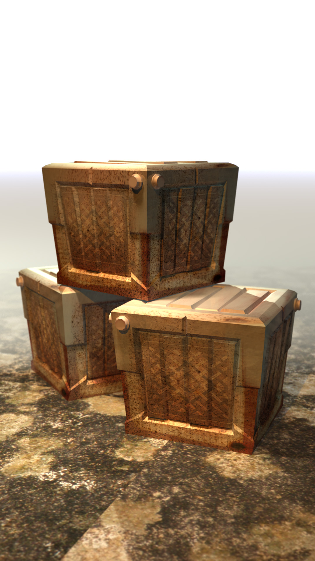
Render of a crate model with only a diffuse texture applied in a generic scene. Its purpose was primarily for me to both familiarize with the interface of my chosen 3d suite (Maya 2015) and to prepare for the first assignment as described by the material on the course portal. Model, unwrap and texture a simple crate object. I also wanted to experiment with rendering settings – in this particular scene i experimented with lightning, material options (blinn & lambert), texture placement options and camera settings for depth of field. Both the mesh and texture are rudimentary – as my senior high school teacher would’ve described it; quick and dirty – but it gave me some experience with the workflow.
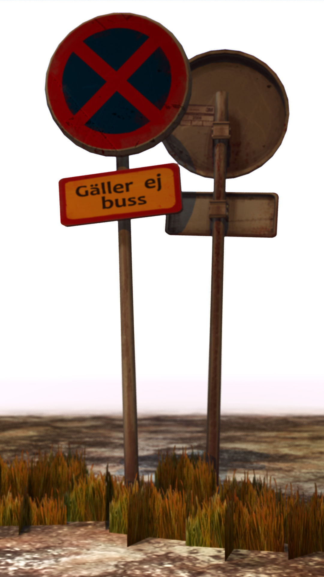
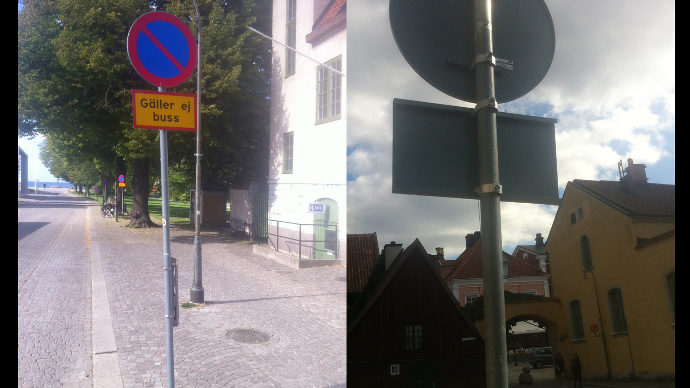
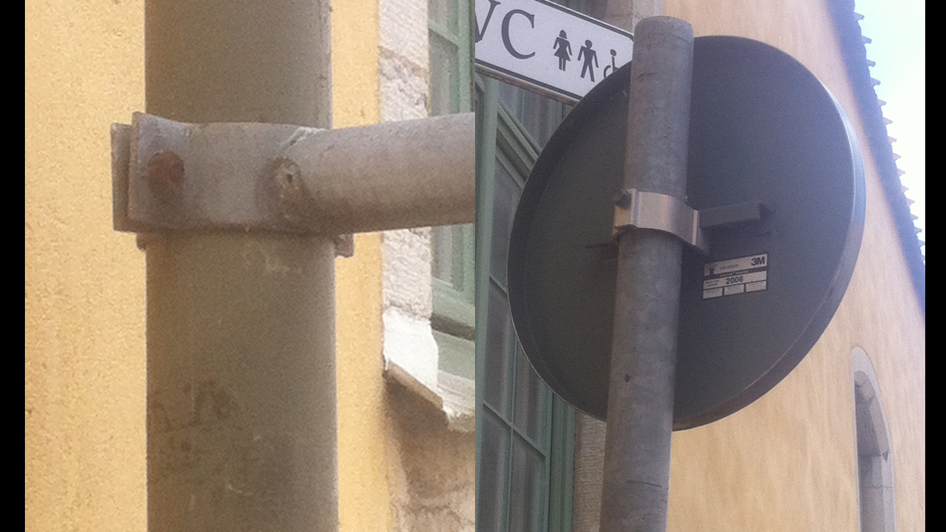
Same scene, but different mesh being rendered. Made this model during the lecture on Wednesday but didn’t get far. Decided to finish it, unwrapped it and made a diffuse texture for it as additional practice. After I had made it I decided to render it as well in order to practice with the export options and working with multiple scenes. During texturing I realized that I wasn’t really sure of what the additional sign under the main sign actually said, so I decided to go out and get some reference pictures, which I did by going down to the actual sign in question and snapping pictures.
It was then I realized that my model really didn’t look anything like what it was meant to be but I figured that as it was just for practice I’d just get on with it. During rendering I decided to fix the wonky ground texture by properly making it tile;able, and I also tried experimenting more with Depth of Field. I tried a different method for applying depth of field, as described here. Finally the little grass object at the feet of the signpost is a simple plane primitive, with a diffuse texture that has alpha applied.
That about sums everything for this week up! I’ll post again the next time a blog report is listed as mandatory (or recommended). |