Loading screen; presenting with style
|
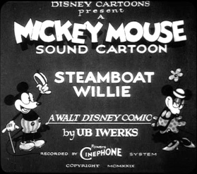
I’m starting to feel, that I’m running out of things to write about, since most of the assets I create are very similar, and I feel that such posts would benefit noone. At this point in the project, we’ve come to a place where we don’t have much to do, graphically. It’s mostly just finishing up and refining what we have and adding extras. One of those extras, we realized, was a loading/splash screen. Looking at our usual style-guide (http://www.youtube.com/watch?v=BBgghnQF6E4), we see that, in the beginning, there is an intro screen displaying the title and creator, as well as what equipment was used to create it. This is where we drew inspiration from.
Analyzing this we find some main elements:
Since the game isn’t in any form of series (even if we could’ve made one up), we decided to leave the series title out, and instead make the movies title the biggest. Also, since we haven’t come up with a name for our project group (not sure if we even will), we chose to go with ”group 8″. Not very pretty, but I digress. We added the main character, as well as the one enemy of each type. We put these at opposite ends pointing towards each other, to indicate that these were, in fact, not on the same side. Lastly, even if its’ (obviously) not recorded using Pat Powers’ Cinephone technology, we chose to include this for the sake of recognition.
Again looking at the reference, we see that, unlike the animation itself, the characters are in fact not entirely black and white, but uses values inbetween these aswell. We chose to follow that example, even if not too extensivley, and added some gray to the Tommy Gun as well as the bright areas of the hats. At first we tried adding several shades of gray, but this looked odd (can’t show you unfortunately) and made it difficult to see what belonged to which character, which is why we changed to only use one shade instead. Finally we chose to add a dropshadow to it to make it pop a bit more. At this stage we haven’t decided whether to have black or white surrounding it, and if we were to chose black, the dropshadow would be redundat. I will most probably give it a bright glow instead to compensate and, like mentioned, make it pop. |