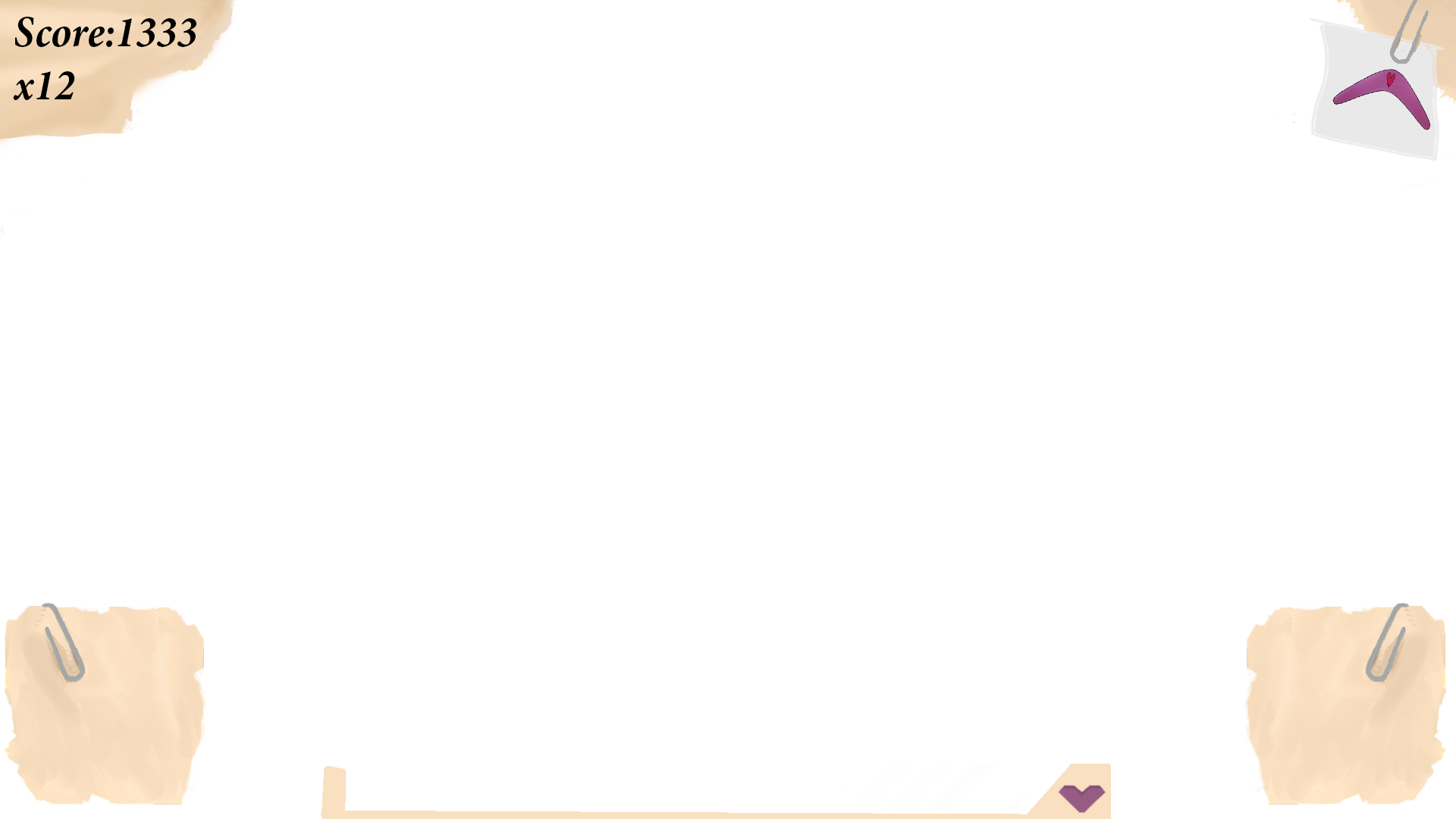
Continued work on the GUI and HUD
|
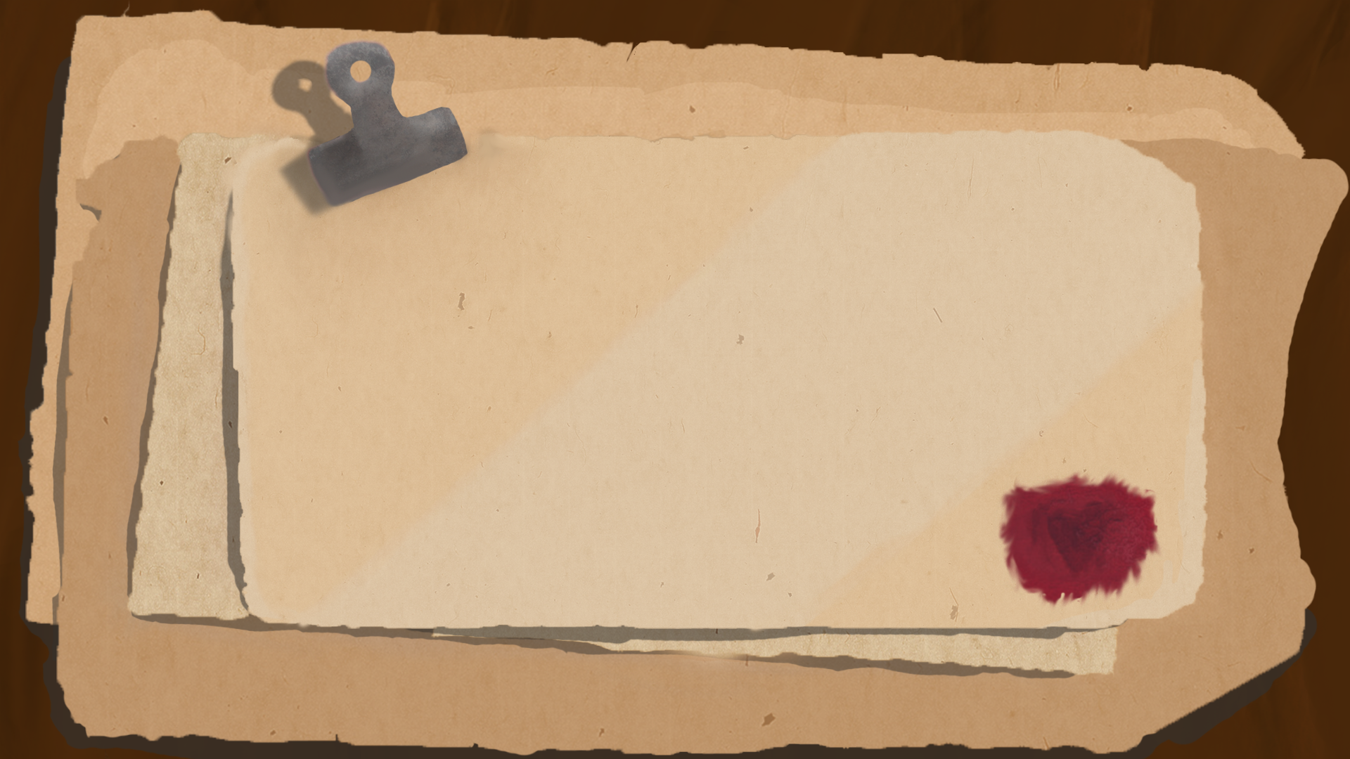
I started to research how old papers, books, quills looked and what I wanted to have in the scene. I wanted the whole scene to look a bit rustic and a little bit ruined.So after looking around for a bit and testing different ways. One thing i started on was having a paper on the left side and a quill and a candle on the right, but I didn’t really like that too much. I also tried drawing a paper wtha quill on it but it didn’t end up too well either.
One thing I really did like however was when i used a stack of paper and colored them in slightly different colors and after shadow to them it actually looked good. However something was missing, a stack of paper looked way too boring. In the end I used a clamp in the top of the papers, making it look like it’s holding them together. Under all this I added a wooden table, to have some sort of background.
However they looked a little to colorless and simple for my taste and there is one very simple answer to this and that was adding a texture on top of every paper. This added some sort of variation to the papers and made them look more realistic. As I mentioned earlier I didn’t finish writing any menu, I started with some different letters but in the end I skipped that.
Now it’s going to sound like I’ll never be happy with this menu, but I still felt some color was missing in the scene. Tere was way to much brown/beige. Here I went back to the first menu, and once again tried to add these wax stamps and drawed one in one of the corners of the top paper. Inside this stamp I used a slightly darker brush to draw a heart and then the mixer tools to smudge out the edges. Now I will not go as far as saying that the menu is perfect, but atleast Im happy enough to work on the letter now instead of adding more and more content on the background. |
 This is the week of the alpha, which also means the week of small fixes on everything from enemy projectiles to the background and while this takes up a lot of time I did continue my work on the GUI and even started working more on the HUD. I used the work I did the previos week with the menu concept regarding papers, love letters and things like that. Due to the fact that we are currently deciding what kind of font we should use I haven’t written the letters or text that we should use just yet. However I’m almost entirely done with the main menu now.