Blog Post 5 – Playtesting
|
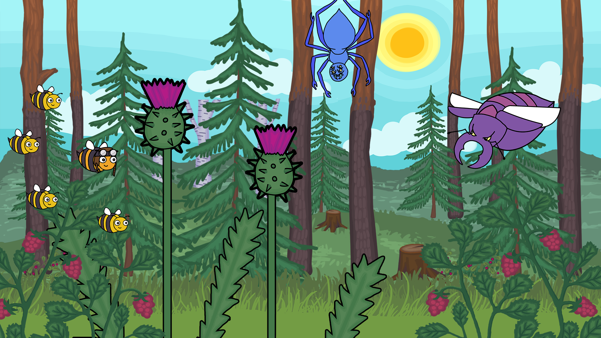
Playtesting has for our group been an experience that comes with a mixed bag of emotions. On one hand, its been a great experience to see people enjoying themselves while playing our game, and of course it feels great to receive positive feedback. On the other hand, we’ve during both of the playtesting sessions encountered bugs (not the buzzing kind) that we previously had never seen before. Luckily they haven’t rendered the game completely unplayable, but it still annoyed all of us a great deal since we wanted to show the game we’ve worked so hard on from its best side. The critique we have received from the playtesters has been extremely helpful, as it has pointed out things about our game from a different perspective than our own. Its easy to become blind when you’ve worked on something for so long, so having a pair of fresh eyes taking a look at your game can really help you spot things that can be reworked for the better. The feedback we have received has definitely helped us make what we already have better, and also spawned ideas to make the game more interesting than what it originally was. To move away from the general experience of playtesting, I thought I’d discuss how the background of our game has changed thanks to feedback from our playtesters. As an artist, I’m obviously extra interested in feedback concerning the visual aspects of the game. The majority of that feedback has been very positive, which of course makes me very happy. It has also spurred me to work harder. One thing we did get negative feedback about during the beta playtesting was the background. People thought it was hard to discern which obstacles were supposed to be avoided, and they also pointed out that the scale was off with some of the assets and that you could tell some of the assets had been enlarged to the point of appearing pixelated. To deal with these issues, I decided to make a mock up game screen to give the team something to, at least discuss around, so we knew which direction to take the background in. We were initially unsure about the scale of the background, in other words how close the focal layer (where the action takes place, in our case where the bees and the other bugs are) would be to the background. In the beta playtesting we had the bees be very close to the background, meaning you couldn’t see much of the trees for example. In the mock up I created I instead let there be quite a distance between the focal layer and the background, meaning you could see more of the forest. My primary reason for this was because I just thought it looks more visually appealing, but it also solves the issue with pixelation. Furthermore, it makes it easy to tell what assets are obstacles since they’re very large in comparison.
This was the first iteration of the mock up background. After discussing with the team, we realized that the background appeared kind of cluttered like this, and could distract the player from the focal layer. To fix that, I suggested that we’d turn down the saturation of the assets in the background. We also decided to add a blur effect, this was also something that was suggested by the playtesters.
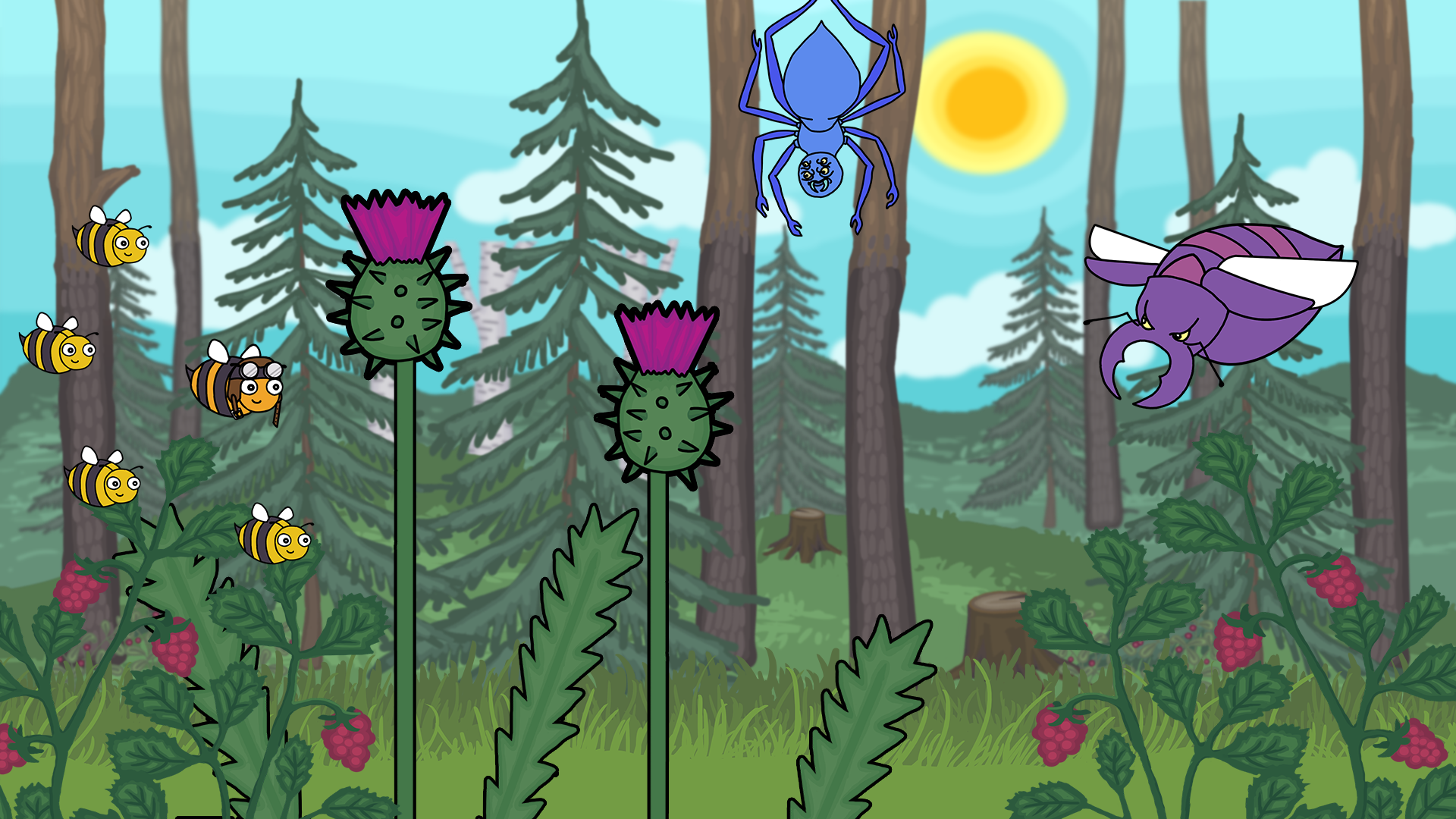
And the finished result! While its just a mock up, it makes it easier for the team to know what to work on with the background, and makes it easier for team members other than artists to assemble backgrounds. Thanks for reading and apologies for the long post! |