To test or detest? That is the question
|
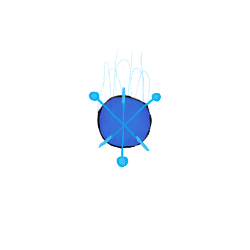
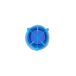
Hello everyone, this will probably a slightly shorter blog post since it’s about how my workflow and priorities has been affected by the feedback gained through the playtesting. Throughout the playtesting we got very few comments on the art in general, and most of what we got was that it looked good – there are however two artistic things that have found their way into the game faster because of the feedback we got. Well technically 3; During the alpha we got comments on the powerup being hard to identify and that the background felt weird and during the beta playtest I got into a discussion about the (lack of) sprite for the ships laser. First of all, the powerup was interpreted as something dangerous even though it was a blue happy little ball – to solve this and to make it look friendlier I added some glow to it, since that is often associated with things being friendly and positive unless obviously bad. This was also something that had been a total oversight on my part since we never planned to revisit this the same way as the following objects.
The background was something I made as test and didn’t have time to figure out how to do it better in the style we talked about in the team. We got some comments on it being distracting and blurry, so we decided to redo it for a couple of reasons; 1. To make it look better. 2. So that it’s less distractive. 3. Because a miscommunication between me and the programmer on the topic of parallax.
The new background, looks a lot better and is easier to work with for obvious reasons. It is however less distinct which is a minus – but you know, in the interest of time – kill your not-so-loved ones. For the beta playtest we didn’t have a laser sprite. I created the ship during the first sprint and since then we sort of forgot about it. The complaint around our laser is that it didn’t feel powerful enough since it was semi-transparent bar with a few round particle effects – which made it feel very weak compared to what it should be doing. So after discussing it with the person giving us the feedback I quickly sketched a design on the whiteboard. To give it a powerful aggressive feel I wanted it to be moving, and sissling with power. As well as spiky to further emphasise the aforementioned feeling.
As I said, all in all we didn’t get a whole lot of feedback regarding the art – part of that might be that we never asked for feedback regarding how our game looked, and most of the few things we got was just stating that they thought it looked good, which is nice for ones ego, doesn’t help a lot with further developing the product. |