GUI/HUD
|
I was tasked with creating the GUI/HUD for our game. Our designer showed how he wanted it to look and then I made my own version of that. He made a One Page Document and on it he made his own GUI/HUD.
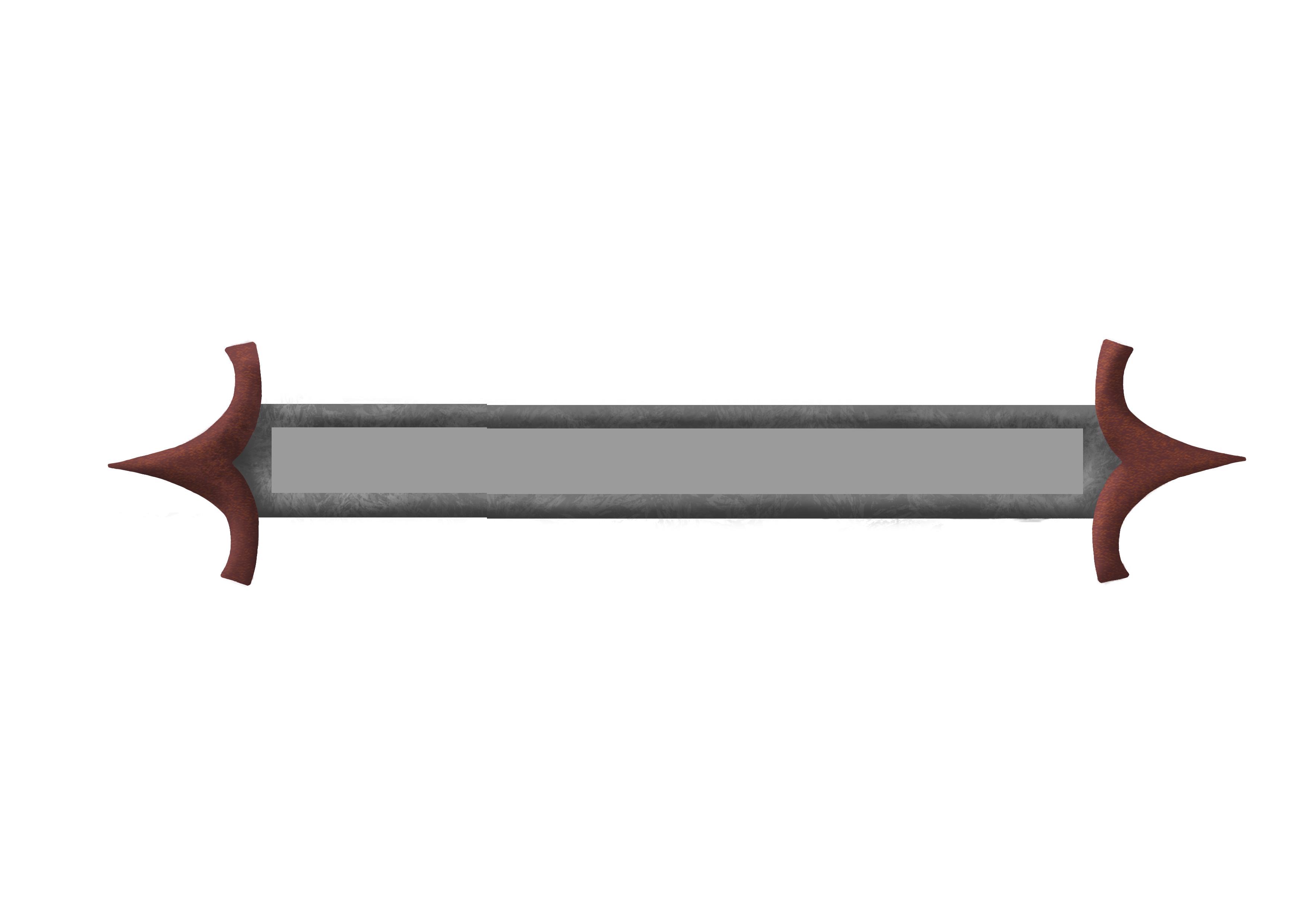
The look he is going for in the Healt Bar is modern metal. I wanted it to look more japanese so I looked up some japanese architecture. I didn’t find any modern metal architecture that looked typically japanese. I decided that the clearest way to show of the japanese style was to use the typical japanese roof.
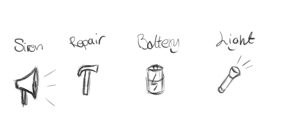
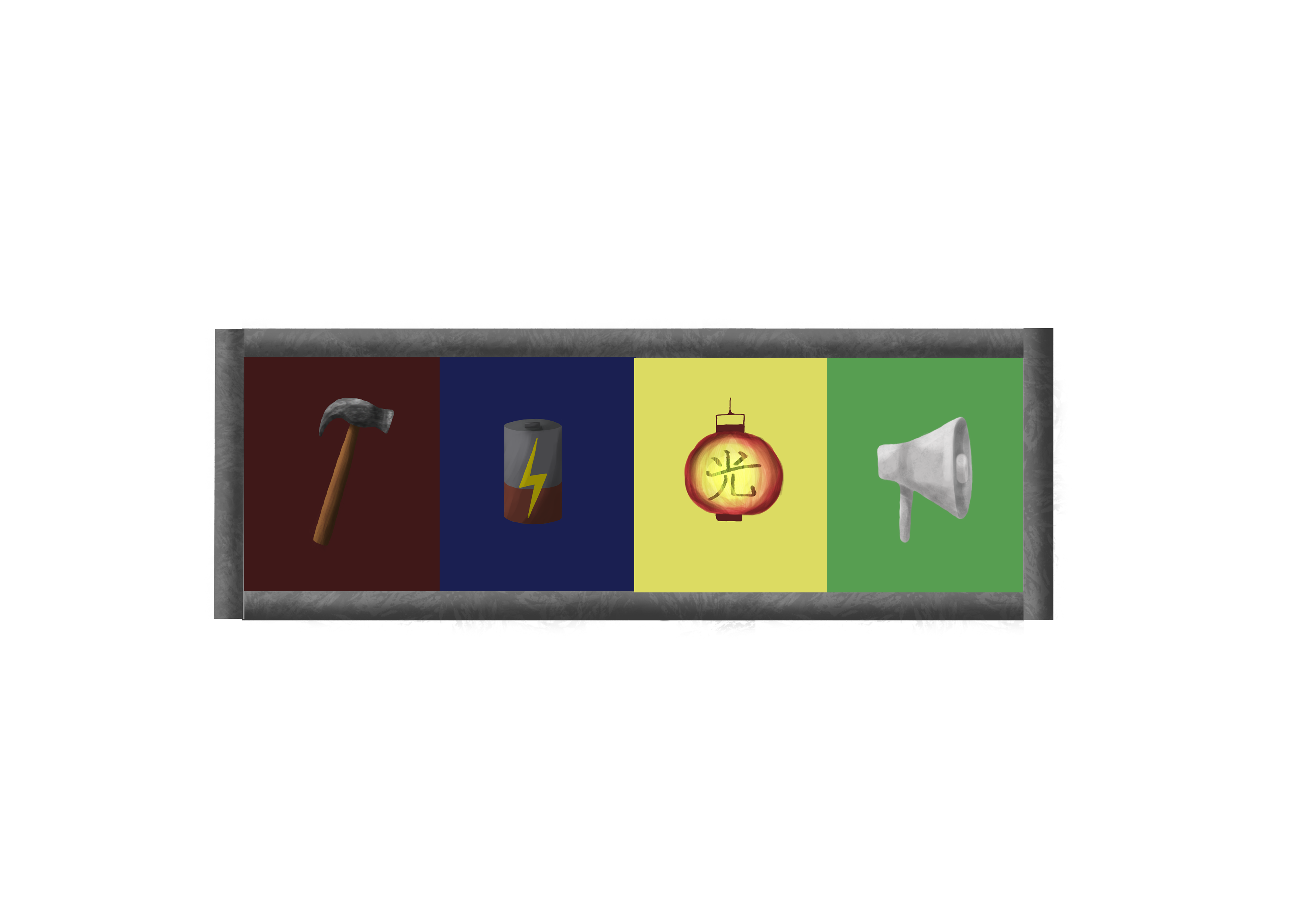
I thought it was good enough, but I really don’t feel like it fits in the game. When it was implemented it just look awkward with the brown. I am at the moment looking at ways to make it look more modern and less awkward. I also made the Power up Icons and the frame for the Power ups. I wanted it to look cohesive with the Health Bar so I made the frame around the icons in the same metalic style. For the Icons I needed images that could easily be recognised for the Power Up it is representing. We have 4 Power Ups in the game; Repair, Battery, Flashlight and Siren. I made some rough sketches to show my group and to see if they thought they represented the Power Ups.
I decided that a Megaphone would be fitting for the Siren. The Power Up is that a loud sound erupts and all the ememies are scares of for some time. For the repair I was thinking a hammer would be a good Icon. It feels like it is an universal symbol for repairing. For the battery I just made a battery. Simple and easy to comprehend. For the Flashlight I made a flashlinght. I thought it also was simple and easy to understan. My group dissagreed with me on the flashlight. I asked what would be better and they suggested a lantern. It was a good idea since lanterns are big in japan. I made a paper lantern with the japanese symbol for ”light”.
|