Whale, Whale, Whale – a design process
|
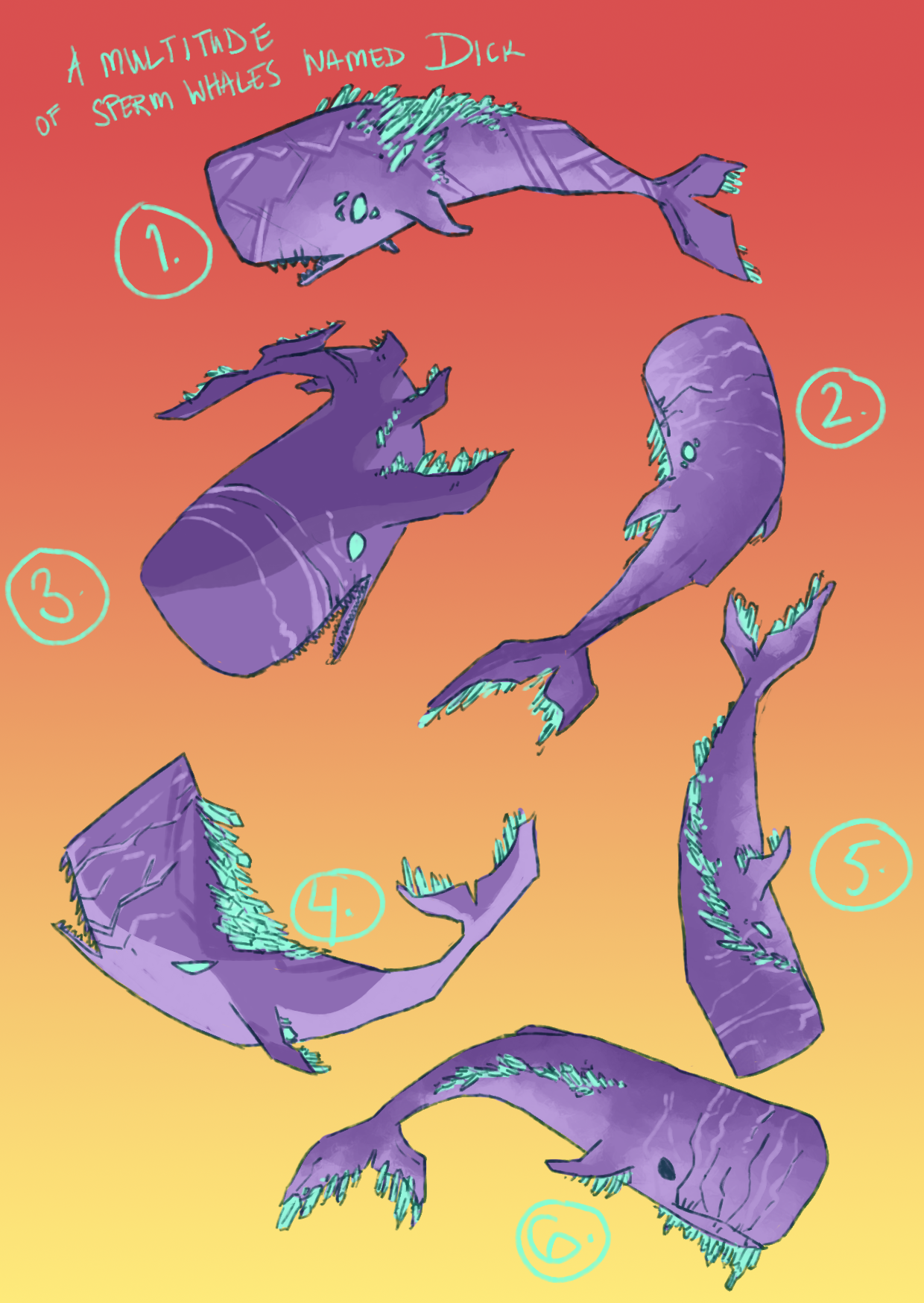
This week we’ll take a look at the design of the boss. I designed and drew everything in Photoshop CC 2017. The antagonist and final boss of Aetherial is a whale by the name of Leviathan. Team Qilin, or rather I, chose to look away from the whole sea-monster thing and instead focus on the Moby Dick side of the game. The Moby Dick influences came from the tagline of the Concept Document; “Moby Dick of the skies”. Moby Dick was a sperm whale, which is a personal favourite whale of mine – they have a great silhouette for drawing, it’s very square. Since whales aren’t generally particularly vicious creatures, making a whale look evil was a bit of a challenge. Early on, there was this idea that the enemies would be inspired by the art deco movement and the ship would be art nouveau, as this would hopefully make it easier to live with the fact that they would be in different art styles. This didn’t actually work all that well and was not a principle that we enforced particularly harshly, but it was a thing we discussed and a thought at the back of my mind. I tried to make the different designs sharper and pointier to try to communicate that the whale was evil, however, it’s hard to make a creature with such a smooth design into something pointy. The crystals were a feature from the original concept document, which in our version of the game are crucial to the story. I mostly tried to arrange them in ways that would make some sense. They are either in a kind of icicle-inspired pattern or a hair-inspired one. The scars on most of the designs are because of the general look of sperm whales, they have scars from eating giant squids. This makes them look pretty old and scary, so I kept that. The colour scheme was not accurate, because when I made these designs, we had yet to pick a proper colourscheme. These colours are taken from the concept document and then watered down a little bit, because we thought the colours were a bit too loud, too saturated.
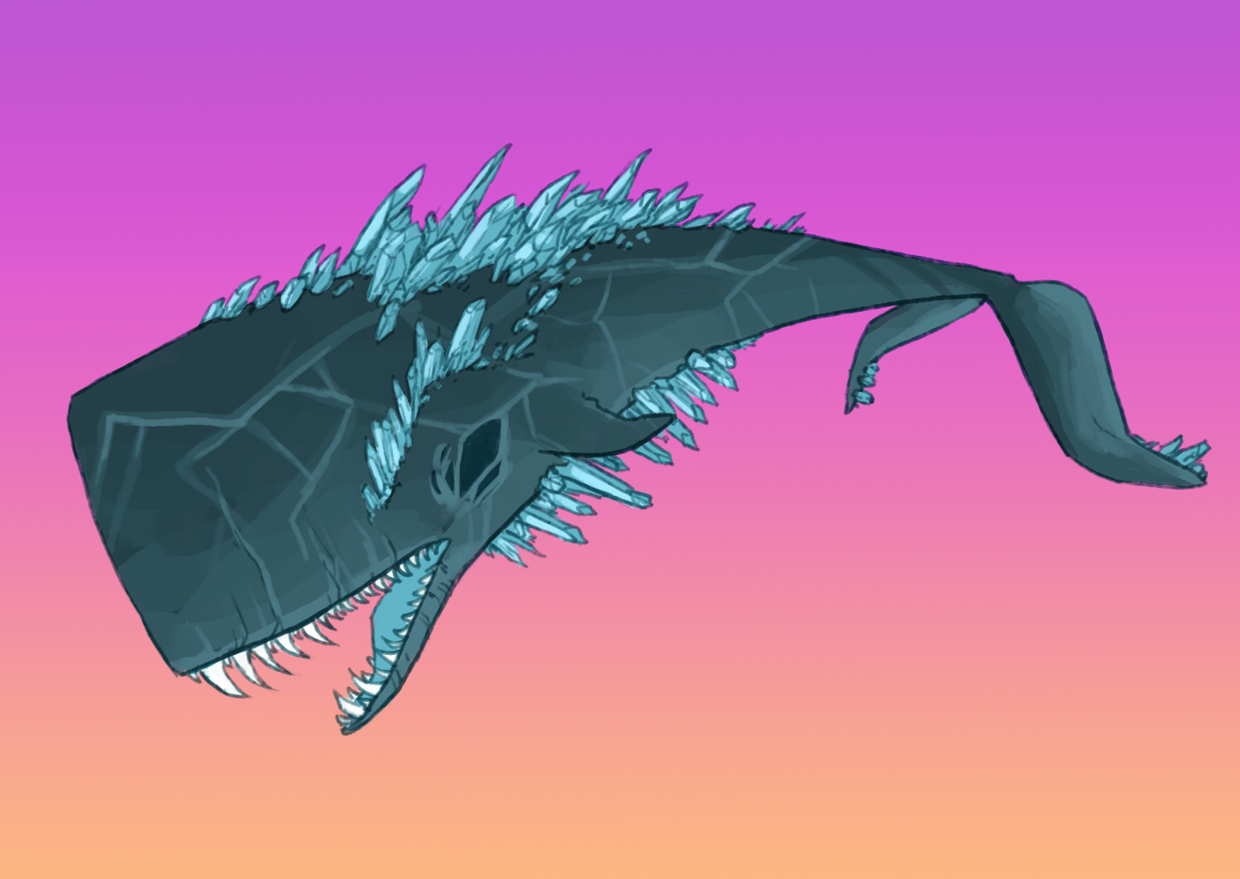
As I started to animate the whale for our graphics class, I realized that I needed to get an approved design. The QA, our designer, prefered design no 1, with some changes, and so I whipped that together. The result was much darker and sharper. Actually, I like the contrast between the soft curves of the whale itself and the pointedness of the crystals and teeth. The dark eyes makes it look more evil, as do the sharpness of the shapes. The colours are the same as for the common enemies, which ties it all together quite nicely. The background in this image is also in the real colours of the actual game. I tried to implement the general pattern idea of design no 1, which was art deco inspired, but in a more subtle way. I think it works decently. The reasons for designing the boss at such an early stage are quite simple. First of all, the entire story of the game revolvs around finding and killing Leviathan, and so having it designed was bound to be crucial. Secondly, I had to animate something for graphics class, and it’s rather hard to apply the theories of squash and stretch to a ship. To be able to animate I would have to have a design to animate. Thirdly, this was something that I personally have been wanting to do since we started this project, and to finally get to sit down and design the whale was really fun. |