15th of February – Implementing Art into Unity
|
This week has been all about implementing the art assets into the actual game, which is built in the Unity game engine. What I’ve learnt from this experience is that making something look good in your Photoshop document isn’t quite the same as making it look good in the game. A tree might look very pretty on its own, but that might change in the context of trying to create a level using that tree. Suddenly, it had to work well alongside many other visual elements, including copies of itself! I hadn’t taken composition seriously enough. When I realized this, I decided to alter some of the art assets so that they would work more naturally together in a composition. For the tree, this meant that the large, sprawling roots got submerged further to the point that they were almost completely invisible. 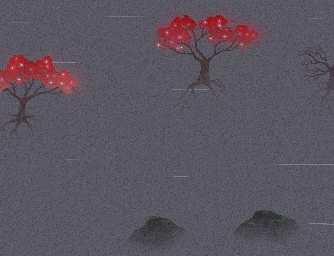 I also changed the water color from blue-gray to plain gray. This was partly because it felt like the screen was a bit too busy. The water needed to appear more subtle. This would allow it to support the more important art assets more effectively; A tree with bright red leaves will pop more if the background is dark and desaturated, whilst if the background had a blue tint to it, it would instead start to compete. A main focus of the art style is after all to encourage the player to explore. This is done by rewarding the player with grand and interesting objects and structures to find. So the more I can make specific assets pop, the better! Another hiccup when implementing art assets into Unity was our grain overlay. See, in the art style we do not have a strong focus on creating nice textures. Instead, we have an overlay – an transparent image – above everything else so that they automatically gets a grainy texture. This looks really nice and allows us to save a lot of time, while also making it appear as if all assets belongs together and comes from the same art style! 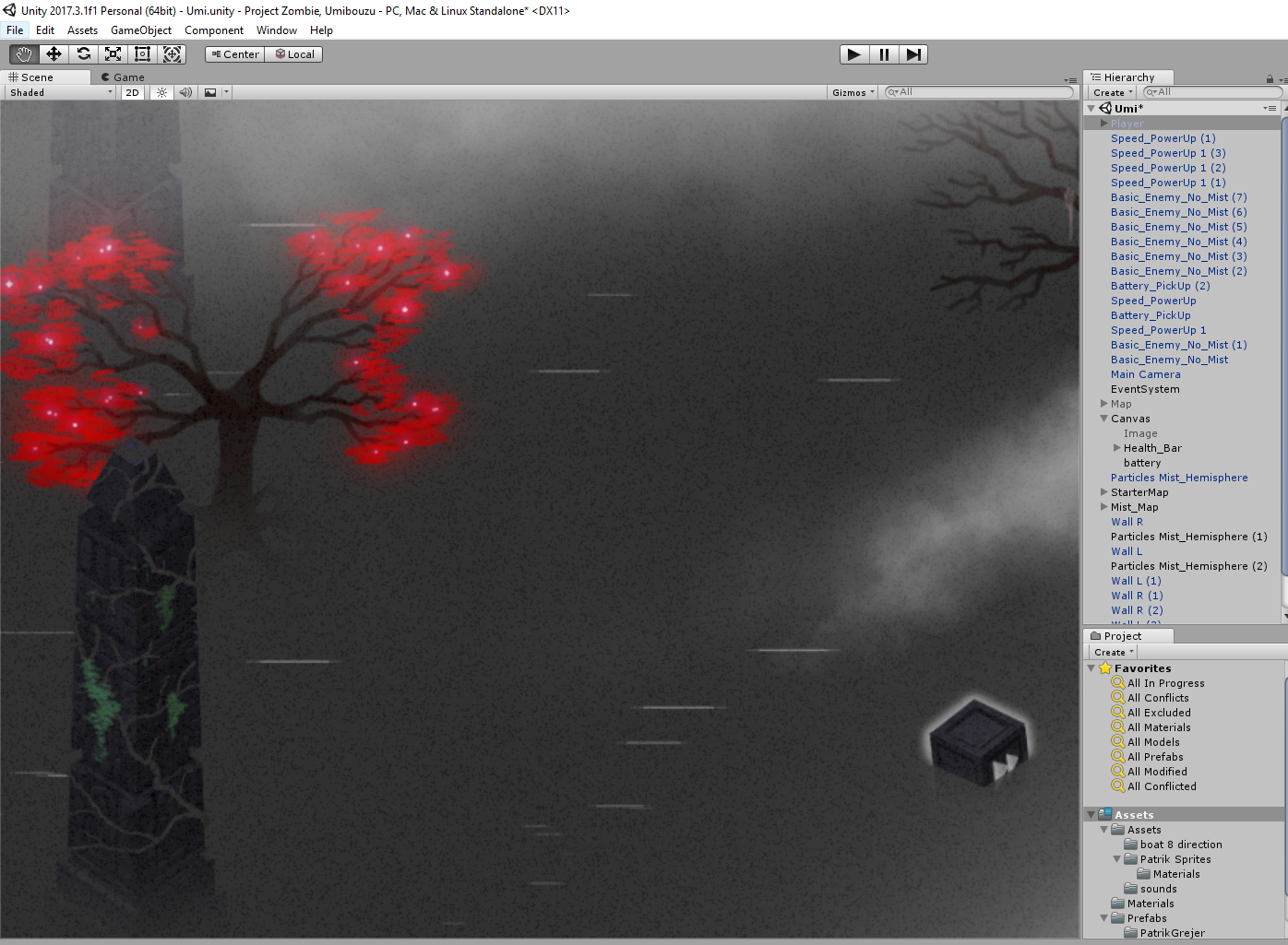 The problem was though that when importing this Grain overlay (2000x1600px) filled with tiny, pixel-size grains with sharp edges was that Unity seemingly decided to either compress or anti-alias the entire image. So instead of a nice and crispy texture, it looked tired and soggy, like a book that’s been left out in the rain. The solution to this was to manually add a part of the grain overlay image to each art asset individually that fitted the silhouette of each image. Luckily, the workflow I’ve been using for this project always starts of by creating a silhouette for each art asset I’m doing, which meant that I could simply select the silhouette and then use that selection to cut out a piece from the Grain overlay image that fits perfectly. 5SD064 |