Game Design journal 1
|
Mikael Ferroukhi date: 07/02/18 5SD064 During this week, I have been helping my Game Design team (Bugbear) by providing them with assets, sprites and ideas for different elements of our picked game: Omibozu. The general idea of the game is to control a ship sailing through a mist in a quest to discover a mysterious supernatural entity, and while doing so using a floodlight in order to see through it and differentiate the different shapes that will appear, revealing if it is an enemy or a power-up for example. It is therefore important to produce enemies that will fit into the Aesthetic design of our game which is to keep cold and/or grey shade colors, making it difficult for the player to differentiate them apart from the mist or other entities. This is what I have created (so far):
This choice of creature has not been made randomly, I inspired myself from the previous work of the team who created the Design Document for Omibozu, in which on a game screen mockup could be seen a shark and a “tentacle monster” coming towards the player character. The Game is supposed to take place in a late 19th century Japan and to use its folkloric animals, I decided to keep this in mind while not going “too far” in terms of unrealistic creatures such as a “kraken” for example, even though the player is searching for a supernatural entity. These animals are modified in such a way that they keep realistic proportions while still showing some sort of “curse” or “something’s not right” feel to them which fits the mystic aspect of our game Aesthetic, while also explaining why they are searching to sink the player character boat. I tried to use different design: realistic/unrealistic, in color/not in color, clear image/blurred image, in order to convey different feels through their design and see which one matches the best the Aesthetic and art style of our game. Since that these creatures will be “hidden” in the mist and that the player character should not be able to tell if they are truly enemies, I tried to blur some of them in order to see what degree of blurriness works best or if it just does not work at all. |
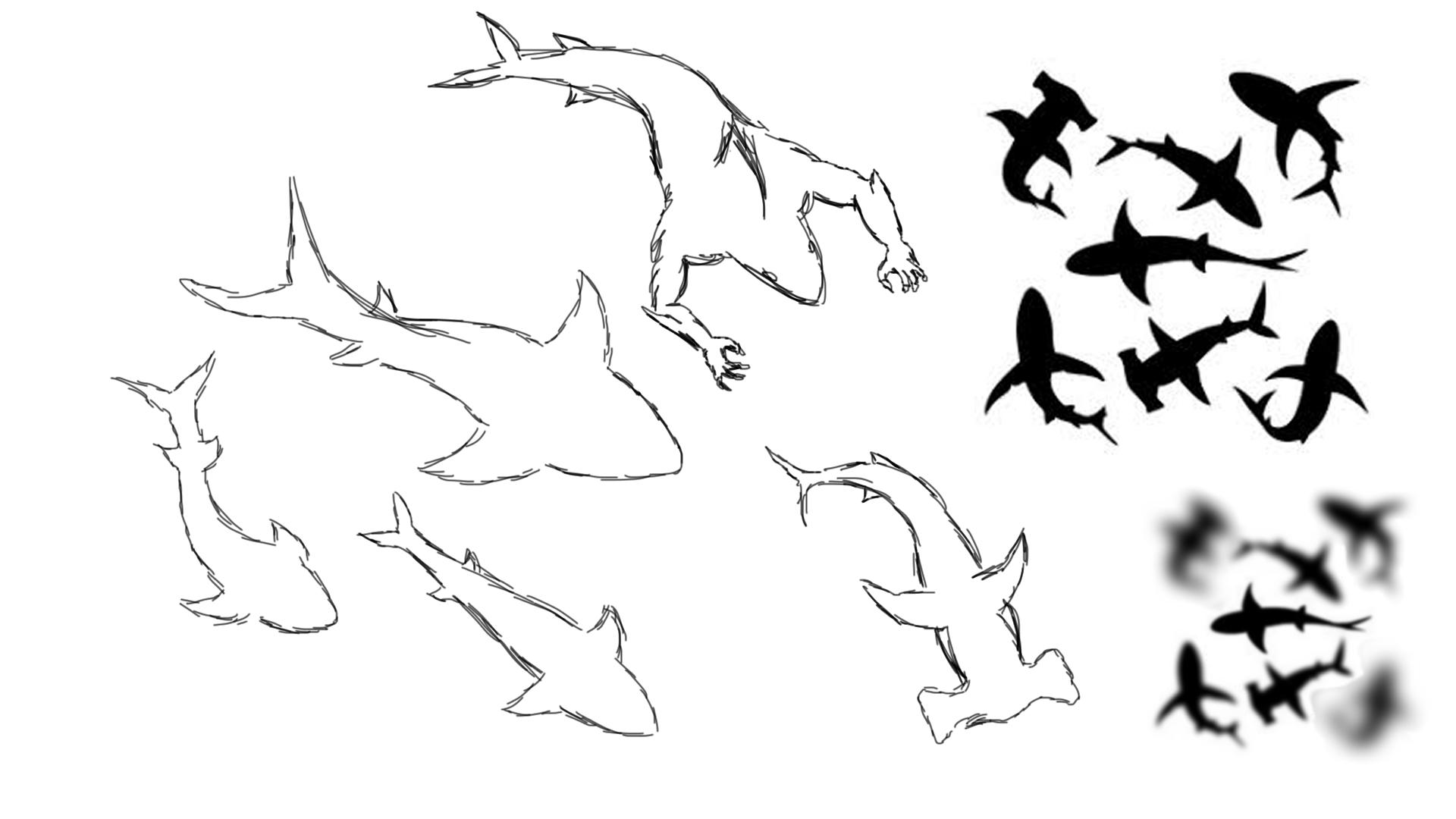
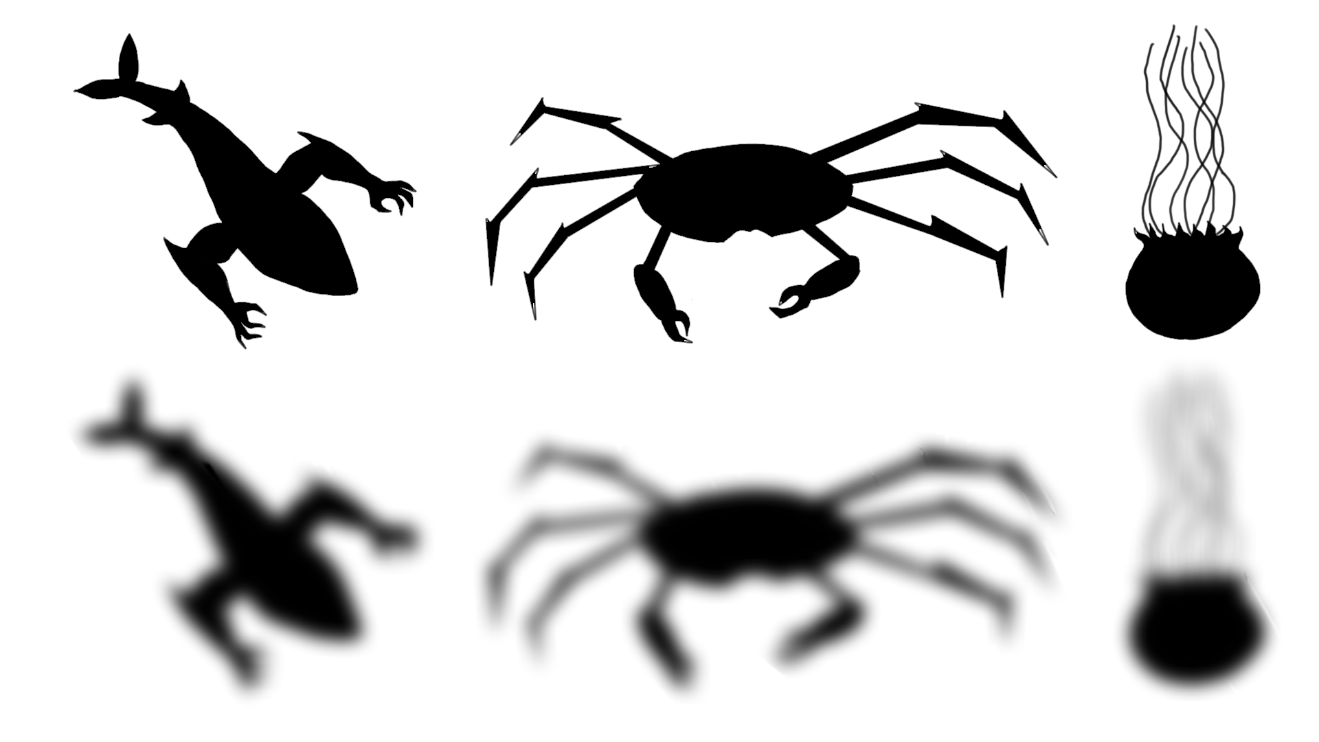
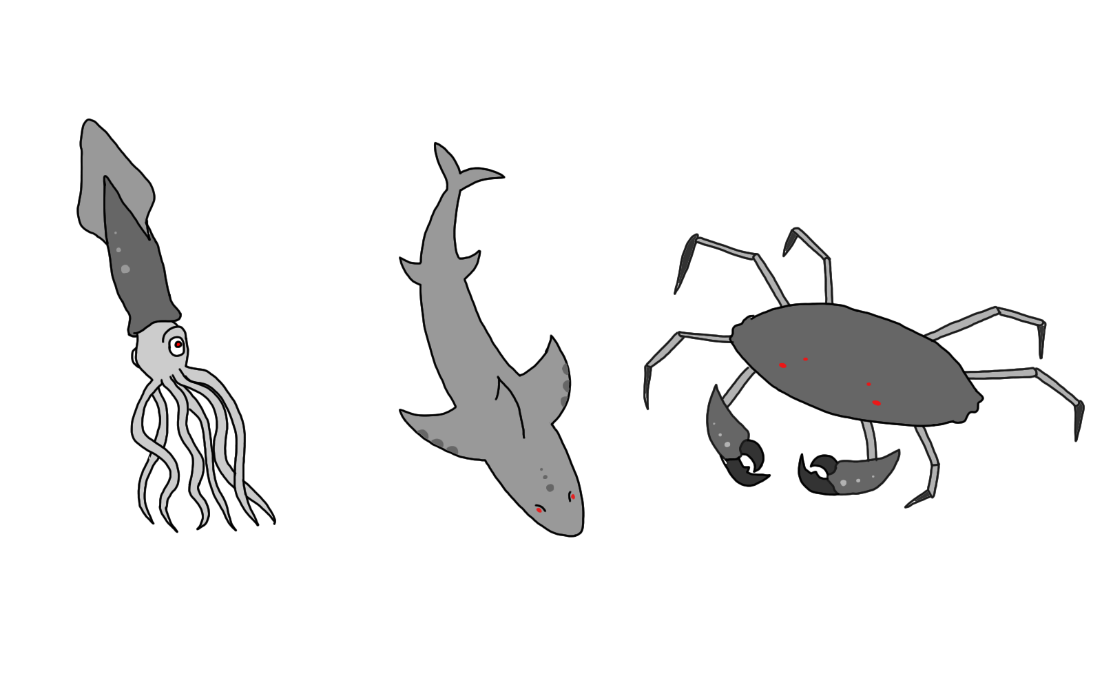 These are different design and sketches that can be used as placeholders for our game enemies. These images have been made using Autodesk Sketchbook as well as Photoshop as tools to draw them. They represent respectively the potential 3 type of sea creatures that the player character will have to face while controlling the boat character : a squid, a shark and a giant crab.