Concept Art – Week 6 + 7
|
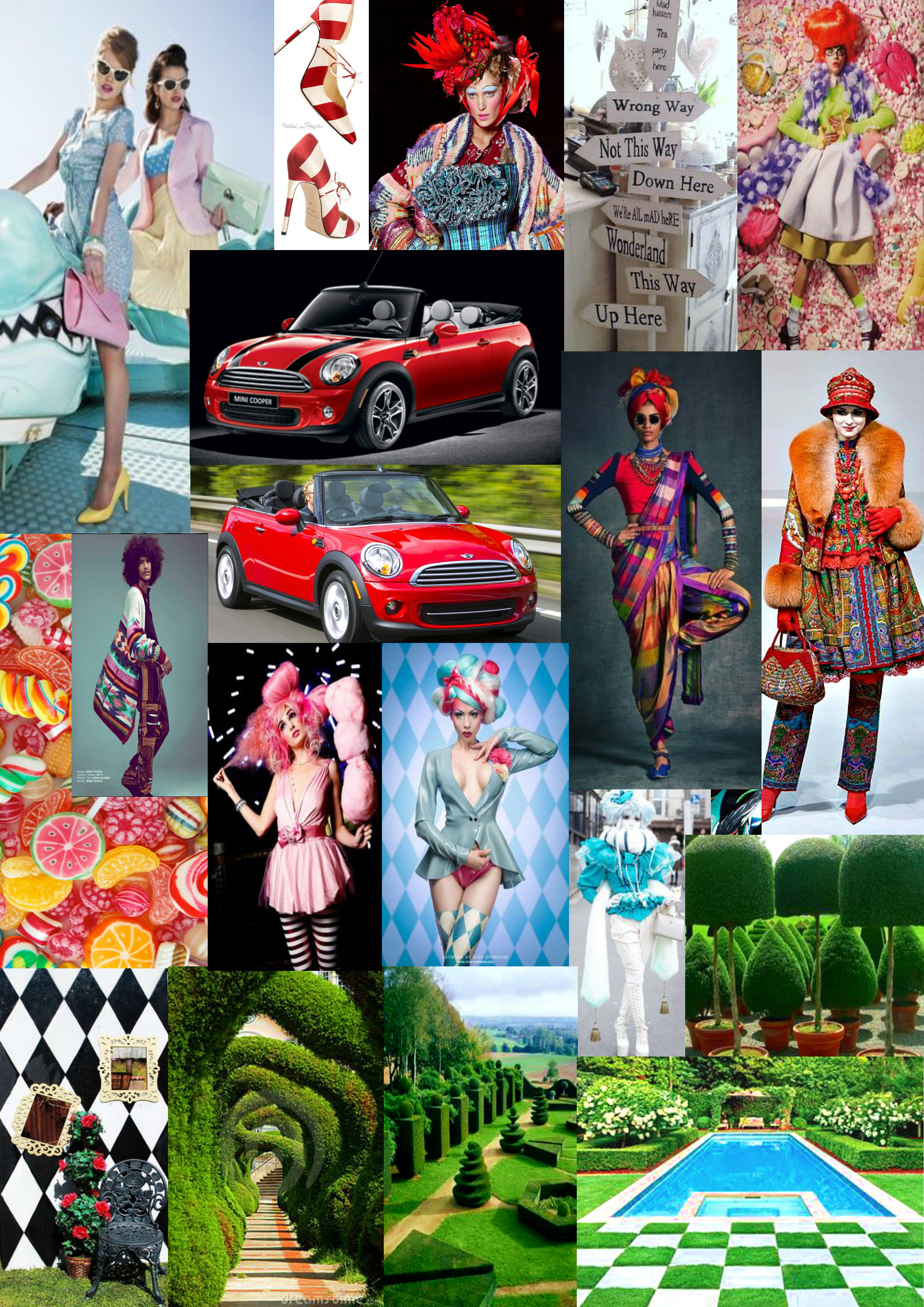
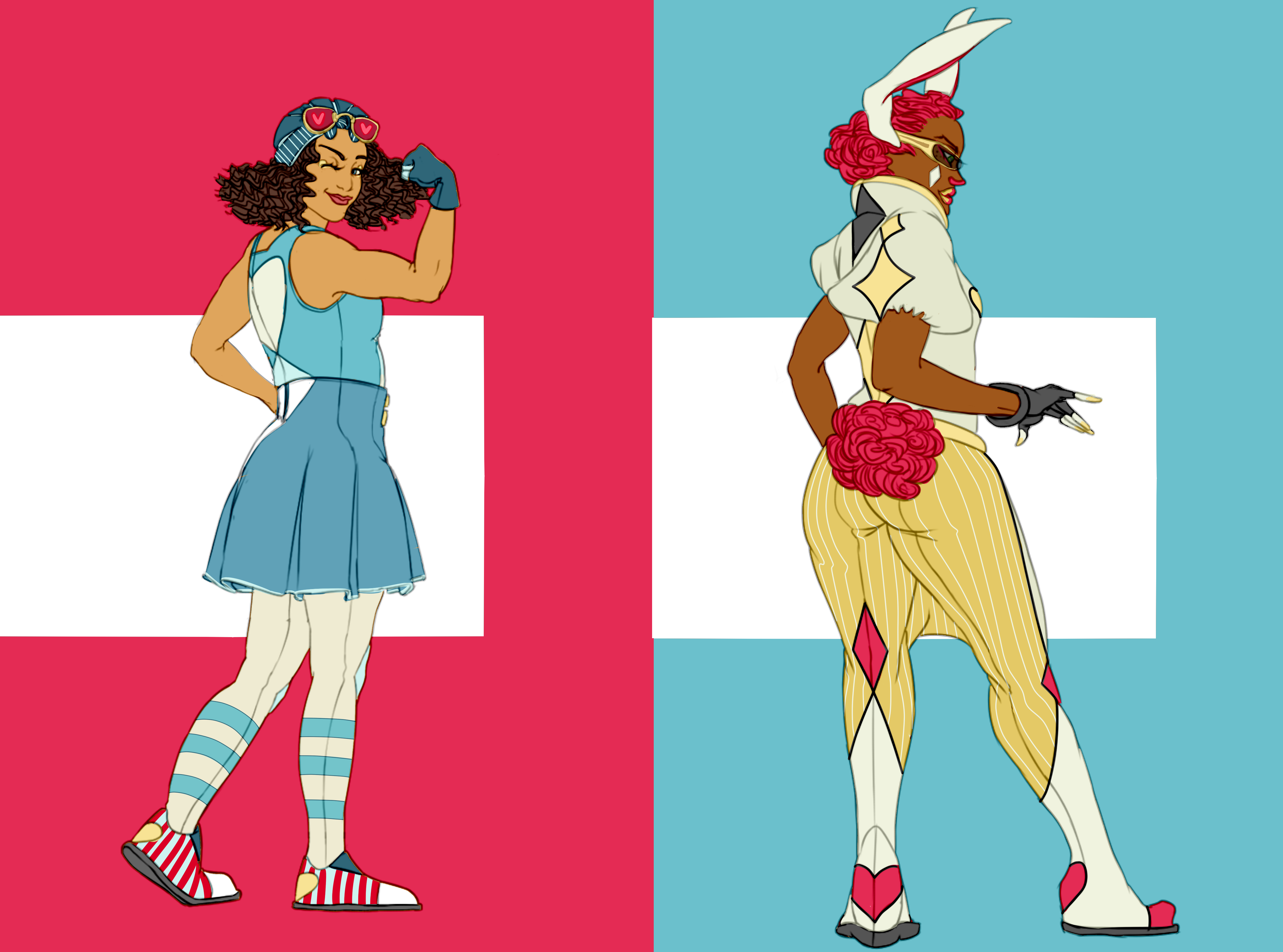
So these past weeks we have been working on character design assignments for an Alice in Wonderland-themed car commercial about a woman from the ordinary world who falls/dreams herself into the colourful and festive Wonderland. We had the script and some simple keywords to work with but besides that it was very much up to us to find a style. So first off we assembled a moodboard to establish the overall direction we wanted to go for (go go Pinterest-powers, activate!)
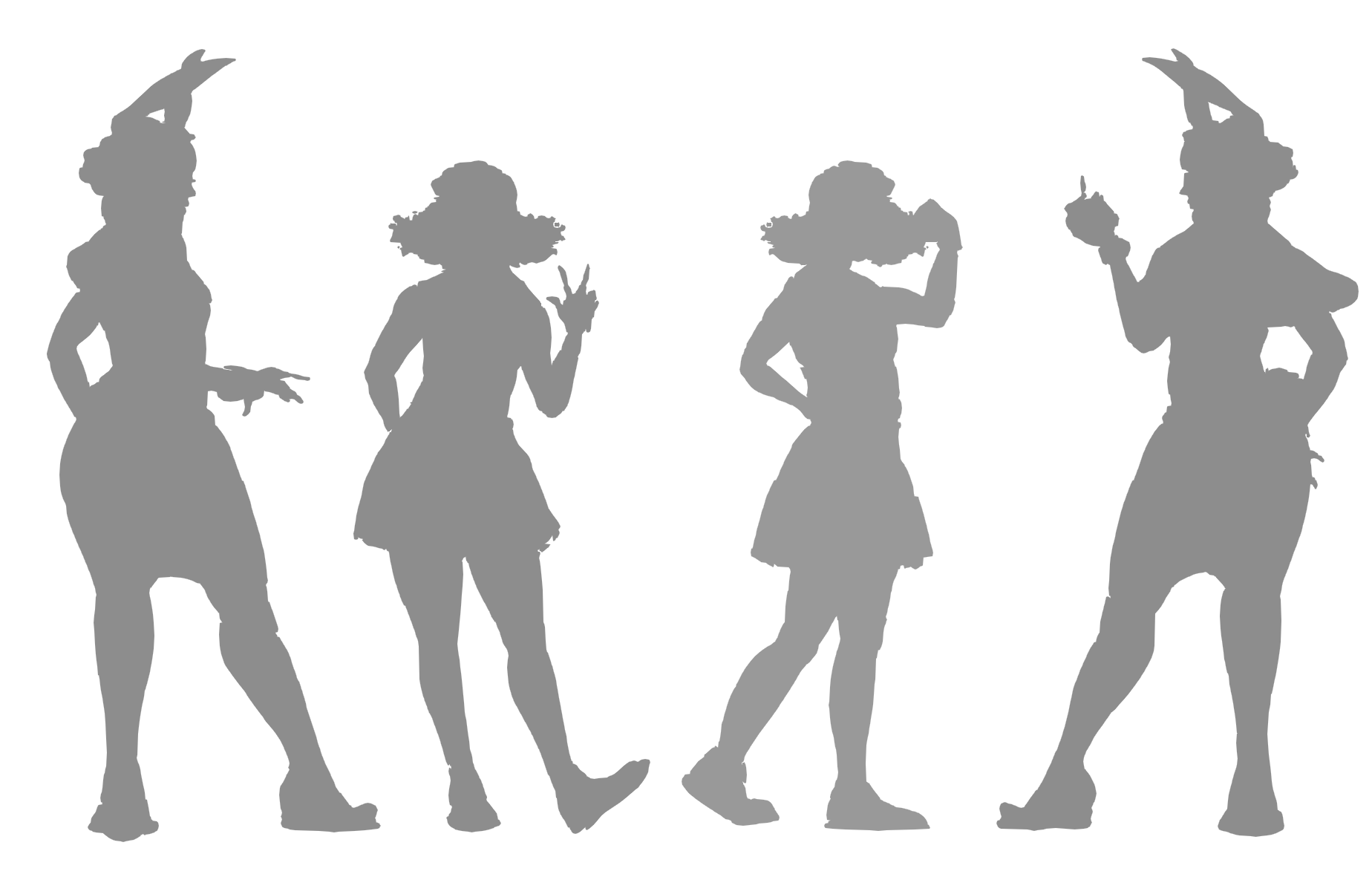
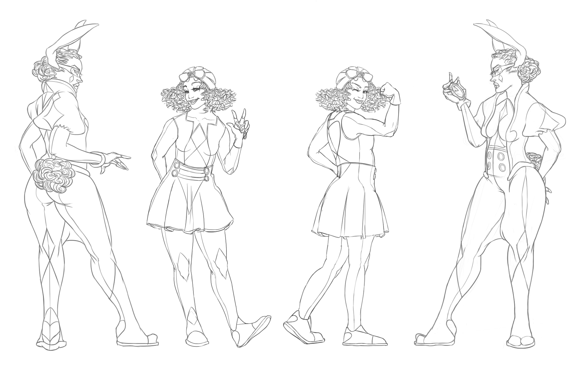
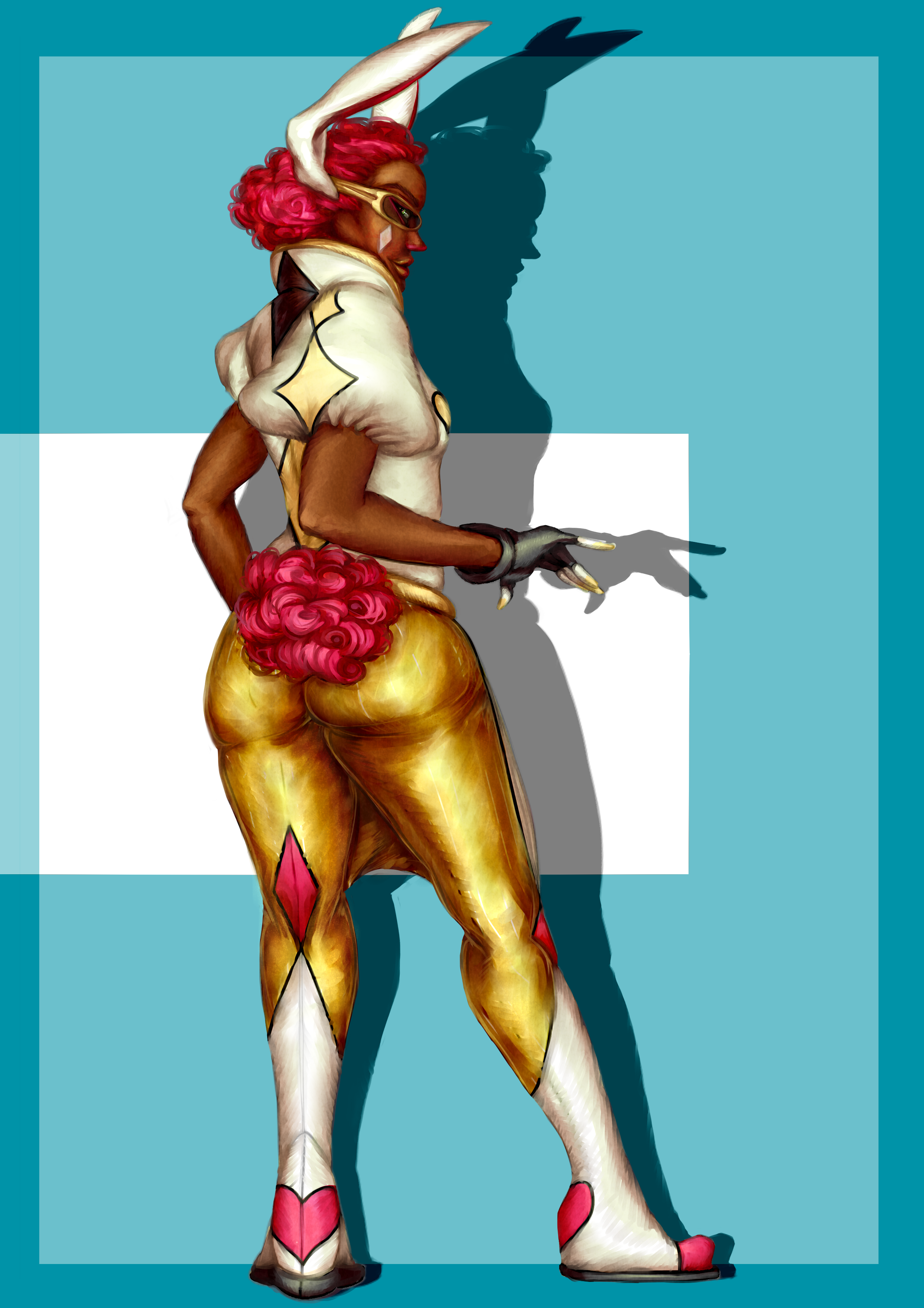
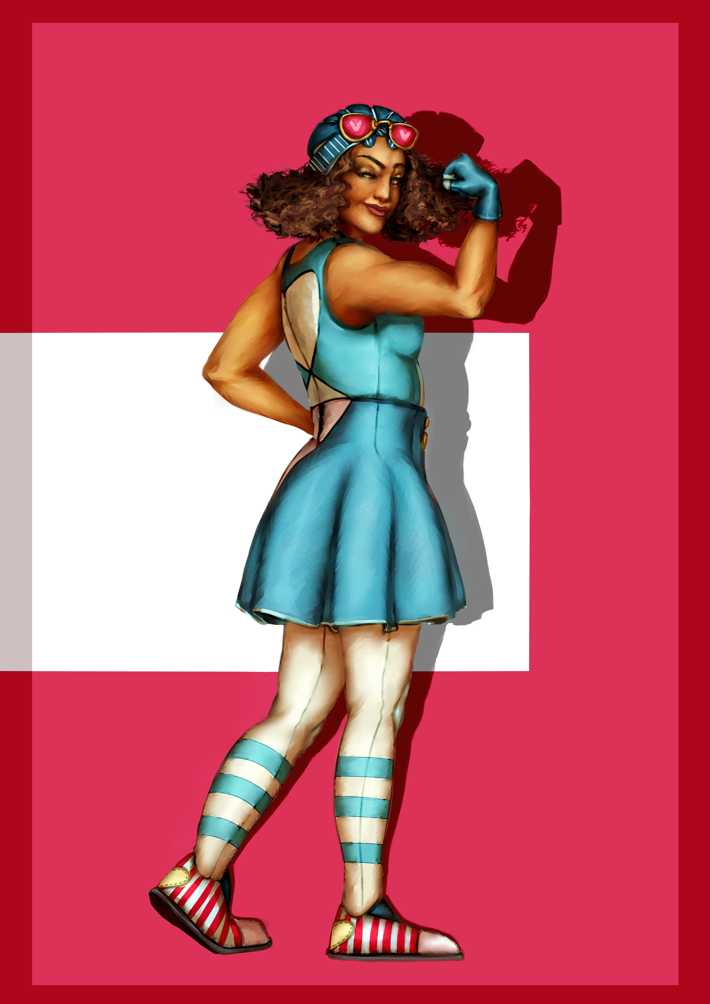
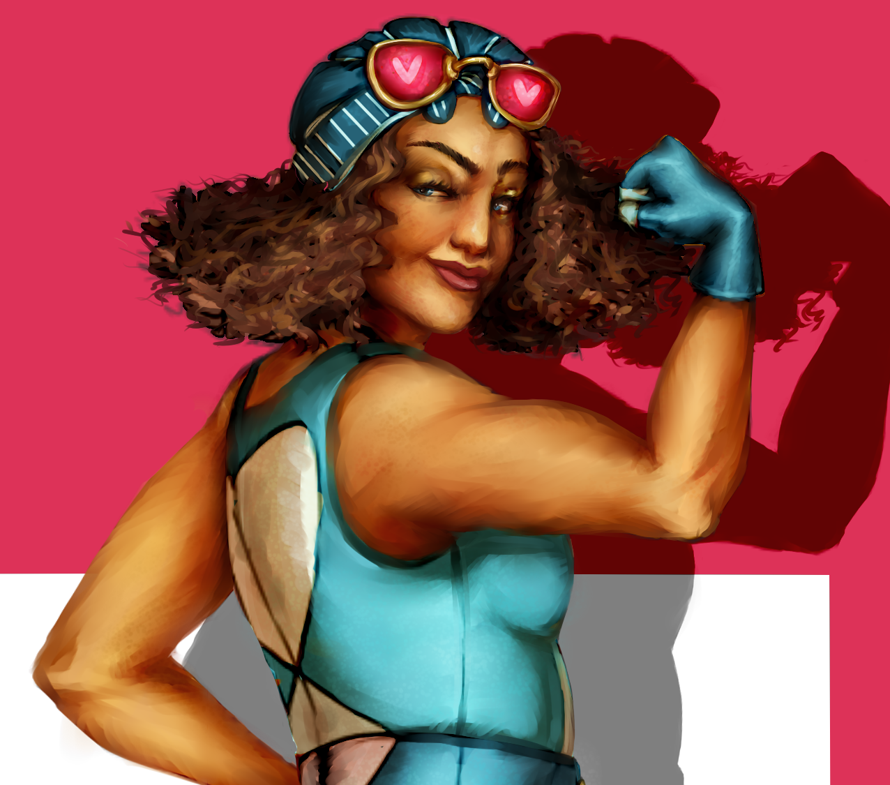
I like the idea of mixing a range of different influences into the designs but after some thought I decided on going for sporty chic with some of the signature Alice elements like the diamond patterns and Alice’s blue dress. For characters I decided to go with Alice and White Rabbit. Firstly: Pose, Personality and Silhouette I thought it would be neat if all the characters Alice meets in her “dream” would be Wonderland-counterparts of real life people. White Rabbit who is described as “usually tight-wound” in the script could for example be her sharp, tall, demanding boss. To contrast that, Alice herself would be shorter, more spunky and energetic. As far as clothing and hairstyles go, I wanted White Rabbit to look more outlandish and native to Wonderland than Alice. Their designs needed to be similar enough to be part of the same style though so they both share the diamond and hearts-patterns. It was a bit of a trial and error-tweaking until I got good readability on the silhouettes, like Alice’s fluffy hair and skirt-over-tights vs. Rabbits more sleek and pants-clad look. There’s also what works for a car commercial in character design vs what works for gamesin terms of how crazy you can go with your design.
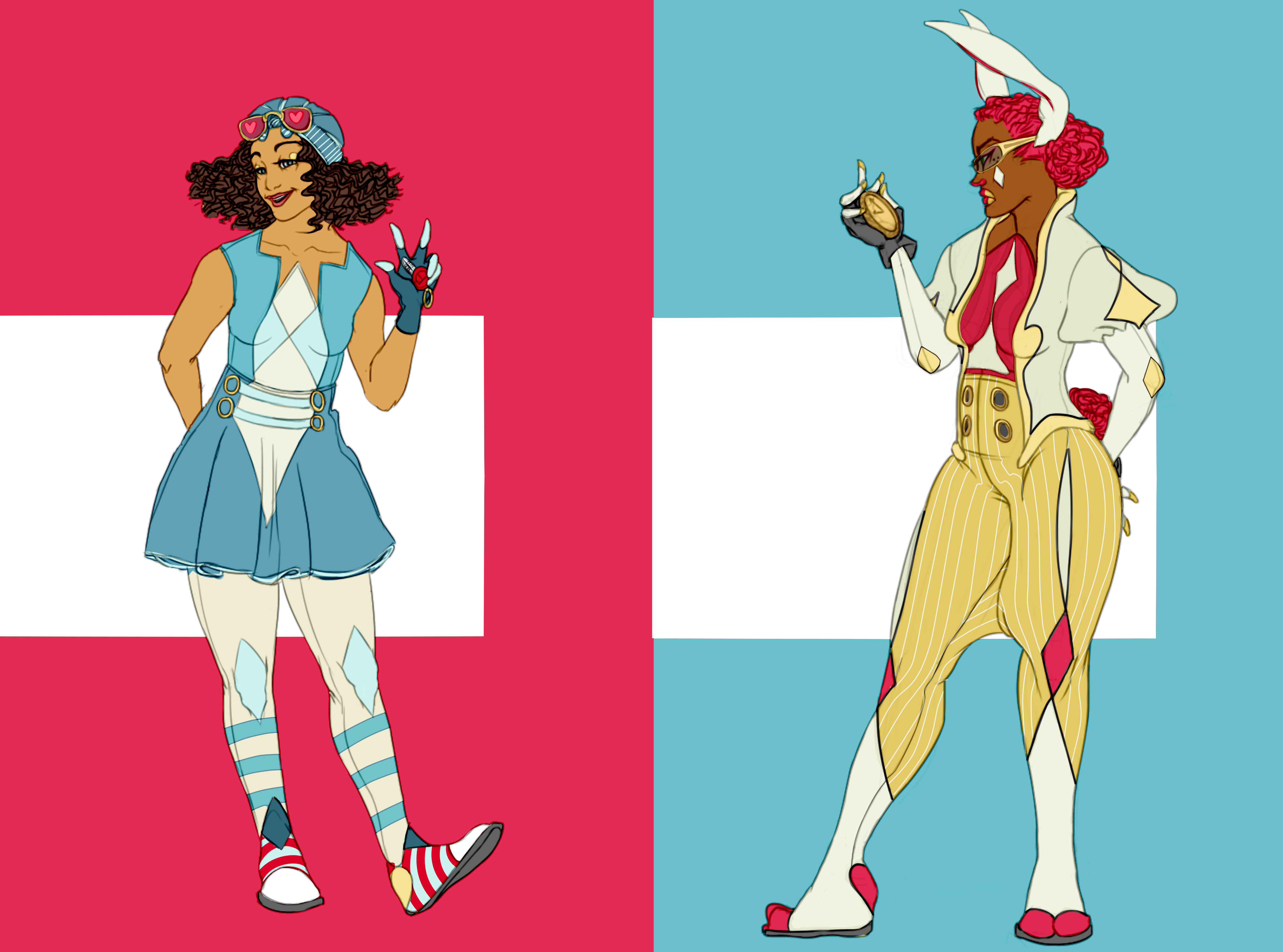
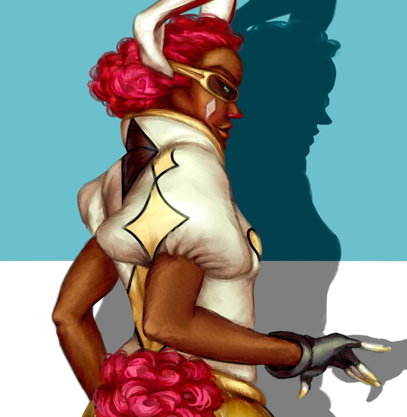
Secondly: Colour palette and texture. For colours I took a lot of inspiration from the moodboard. Again I wanted the Alice and Rabbit to share common elements and be complementary to each other but still readable. A. The backgrounds would be in a lot of saturated blues and greens, the colours had to work against those. So with Alice having the blue, I decide that besides the obvious white, the White Rabbit would have some hot pink in her outfit. I had to go back and make some tweaks to the design, like removing the long sleeves on both outfits to make the coloured silhouettes readable even without the lineart. I played with the thought of going with the standard blonde Alice but making her a dark brunette gave better contrast against the blue and the white. With the blue dress, stripes and diamond pattern she should still be recognizeable as Alice.
And finally, the rendering. The script especially mentioned “glamorous”, which doesn’t necessarily overlap with “sporty”. But I figured that the glamorous part could be reflected in the fabric choices, making them more glossy and festive. This time I didn’t make a greyscale value study underneath the colour which kind of shows. I think that’s something I’ll need to do for a while before I can start painting directly with colour. I did learn a lot about subtlety during this exercise though and got to try some new fun techniques I picked up from Youtube speedpainting tutorials. You often hear that you shouldn’t use the luminosity and shade layers to render your paintings to avoid getting too much white and black in them but doing that with colour and painting over that actually works pretty well. You get that shiny look with saturated shadows, a bit reminscent of 50’s pinup-posters. I used those to put down the basic highlights and shadows and then smeared that out streak by streak with the acrylic brush which gave some nice effects for example on Rabbit’s jacket (pants came out a mess though, I should have picked up some references for golden tights. The stripe pattern all but disappeared).
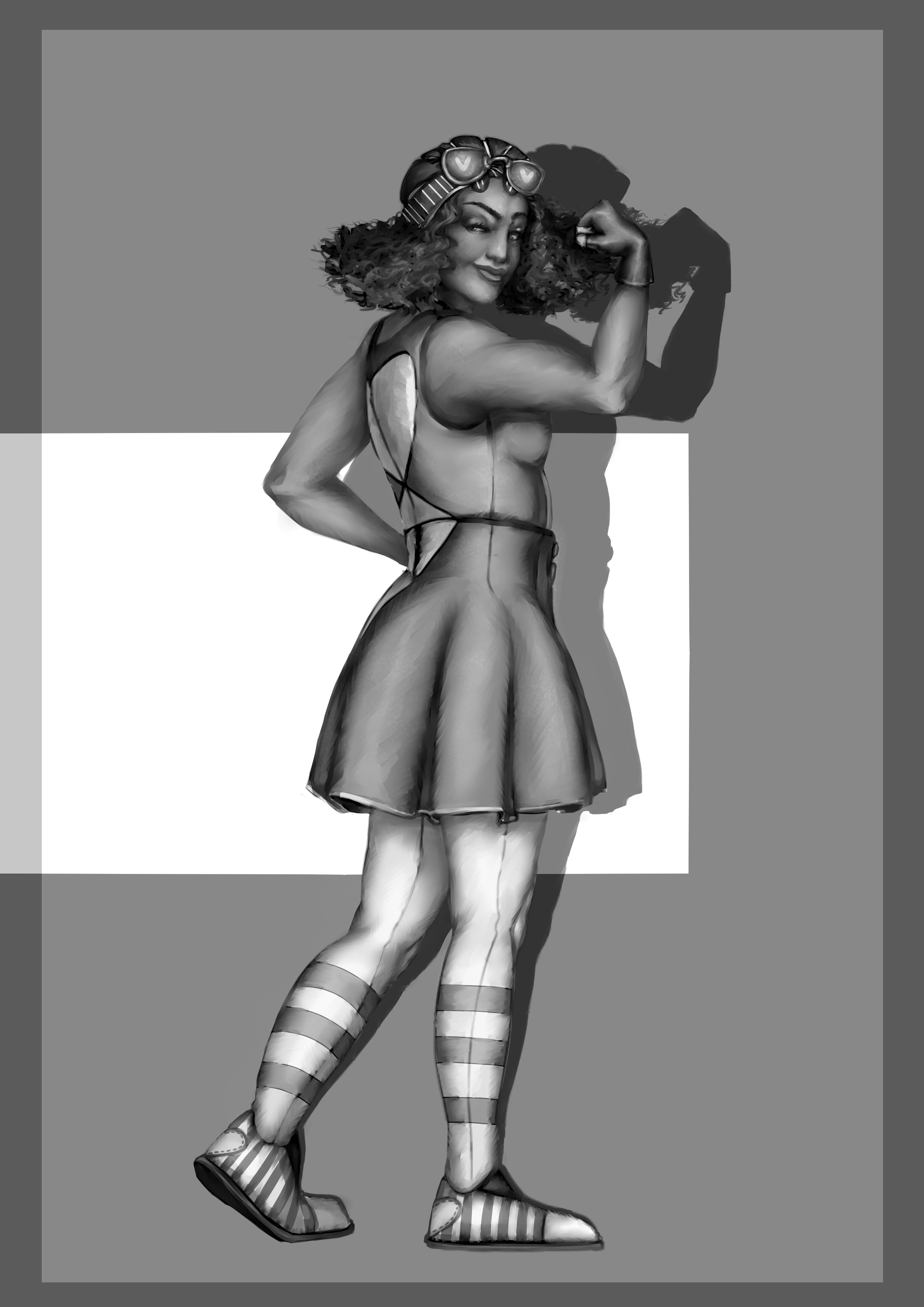
I still need to work more with my values and next time I think I’ll paint the values first, just as a reference if nothing else. The shadowing is also a little inconsistent and I think I need to take up my anatomy studies again. (You can see below how the values are pretty flat in some places in the picture below, especially in the skin).
All in all it was a very interesting and fun exercise. I found things I need to keep working on and some painting techniques I really like. Merry Christmas and a Happy New Year! |