Space Shooter Project. Blog 5. GUI
|
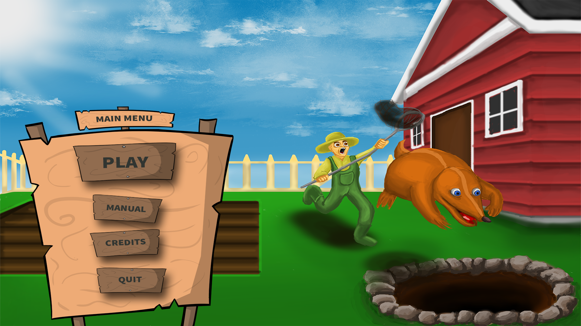
So this week I have been working on the overall GUI for our game Mole Munch. This includes all the different menus and screens as well as the final HUD for the game. It has been a bit more work than I expected, probably because I made it slightly more extensive than it would actually have to be. Just as a quick example I made a level select screen because we planned some additional smaller levels as well as a small tutorial which we will probably end up ditching because of time constraints. So I am going to be showing some picture and coordinates which I gave to my programmers in order for them to be able set this up in the game. So this is the menu design for the startup screen (note that it is not me that has done the background image):
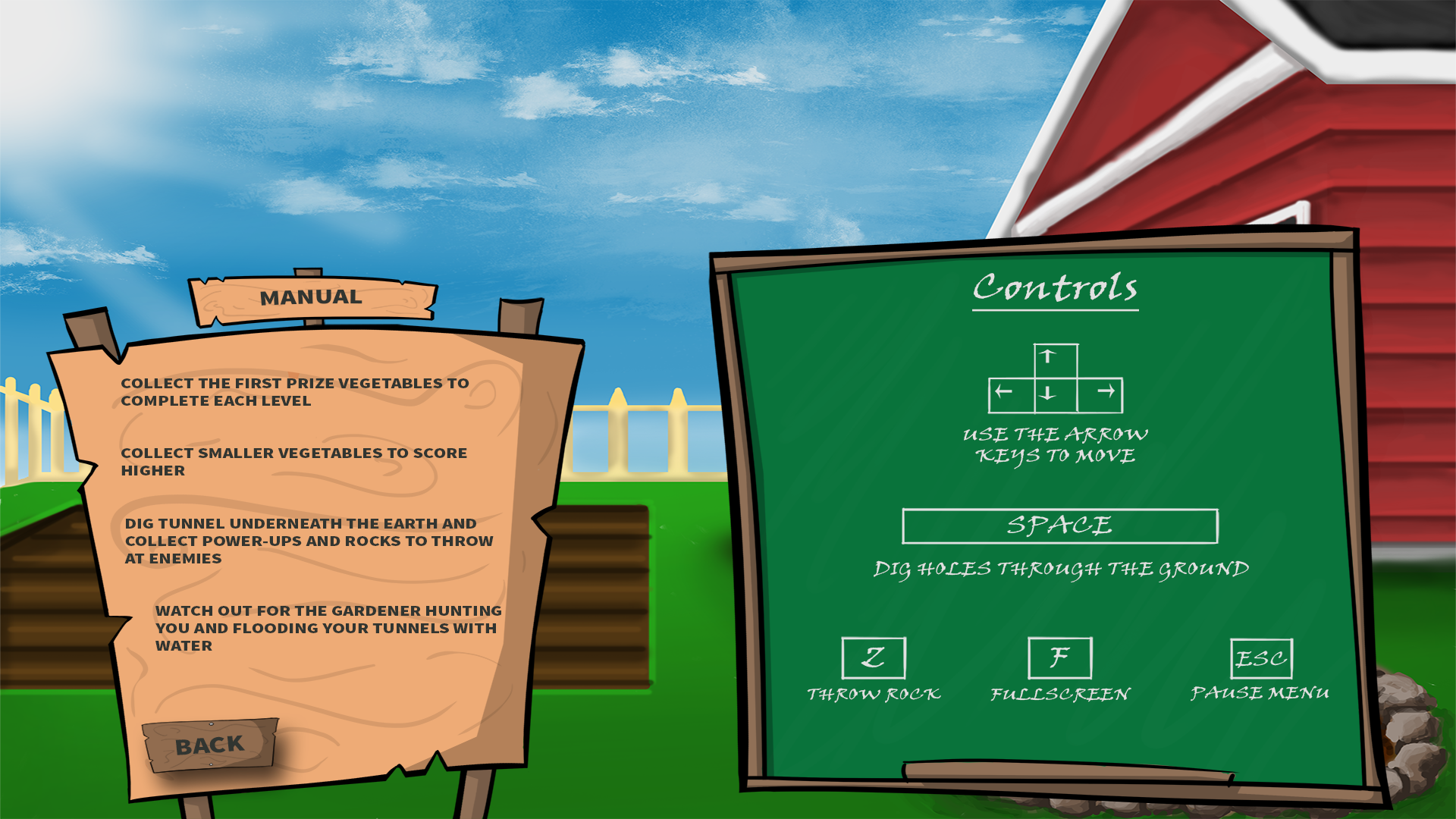
And here is another of what our manual page looks like with some simple control instructions. I might add some additional pictures and text to this screen to give out some more information:
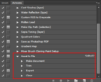
But all images and text are separated in different layers in Photoshop in order to be able to properly set up sprite sheets with all the different items. I seriously recommend (for other graphic people like me) to set up actions for saving out png Images, not only for full images but for folders/layers as well. This will save you an enormous amount of time and pointless clicking on “save as” and other mumbo jumbo.
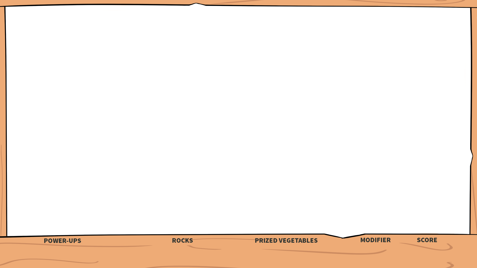
Here is a nice page describing how to set up a very efficient way of saving selected layers/folders as png files with a single click: http://viget.com/inspire/single-click-layer-exporting-in-photoshop So back on track. This is the empty screen I sent off to the programmer to use as a base:
And this is the sprite sheet I created alongside with it to set up all the different menus.
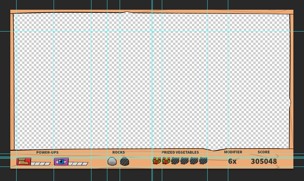
My programmers wanted it set up in this manner with all new items starting on 0 on the X axis and then animations accompanying to the right. So since a lot of items where different sizes I needed to make some explanations. So I made a txt file that explains the size of every sprite and its location. To get the green “select” version of the panels you simply add the width of the sprite to the X axis: EX: 1 “Artifact” x, y, width, height SHEET: 1 play 0, 0, 393, 185 2 manual 0, 185, 283, 149 3 credits 0, 334, 283, 149 4 quit 0, 483, 283, 149 5 tutorial 0, 632, 283, 149 6 level1 0, 781, 283, 149 7 level2 0, 930, 283, 149 8 main menu 0, 1079, 333, 84 9 level selection 0, 1163, 333, 84 10 manual 0, 1247, 333, 84 11 credits 0, 1331, 333, 84 12 board empty 0, 1415, 904, 781 13 board controls 0, 2196, 904, 781 14 back 0, 2977, 233, 128 I have never really set up a lot of sprite sheets before so it took me some trying around to get a nice workflow going. So the first one took quite some time, but after that was done I was able to produce them at a significantly higher speed. So I did some work on the HUD as well. This is what I wanted the HUD to look like:
And this is what I could send so the programmers to use as a frames image for that game.
Everything else was saved into sprite sheets similar to the one I showed before (with proper documentation). In addition to this I also used the sprites in the HUD together with grids in order to get coordinates to every items position. Like this:
By doing this I could send an additional txt file to the programmers which would make it easy for them to import all the different sprites at the correct position and with the correct spacing. It looked something like this: EX: Sprite x, y, : Speed Powerup: 40, 1006 Vision Powerup: 295, 1006 Rocks(2x): 658, 1000. spacing: 85px Melons(6x): 965, 1000. spacing: 64 px modifier: 1478, 1010 score: 1705, 1010
So that’s some of my work this week. Hopefully this wasn’t to gruesome to get through as a reader. |