Fixing a Level Design
|
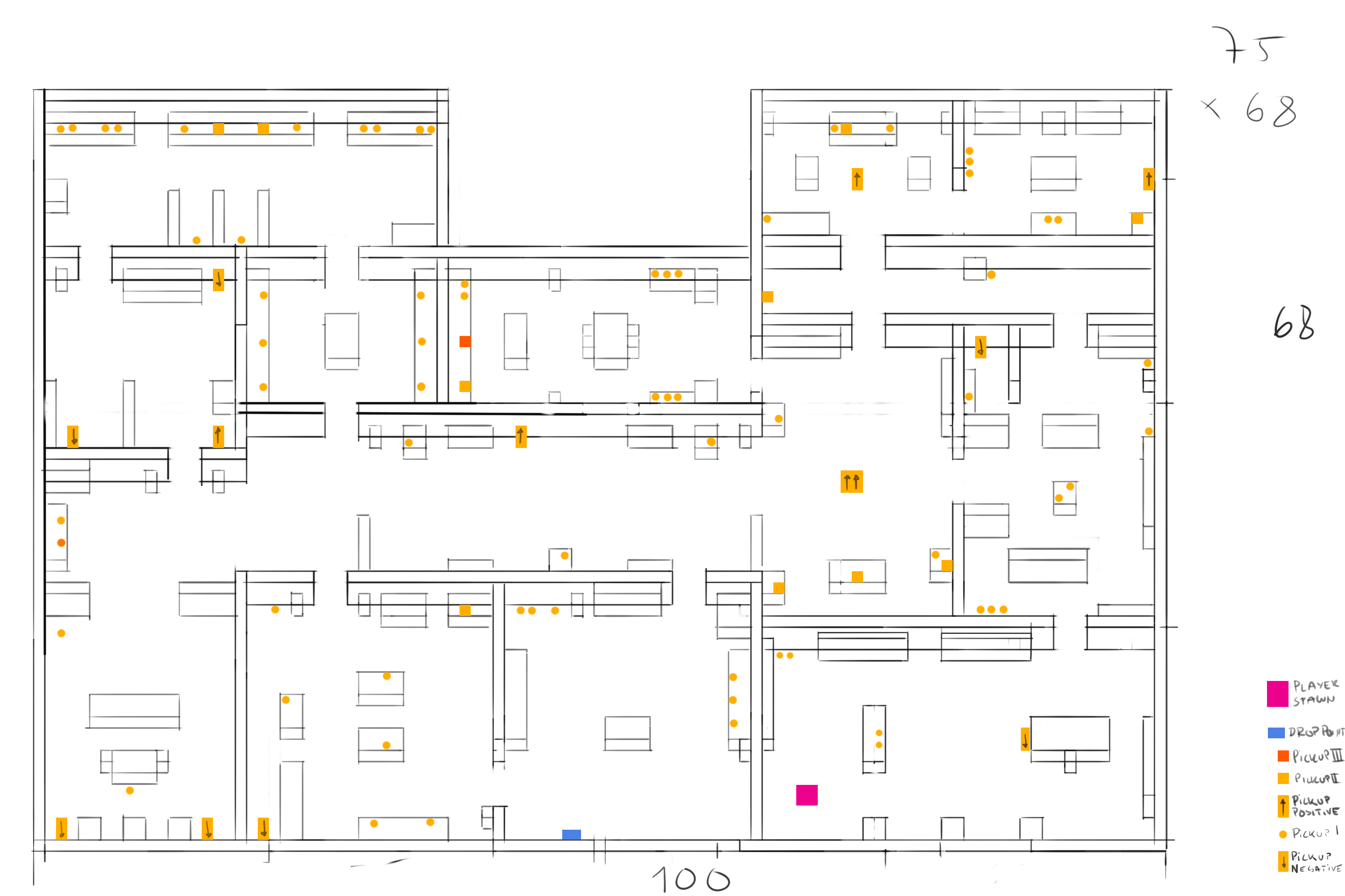
So I dedicated part of this week to restructuring our level design map. The initial map were only lines and thus it was really cluttered and hard to read. The point of the map is to provide the person who builds the map with the information necessary to do so. Everything need to be easy to read, easily discernible and provide a clear structure to follow when building it. The first draft I made failed to deliver on all of these points.
Another problem with this design is that it was too spacious, we figured this out after playtesting, there simply wasn’t enough clutter in the actual map to provide a challenge, either that or the player felt bored walking through the map. So before fixing the structure of the map, as drawn, I had to fix the actual level itself. Part of doing this was to split existing rooms into smaller rooms and adding even more furniture to the map. The map above is version one and it was made before any of the actual furniture was drawn, the problems that arose because of this was that several of the actual objects placed in the map had the wrong dimensions, proper structure of the objects done in advance would have prevented this issue. Moving on to version two of the map…
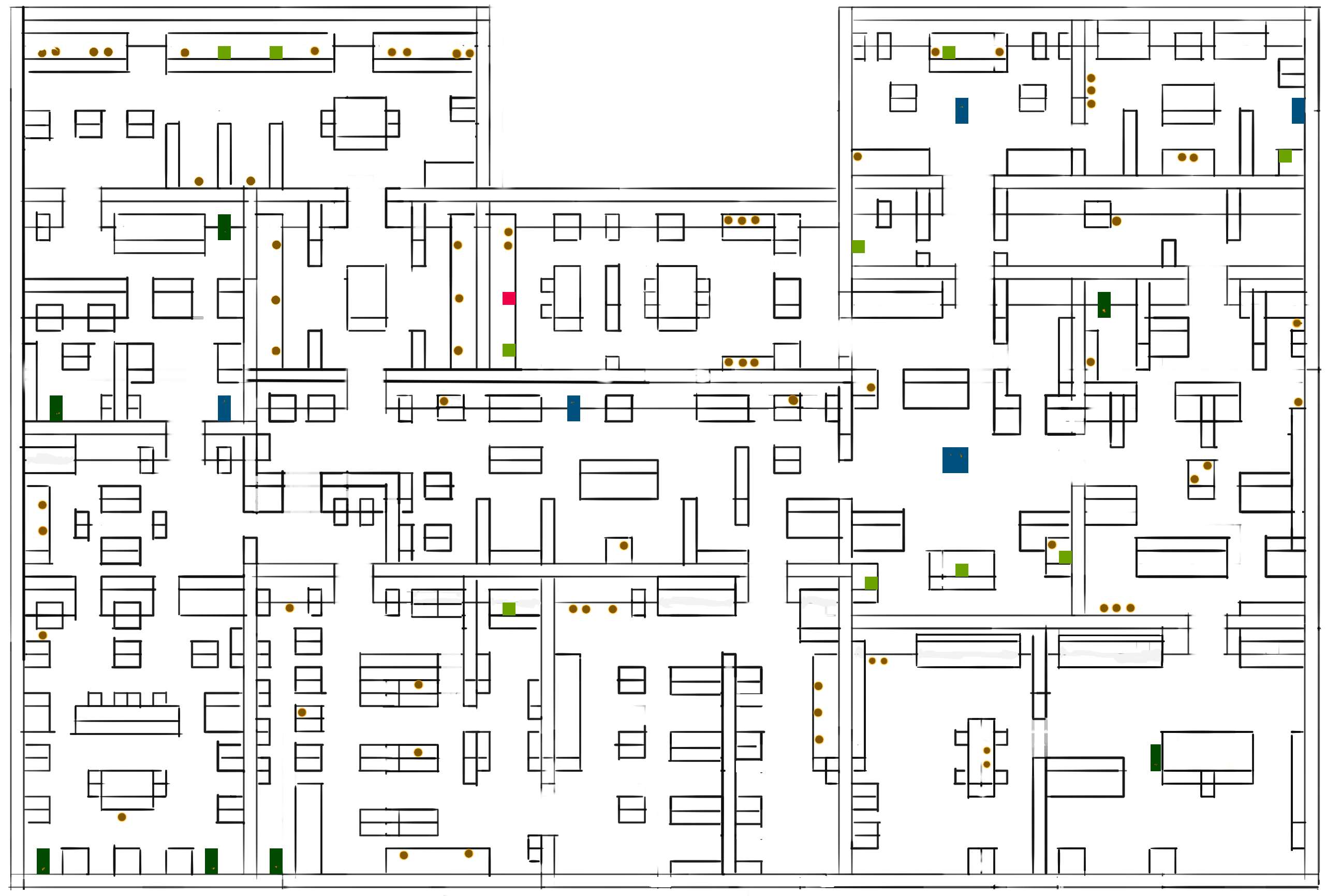
After cleaning up lines and correcting several objects it was also decided to change the color of the pickups and other interactive objects in order to make them easier to tell apart. I also removed the legend and put that as a separate file. Now after adding more walls and objects in order to make our level more maze-like we had to tackle another problem we faced during playtesting. Our level was too big and the player got lost in our level, this problem was easy to fix though as the programmers later added a minimap displaying the level and thus making it easier to navigate.
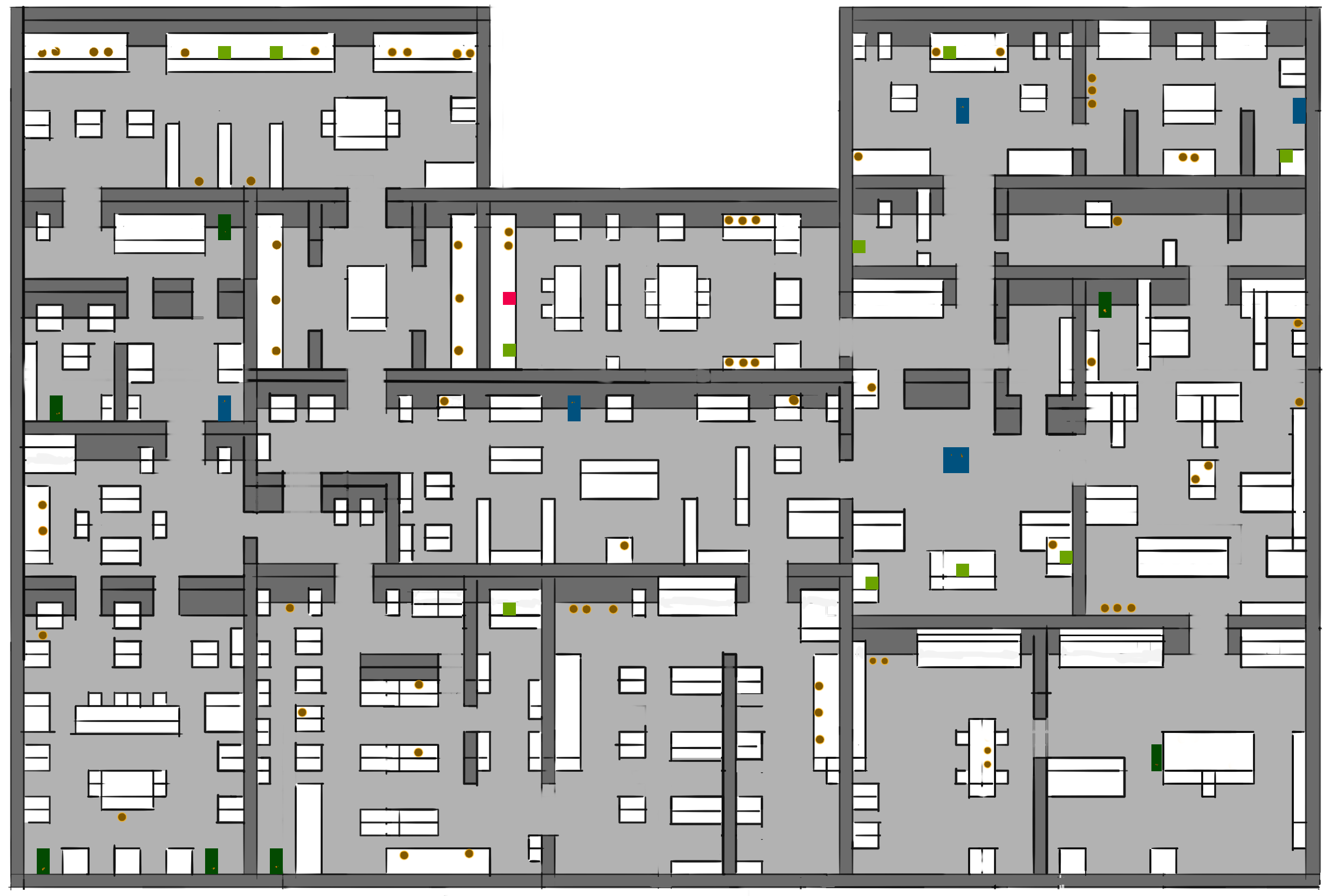
The last issue I had to deal with was how the map felt cluttered, when you looked at our map it was hard to discern walls from floors or objects. My solution was to color-code these different parts in order to make them easier to make out. In this example I colored the walls a dark gray, the floors a light gray and all objects in white. I wanted to keep these colors in the same spectrum since it would have otherwise become even harder to look at, if I would have gone with pink floors and green walls with blue objects for example. Also, all of the pickups and whatnot stand out more from the grayish background. For the level builders I made another version of the same map but with a tile-grid. That’s all folks! |