Magic Writer – Blogpost 3
|
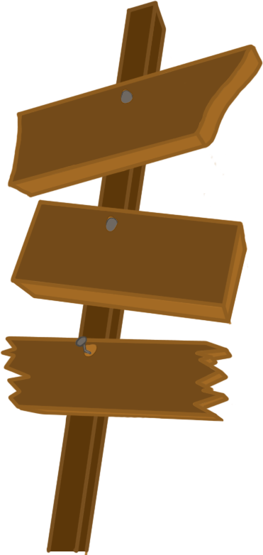
Another week of production, another week of blogging. It feels like I will not have that much to say today due to this week not being so productive, at least on my part. This is partly due to a small change that the group agreed on, and that was to change the sound that came when the player successfully casted a spell. We had earlier decided on a “poof” sound for when the thought bubble disappeared in a cloud of smoke, but after several weeks of looking, the only once I found that were any good cost money to use, and that was without a question a no go. So when the group agreed on changing the “poof” sound to a “plopp” sound, the kind of sound you can find in cartoons when bubbles bursts, it only took me a matter of minutes to find a few good once that were appropriate. Sorry don’t have them ready for show at the moment, will edit in a link later. The other thing that I was assigned to do this week were the buttons for the main menu. They were originally meant to be square boxes in the middle of the screen, very plain and simple, boooring. I had my own idea to make them a bit more interesting and more a part of the game, so instead of just having the buttons floating in the middle of the screen I wanted to make them part of the scenery by having them as wooden signs next to the beach. I figured that the best way of showing the idea way by showing them a sketch of it.
So a couple of thoughts that I had while working on it were the shapes of each sign. I wanted the Play button to be a bit welcoming, so out off all the signs, the play button is the one with the least sharp edges and has a more rounded shape compared to the others. But I also wanted it, compared to the other signs, to guide the player, so it is shaped as if it is pointing “this way to the game”. I was also told that they wanted a secondary color of the signs for when you have the pointer on the buttons. Due to the shortage of time I settled with just making them a bit darker and changing the color of the text for the time being.
They will not all darken at the same time, this is only to show their secondary colors. A few changes that I am planing to do with them is to add a bit more effect to the pole holding the signs, and making the text on them as if they have been carved in instead of just painted on. And that wraps things up for this week. Wow, I seriously did not think that I had this much to say for this week. Until next week, take care. |