Building a Spaceship With Tiles
|
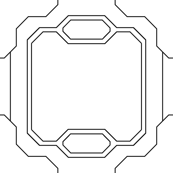
Four weeks ago me and the rest of Team 5 started the development of the space shooter ”The Last Signal”, originally designed by Team 10. For this project I chose to take the role of Lead Artist, along with the responsibility of producing and shaping the visual tone of the game. A Level Designer was also chosen in the group, with the assignment to design and build the different level maps in the game. In order to decrease the workload of the Level Designer the group decided that the Lead Artist should make tiles that could be combined to make every room or corridor the levels would require. Everyone agreed that this was a simpler and more time-saving method than should the Lead Artist or any other graphic artist spend time to build every map from scratch. It would also remove the risk of clashing different art styles when building the levels of the spaceship. Everyone uses the same tiles. Granted, some of the levels will need to look different to add variety to the levels and introduce different parts of the ship. The engine room would not look the same as the living quarters or the greenhouse, for example. The ship is a science vessel on a mission in outer space so it made sense that its interior would be clean and sterile white, just like the uniforms of the people inhabiting it. The interior might appear empty and boring but that matches the mood of the majority of the ship. Most of the variety and color will come from the various props, stored in the different rooms and corridors, not from the rooms and corridors themselves. Most of the ship will not even be visible during the first part of the game as the energy is out and the ship will be covered in darkness, only sparsely lit by only a few stationary red floodlights, guiding the player through the level(s). I knew from the beginning that the most challenging part of creating these tiles would be to make them compatible with each other, no matter how they would be assembled. I sketched out a room that would be able to be constructed with approximately four tiles to see how a smaller room on the ship would look.
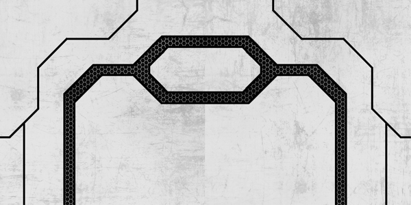
From there I made two tiles showing the upper part of the room to test different textures for the tiles.
Most of the work process consisted of aligning the mesh lines to link seamlessly with one another. Even though it made my work harder I felt that the metal mesh lines needed to be in the level. The lines are meant to guide the player through the ship aside from the stationary lights and the player avatar’s own flashlight. There is a reason for the split entrance/exit lines to be different from the standard single wall lines. Not only does it add variety in the pattern but the separation and reunion on the lines are meant to symbolize the joining of two separate rooms in the same interconnected infrastructure of the spaceship, represented by the single mesh line. So this is what the final result looks like. This is a sprite sheet for the existing tiles. More updates to come! /Erik Ögren  |
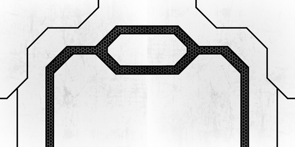 I realized that the textures were clashing too much from tile to tile so I tried to soften up the edges of the tiles to better hide the fact that they were two separate parts of the same ship. More tiles were soon added to the roster: Entrances and exits, walls facing north, south, east and west; each with extensions to make either an entrance or a wall longer if necessary. The process of making tiles was far more time-consuming than I had anticipated at first. Not that the pattern or texture was difficult to reshape for the different tiles, but because I had decided to add a metal mesh texture to the sub floor I had made my work harder than it needed to be.