Ambient Pressure: the Diver
|
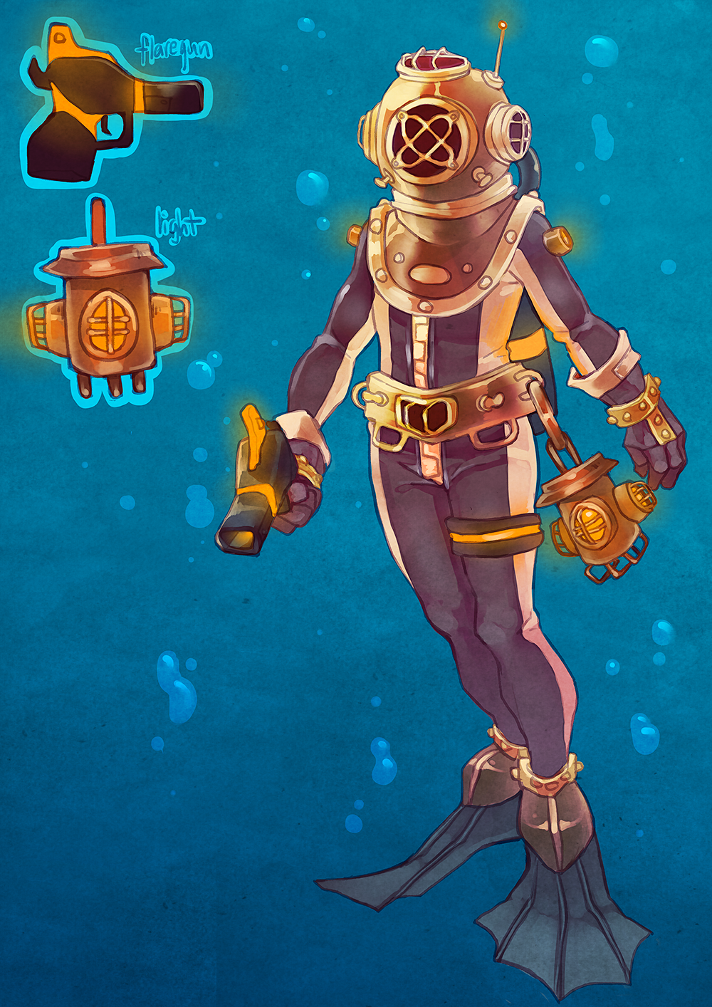
Our game is about a diver who is on a mission to find out what is going on with the underwater life in a specific place; there has been sightings of mutated fish. The goal is to dive down to this sunken ship and collect as much samples as needed to test what is really going on down there. There will also be angry mutated fish, which you can not kill easily (not by yourself, at least); but tricking them is easily enough when you have access to a flare gun and the fish are attracted to light. Since the player would be pretty important to get finished early on in the project, I decided to work on the design for that first. Below is the finished base sprite:
Here I’ll walk through the process and why I made the decisions I did. I wanted the diver to be clearly visible in-game, even in the dark environment. I still wanted the diver to be discretly dressed, as divers usually are. Why would a diver wear a completely white suit in a dark and dangerous area? That’s why I decided to keep the general dark color scheme, but added light stripes to the suit, to guide the player’s eyes more easily against the dark background. I also knew that at some point, the player would be forced to put out their light, to avoid fish. I did not want the player to lose their sense of where they are on the map, which is why I added glowing elements to the design. By adding lights to the head, shoulders, hand and hip area; the player can still determine the diver’s position easily. I chose an orange glow to give a good contrast to the blue water. After a discussion with the group, it was decided that we wanted an ”older” look to the diver, instead of a modern and sleek one that the previous group had. It was mostly because of personal preference, but also because we thought it made more sense with the concept (for example the bad light and inability to deal with monsters). My group specifically asked for ”one of those old diving helmets”, so that was our starting point. We did not want the equipment to be completely outdated, though, and decided to mix the modern and old; kind of aiming for a mild version of steampunk, I imagined a universe which is not as developed in all areas. This is also one of the reasons why I changed the glowstick gun to a flare gun (magnesium); it suits our ”older” concept better. We also thought it made more sense since the glowsticks have to go out pretty quickly, which glowsticks do not. After thinking this through, I started out with a concept. I looked up some references of old diving helmets, to use as inspiration. I couldn’t just slap on an old diving helmet without it looking out of place, which is why I added similar elements to other parts of the design, like the belt. I then drew a quick one traditionally in my sketchbook and showed it to my group, they approved of it (with some small changes) and I continued to draw it digitally. I especially liked using one of those old diving helmets in this case because it really contributed in my attempt to make the character gender-neutral. Here’s the finished concept art:
The sprite turned out very similar to this, but not exactly, as you can see. I knew from the beginning that all these details would be a pain to animate, but both the group and I would very much like it to look like this. I’ll do my best animating all the small details, but some may be removed during production. The programs used for this was mainly Paint Tool Sai, but also Photoshop CS6. Research was done too, using Google. |