Insight #6 – Behemoth Postmortem
|
This week I’ll offer a postmortem analysis on the game Behemoth developed by Team Jabberwock for the Shoot ’em up course in the first year of the Game Design program at Uppsala University. To begin with, I would like to offer a brief overview of the project. The game Behemoth was based upon the homonymous design document developed by Team Bugbear during the first semester of the education, its main aesthetic is ‘Feel like operating heavy machinery’. The game is a 2D top-down shoot ’em up with an arcade pixel art-style in which you take control of a gigantic spaceship and its defense systems, your goal is to break through waves of enemies attacking you and get to safety. The player’s control is focused solely on the movement of the cannon and the shields to create a strategic and paced shoot and defend motion, since in fiction the ship is so big that it would be impractical to have it move in any direction other than directly forward. Behemoth includes three distinct stages of increasing difficulty with three types of enemies clearly distinguished by orthogonal unit differentiation and behaviour, a variety of attacks that the player uses to approach the different enemy types, and a small tutorial stage, a game over, and win scenario to offer a complete experience.
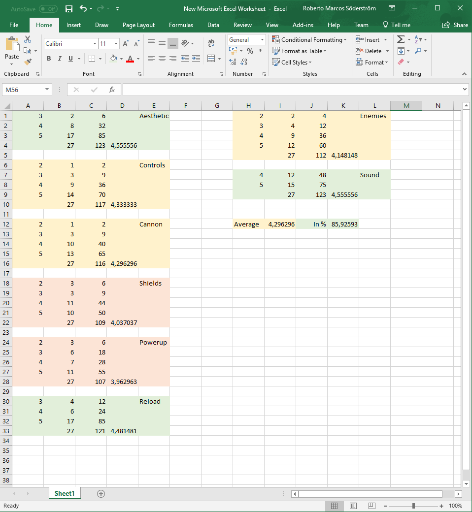
We began development on the 15th of January 2018 and released our final build two months later during the Gold playtesting session on the 15th of March. The team followed the SCRUM methodology and was composed by 6 team members (special thanks and team composition listed at the end of the post). We used Unity as our game engine, as mandatory for the course. Our biggest take-away for the project is undoubtedly the fact that effective communication and working together are great tools all teams should use to avoid unnecessary complications. We struggled with keeping a cohesive vision for some elements of the game during the initial stages of development but managed to get the whole team on the same page thanks to meetings and the invaluable tool that a whiteboard to doodle on is. What went wrong? During the development of the game we faced several challenges, some affected the team interaction, others the design of the game itself, and others were more technical in nature. One of the biggest mistakes we made was not knowing (or not thinking about) our strengths and weaknesses when it came to actual development, we should have had a risk assessment session during pre-production. A lack of communication and clarity slowed us down during the middle stages of development and made the Alpha and Beta builds of the game not live up to our full expectations. Some design decisions were not fully established during the pre-production phase and ended up causing delays and some frustrations when we had to re-arrange elements later on, an example of this is the way we implemented the reload function, which we managed to solve after analysing feedback from our users during the Beta. Technical issues could probably be pin-pointed as the origin for most of the discussions we had. We had trouble implementing our pixel-art assets into Unity, as the resolution change created visual artifacts and a decrease in quality; this was never fully solved but was brought down significantly after learning more about how the engine behaved and treated the assets, we still feel the game could have been much more visually cohesive if we knew the tools better. We also had some trouble on the code side of the project, unfortunately that is not a field in which I have experience, so I could only observe the results of the errors. We also had feedback that focused on the lack of adaptability of the controls (mainly key re-mapping), something that was never in our scope of production but that would have been a nice addition when considering the final user experience. What went right? The game actually works! After the 8 development sprints we had a fully playable game that was well-received in playtests (with an aggregated score of 85.9% in our final survey) and we were happy to call our own. The overall aesthetic was very well defined thanks to a strong team-vision and clear concept document mock-ups with strong outlines and use of Orthogonal Unit Differentiation that translated well into our adaptation of the game. When conceptualizing the game artistically we decided very early on that we wanted an arcade feeling to it, so all our assets were designed in a pixel-art style with 8-bit music and SFX. We also decided we wanted the game to teach the player how to control the ship from the very beginning and limit the amount of in-game tutorials to a minimum, essentially following the diagetic principle “show, don’t tell”, and taking inspiration from classical game design philosophies and developers, especially Nintendo: “Once the player realises what they need to do, it becomes their game” (Shigeru Miyamoto, 2015). This proved very effective and appreciated by testers. Team members and special thanks This game would not have been what it is without all its members: Jad El Masri (Lead Code), Niklas Ericsson (Producer), Jesper Karbing (Lead Sound & Art), Joakim Malmström (Lead Design), Isac Torsson (Code) and myself (Lead Art).
You can download and try out the version that was available during the latest playtesting session from this link. Have fun, and please do feel free to comment on your experience! Reference list Shigeru Miyamoto on the design of World 1-1 in Super Mario Bros. (~2:40) Spreadsheet with ratings from our last playtesting session.
|