Power up- Cormorant
|
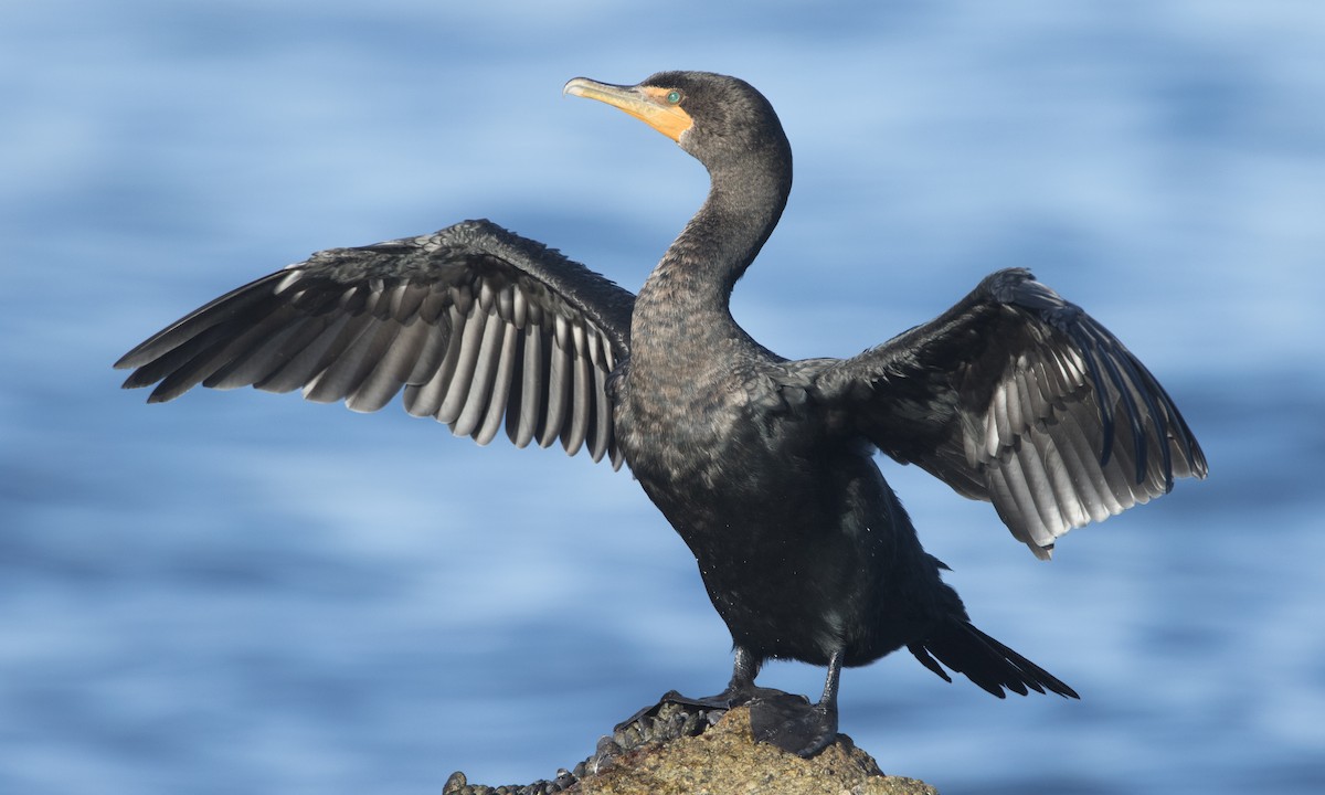
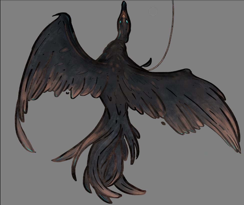
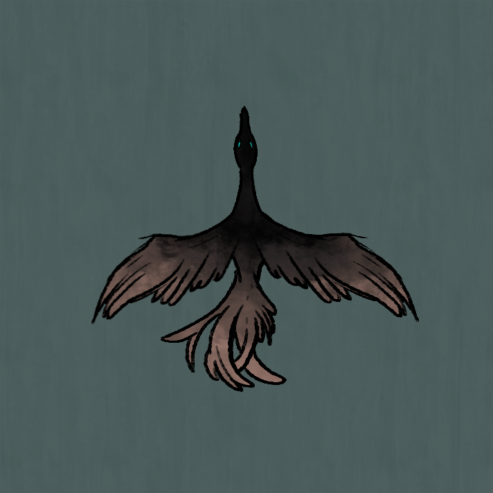
For the power up, we decided to create a bird called a cormorant, with one full animation to it. As for the cormorant animation, I would argue that I failed. The bird fits the aesthetic of the game graphics-vise, and the animation, although it is a little bit too non-exaggerated (I would have liked to give it two or three more frames of animation for when the wings are in it´s nethermost position to truly make it look like it´s completing a flowing movement, right now the movement doesn’t gain enough momentum to look aesthetically pleasing, the number of feathers change a bit under the course of the movement as well. But since the bird will be moving in the game I decided that the animation looked good enough to be implemented and the time that would have to be put down could be used fixing bigger issues and more important assets.) The cormorant bird took less time than I thought to animate, since I had previously animated a fish that took a lot more time than thought, and this, not counting the concept art, pre-animation work and research took about five-six hours to complete. The problem I have with the cormorant, and why I consider it a failure is not in the animation itself, but in the conceptual art, and the colour theme chosen. I based my concept of the cormorant on actual cormorant birds, that are a traditional fishing technique, and in our game would be used as a power up to circle the player and help them by damaging enemies. I kept the concept relatively close to the real bird, in both shape and colour scheme, but still within the range of the colour scheme made for the game. A cormorant:
(Picture taken from google search images, https://neotropical.birds.cornell.edu/Species-Account/nb/species/doccor/overview) The concept design:
The completed animation:
The problem with the design was discovered during the playtesting, where many of the players thought the bird wasn’t an ally, but an enemy this because the muted colours and design made it look too much like the enemies, and that the purpose of the bird wasn’t told in the graphical design of it. A lot of the graphical language of the bird, like the sharp lines and colder, “glowing” colours are used in the enemies. To counteract this I would have liked to redesign the bird in the graphical language used in the players design, with softer lines and warmer colours, but still staying within the aesthetic of the game. |