Project Aetherial Blog Five
|
Introduction The BETA is now behind us and we are starting to see the ocean at the end of the lane, as we rush toward the final gold version of the game. This week’s blog will dive into the subject of playtesting and how those sessions have come to influence our game development. Personally, I will look at it from an artistic point of view and describe two items, one which I changed due to playtesting feedback, and one art asset which I created due to playtesting feedback. The crystal of doom First up comes my lovely crystal which were deeply misunderstood at the second playtesting session (it was not implemented during the first playtesting). I had received the request to create something of a checkpoint, which would then take the player onward to the next level. We have three levels in total and then a separate boss level. This was something involving both the designer, programmer and me. We needed something visually different from the other assets in the background that would call the players attention. Seeing as crystals are a big part of our game (all enemies have crystals on their bodies, the power up is a crystal et cetera), I decided to go with a crystal as a means of level progression. In hindsight I might have linked the crystal and the enemies together and created something that did not look friendly.
Concept designs of “end of level” crystals 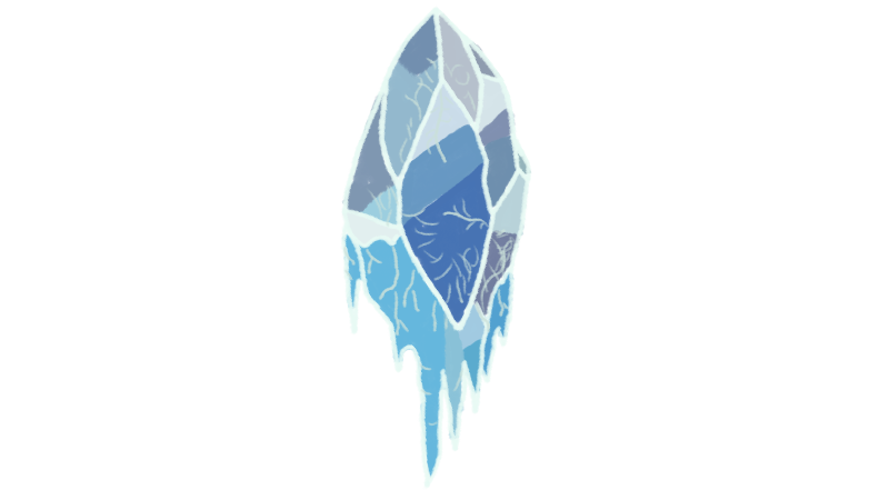 This floating crystal, which makes sense considering the game takes place in the sky, ended up being chosen by the designer to represent the end of the level and work as a gateway to the next level. I unfortunately did not have time to make the crystal sparkle or shine, as was the plan, in time for the playtesting, which may have influenced the play testers view of it. When the play testers reached the crystal at the end of the level, almost all reacted by trying to shoot at it. Where my team saw the crystal as pretty and friendly, “all” play testers saw it as either a new type of enemy or something solid that should be destroyed. Hindsight is 20/20, but I suppose a solid chunk of mass do not give someone the incentive to charge right into it. Only once nothing else happened, did the play testers approach the crystal and notice it took them forward. We received a lot of comments describing confusion regarding the crystal. Swirly portal saves the day! What was the solution to this problem then? Well, first up was to scrap the crystal, as we had understood it only created confusion. Next up was to come up with something else and we naturally immediately gravitated towards using a portal or gate as means of level progression. I created the portal in Photoshop and rotated it by using duplicate layer and then free transform. As always, in hindsight, I should have copied the layers instead, as the duplication affects the color and makes them different with each duplication. In my portal animation it is most notably seen between the last and first frame. It still ends up doing its job and hopefully this change of assets will mitigate the confusion regarding its purpose. 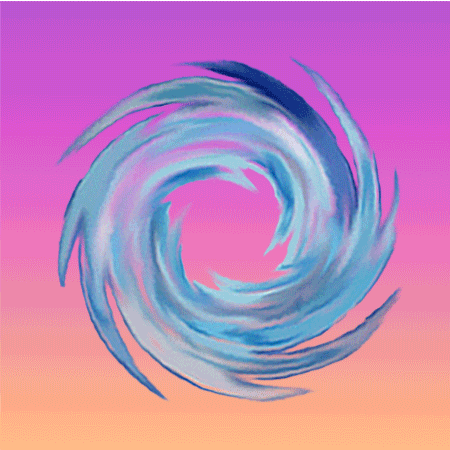 Adding fire to fire! As several other teams, we at first created a power up which increases the players speed. This was easy to implement and the power up was visualized as a “fast forward” crystal (which I will not include here, since it was the other artist in the team which created it). However, this temporary speed increase was shown to be rather ineffective, as players in our game for best success would always be stationed at the left side of the screen, instead of dashing forward. We ultimately decided to keep this speed power up in the game, since various play testers still enjoyed it. After the decision to keep the speed power up, we instead discussed the possibility of implementing another power up into our game. We did get the suggestion from a teacher to add a power up which would increase the players fire power or clear the screen. Our designer settled on a power up which temporary would increase the players fire rate. Seeing as our previous power up was a crystal, when designing the new one, I decided to keep to the theme and do a crystal as well. For fun and as a play on word association, I created a “fire” crystal to increase the fire rate. I also animated a short sequence of it “sparkling” (rather poor result), to match the previous also sparkling power up. 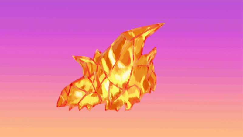 The sun sets on yet another blog, thank you for reading! //Therese |


