1st of March
|
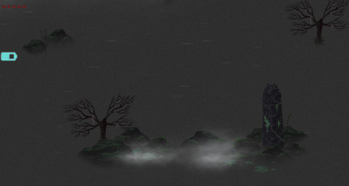
Our team member from the Game Design minor finished constructing the overall layout of our level earlier this week. It consisted of large horizontal wall sections, placed in such a way as to create different paths for the player to travel. He then handed it over to me so that I could build the actual level using all of our art assets. It quickly became apparent during the process of placing assets and decorating the level that it’s very beneficial to have a large amount of assets to work with. Otherwise, the level feels all the more stale and unfinished. This caused me to pump out some more assets, at which point I became very tired and somewhat disappointed of our art style.
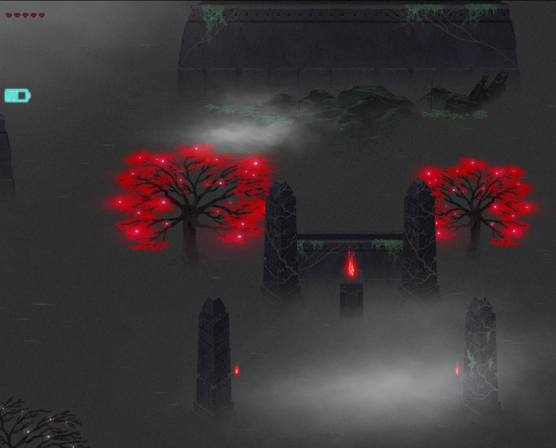
You see, when I designed the art style I focused heavily on two things: First of all, it should be easy to replicate for our other artist. For instance, instead of using textures it uses a grain overlay on each asset. Under it there’s just a solid color. We fade out the bottom part of the object with a feathered eraser if it is in contact with water to make it appear as if it is standing in mist. Fairly easy to use once you get into the workflow. However, since we ended up using separate art styles anyways, this was all for nothing. The second thing was that the art style should make it easy to create objects that really stands out among its surroundings. This was done by mostly using desaturated colors from a fairly narrow range of lightness, which effectively lowers contrast. Then, we could just use a very bright and saturated color whenever we needed something to pop. This can for instance be seen in the red fires and was going to be used on particularly interesting, one of a kind structures and objects that the player could find scattered around the map. This was supposed to be the players payoff for exploring the nooks and crannies of the level. The problem was though that I haven’t had the time to do these interesting, one of a kind structures, so that also didn’t end up working out so well.
Basically, the art style had a lot invested in these two things, which was its main focus, and neither of them payed off.
5SD064 |