The background as tool for narrative and suspense

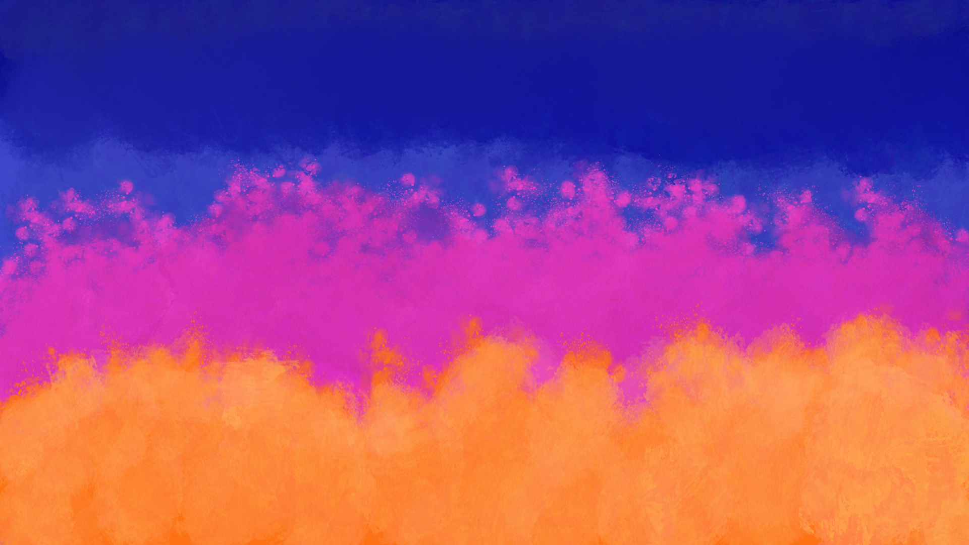
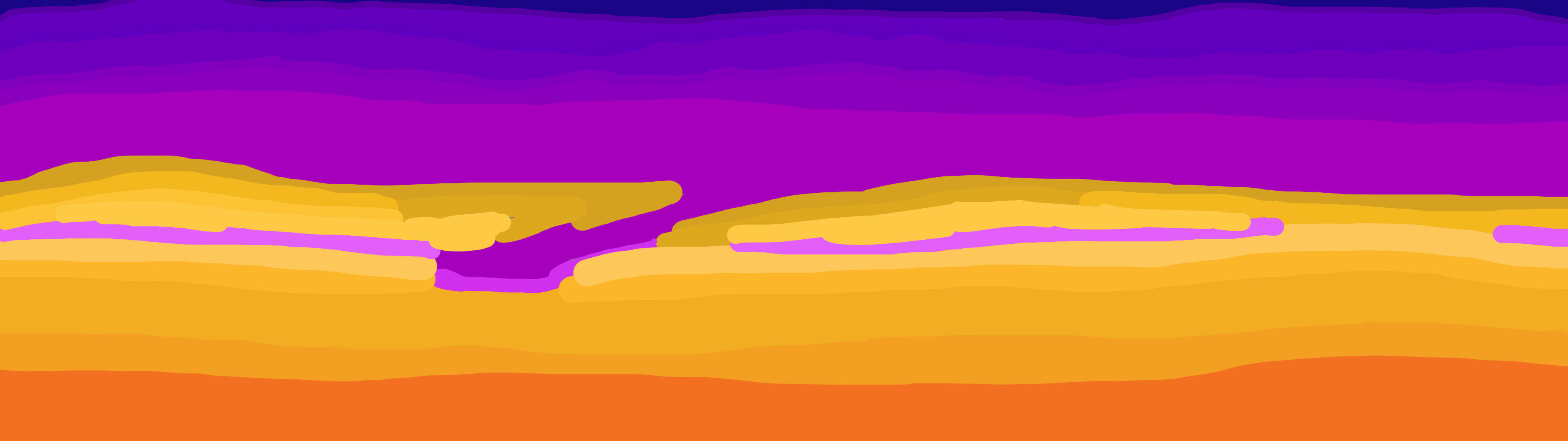
When tailoring a game to make the player feel like a champion, you can’t just do it through a finely tuned challenged – you also need to create build-up. In Team Devourer we decided to convey feelings and mood through the use of mainly the background.
I our version we have different scenes that we use to build our narrative. These are: A sunny afternoon – used for the tutorial level.
A twilight dusk – used during the easier of our two levels. A night sky – used during the harder of our levels as well as a modified version for the bossfight.

A nice, sunny day is often associated with tranquility and the feeling of safety. That’s why it will be the brightest and with a more vibrant and lushous background. As I said earlier, this is where the player will learn the ropes of our game. There’s no real threat here and it’s also here where we introduce the narrative parts of the game – like the treasure hunting pirates and the Leviathian.
The colours and background objects also serves as contrast to later stages.

Dusk is often representing and associated with uncertainty and mystery, whilst also being a blurred line between the safety of the day and the dangers of the night. Seeing this is where you are first faced with both the Leviathan and forced to use the skills you was just thaught – beginning the ride up to the climactic finish (boss fight).
In the last stage you only saw a brief glimpse of the enemy so a new player won’t know what to face until the end of the stage and since the challenge of the waves rapdily increase, the players will also be more on edge and feel a bit threathend and stressed – two important factors in creating the feeling of challenge.

The night is commonly attributed to danger and makes a lot of people tense up. Since you’ve seen the Leviathan now, what it can do and now it’s out there hunting for you, keeping the player a little on the edge. The night sky adds to the atmopsheric doom and gloom. Another reason I wanted a night sky in the game is because it allows graphics to
stand out more, creating a more grandeour experience. The vegetation on the island is aslo a lot less visible and aren’t as lush as previous scenes.

Lastly we have a dawn. Emerging from the darkness into light. Granting the player as sigh of relief after the boss fight. The colours
are probably gonna conflict with the player avatar, which is why it will probably only be used in a cutscene at the end.
All of these scene shifts help to build a narrative with small intermissions between them as well as adding rising tension.

The iterative process for the background looked like this. From the second version forward, everything is made in 3840×1080 to help a little with the future parallex scrolling.
Background one

This is my favourite version of the background. It doesn’t work with our game however since the colours themselves are way to vibrant obscuring important info, like the player avatar, as well as having radical shifts between each field.
It also has a lot of texture wich would just be distracting for the player in the long run.

Background 2 wip
The second iteration of the background was remade from scratch. A big part of this one was trying to capture more of what an actual sunset looked like. With the shiftng colour hues of pale colours and warm colours of orange and blue. It has a little bit of rendering work put into it, but as you can see the brushstrokes are still way too visible, which doesn’t fit the artistic style that I was going for and it’s a detail that once again would distract the players.

Background 2 wip smudged
Based on the second iteration this version was created by heavy use of the smudge- and blur tool in an attempt to render most of the brushstrokes invisible. Which it does. It’s not even half-bad I’m still not that happy with it and I’m gonna probably redo it sometime before beta. Going for a better gradient between the colours. However during the playtesting we got a comment on the background being a bit hard to distinguish from what’s important.

The future backgrounds will have a better colour gradient picked out from the start as well as some more research put into them so that I, as an artist need to spend less time fixing the ineviatble mistakes that will occur.

About Carl Leong

2017 Graphics