Pixel art and pre-production
|
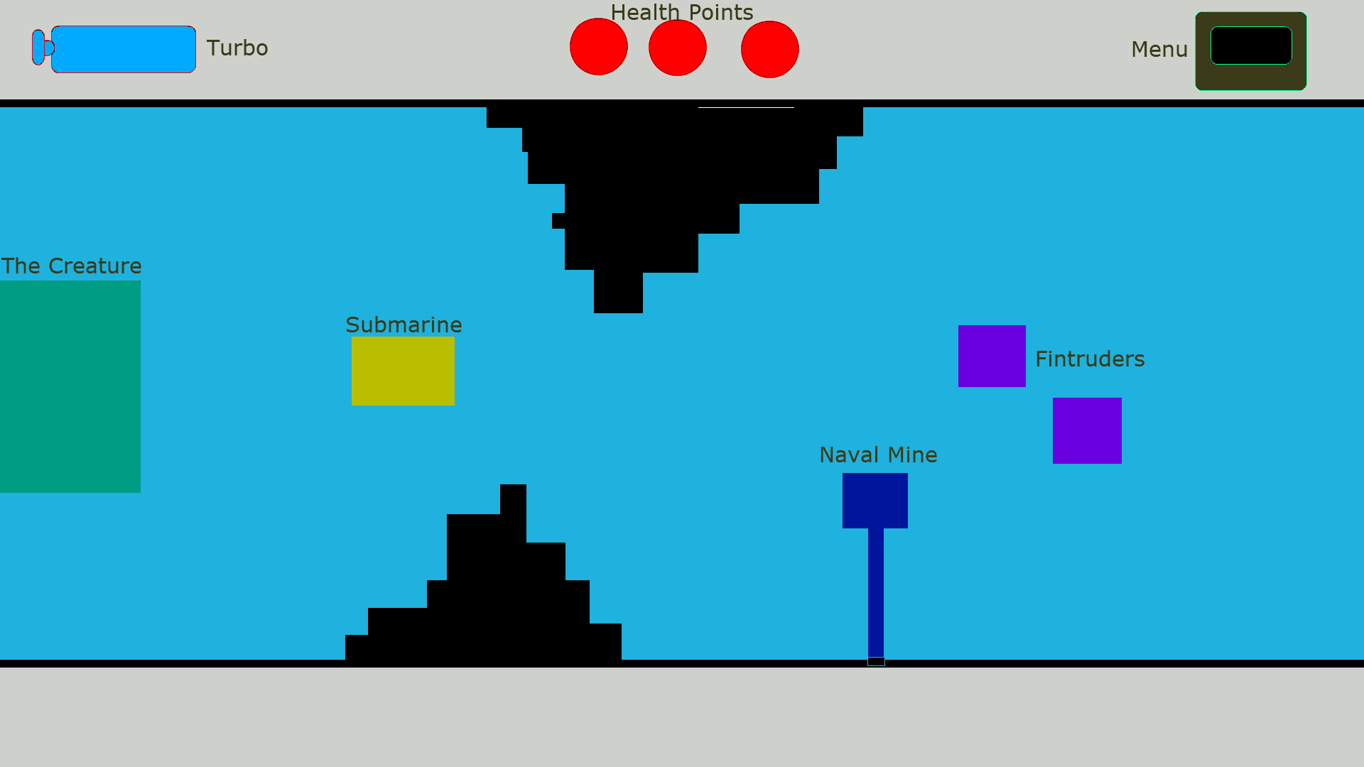
The game development team Ettin (which I am a part of) decided to make a game based on the concept document from the team Poltergeist. The concept is called “Depth”, and the core tenants of the project feature a giant fish creature chasing a submarine through underwater caverns. The Lead Artist and me quickly decided that we wanted to make the game using Pixel-art. It was a realm we both had little experience, and were eager to learn more about. This is what I learned from my first week of working with pixels for the project. Planning is EverythingWhen working with pixelart it’s important to consider a few things;
This mock up was made with Paint, in 1920×1080. The Lead Artist (Ellen Wetterholm) and me then measured the different sizes of these cubes to use as the baseline for the assets. Of course, almost none of them have stayed the same throughout the process. Luckily we haven’t wasted much work, due to being hesitant to work on uncertain aspects of the game, and instead work on things that we had a bigger degree of certainty. The submarine has been resized 3 times since the start of the project. If animations and sprites were made for it before these changes, tens of hours of work would be wasted. Playtesting these aspects before committing to sizes was of utmost importance. 3. Why make the game with pixel art?For us there were several aspects; Artistic look – We both agreed that we wanted the game to have a retro feel and look, and not look like a game made in Flash. Not because those games are worse, but they have a certain feeling we wanted to avoid. This is a good example of what I’m talking about;
Learning Outcomes – I believe that there is a lot I can learn about making good art assets, color theory and abstraction by making pixel art. Pixel art is about squeezing as much meaning and detail from small squares on a screen as you possibly can, letting the brain of the player fill in the gaps you left to be filled in. It’s about tricking the observer to see more than there actually is, by implying detail. It’s a lot like traditional painting in that way.
-Benjamin Thomas Harbakk Signing out |