The award scene (And a poster)
|
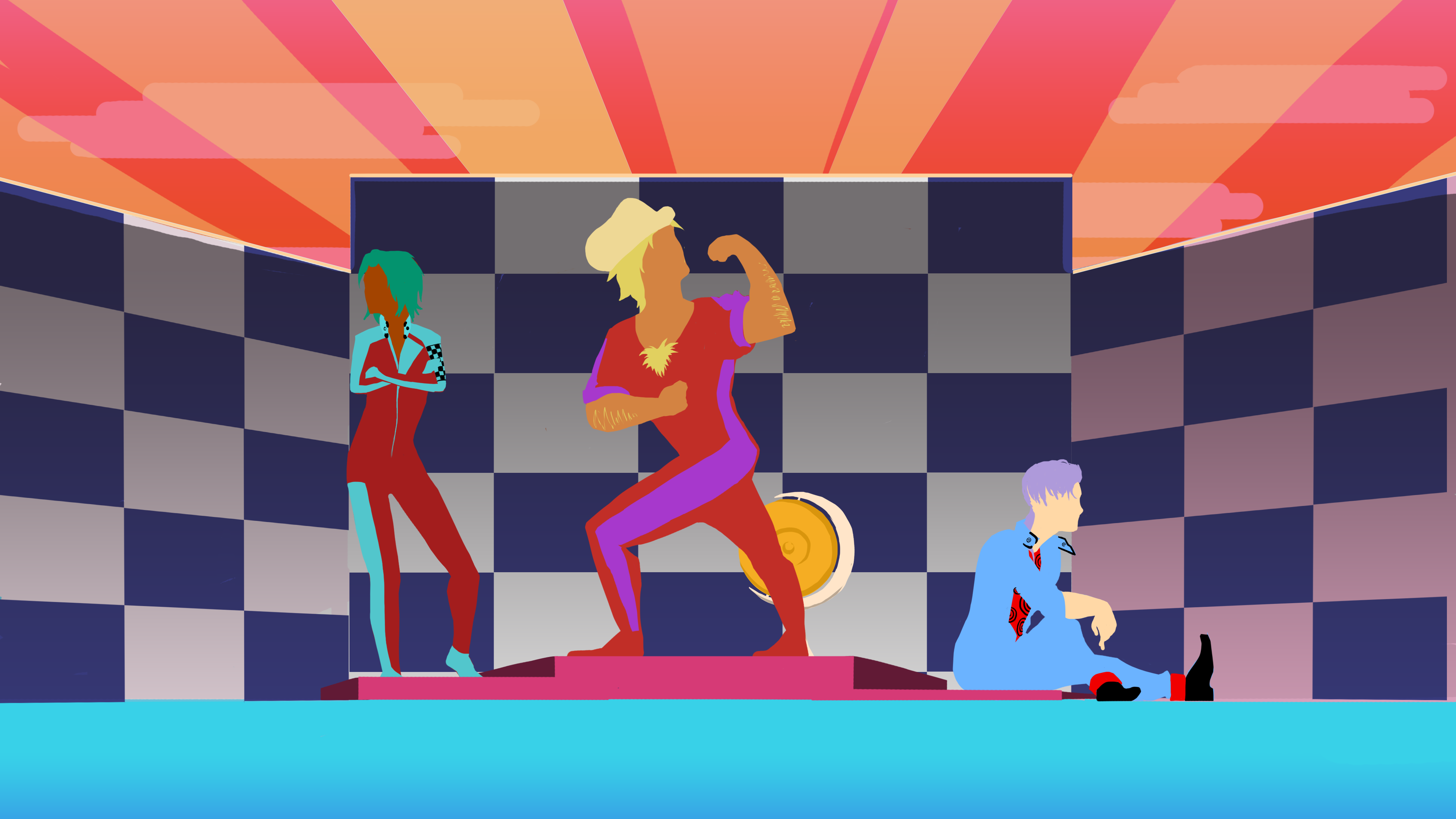
When the race concludes, we wanted to make a scene where we show the placement of the characters in said race. To do this we’d have to make sprites for each and every combination of results that could be achieved. Since these characters will be set more naturally into the environment than the dialogue-scenes, I thought that they should match the simplicity of the environment. This means that they’re more or less colored silouettes. So to get across the emotions of these characters and their personalities I would have to rely entirely on body-language.
To be able to put together the scene in unity, I divided the different parts of the scene in different background and foreground-sprites. I also thought that by making the spotligts from behind the set that you could make it look a little more dynamic by making the different pillars of light fade in and out. Something like this:
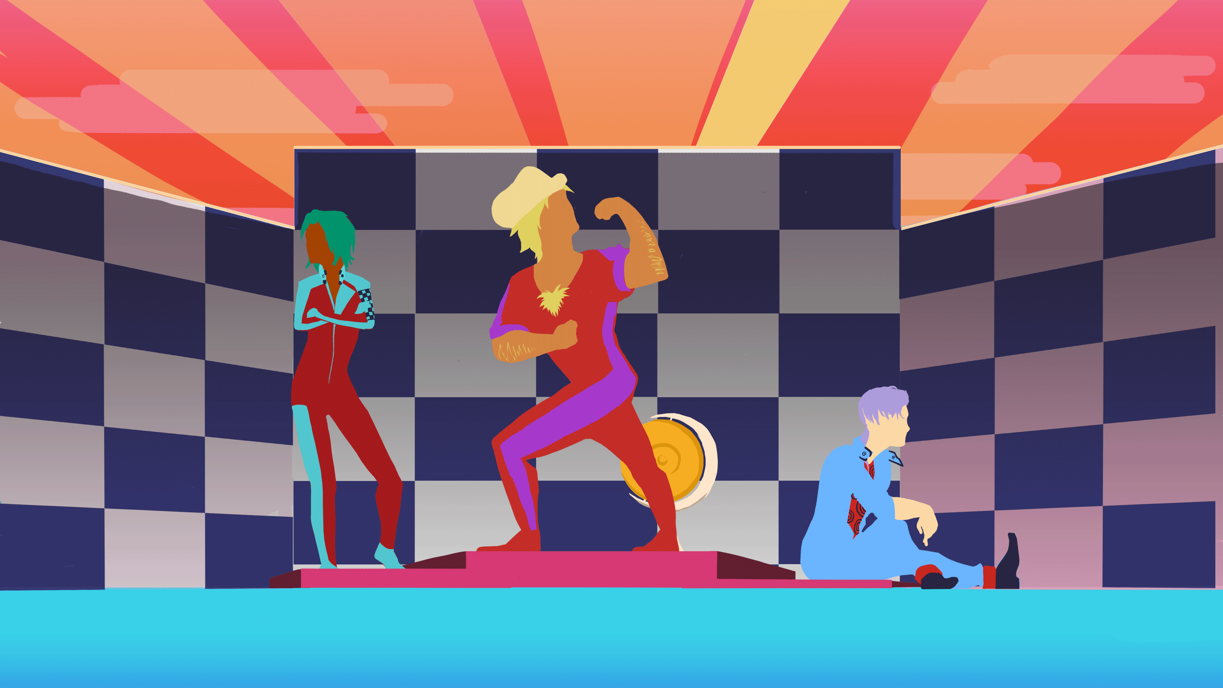
(excuse the crappy image quality) Now, in the end this didn’t really matter. Since we got behind schedule a bit on the implementation of the awards scene in unity I made each and every possible combination into an animation that we could use as an animated texture in the enginem which would cut down on programming time for our programmers. Hopefully it’ll be implemented before we’re gonna showcase it at the Gotland game conference. I also made a cover for the SGA document, which you send in to the swedish video game awards to explain your game, it’s concept, mechanics and controls, so that te judges can get into it at once. Since I was a bit hardpressed at time, I didn’t want to go with a risky concept with alot of difficult angles or such, so I thought that it wold be an opportune time to show of the most striking part of our aesthetics instead: our color scheme.
The image is done in a style similar to our start screen. It’s our three main drivers in the game and the color of the helmets represent our main color scheme. The title was made by our car designer and 3D-artist, and is here even more polished to look as 80’s as possible. We also tried to print out this image to use as a poster for our GGC-booth, so I scaled the picture up to A3-size and cleaned up any blurry outlines that appeared as consequence of the upscaling, but in the end the schools printing-machines didn’t want to work. Why that is we don’t know, but that’s how it is.
And that’s all for now. Have a good day! |