Part 5: Some thoughts on Color
|
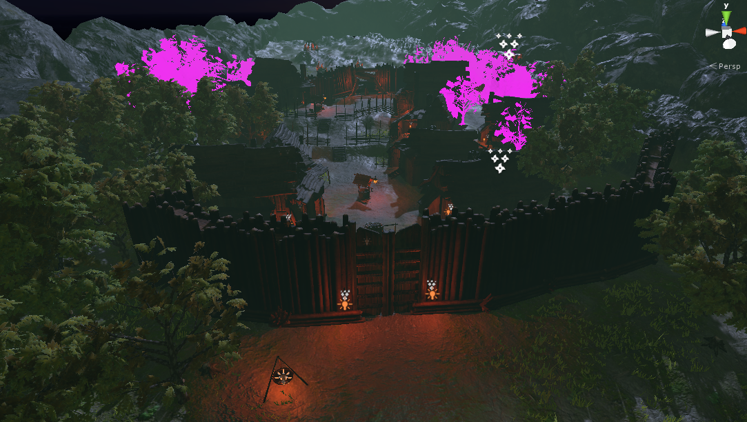
Since Rune Mages uses Physically Based Rendering, there are some rules that must be followed for the highest visual fidelity and functionality. There are some general guidelines, such as The Comprehensive PBR Guide, that let’s you understand what values are PBR and which ones who arent. The Marmoset PBR guide is splendid as well. So, with all these things in consideration, it is important to stay neutral in the albedo’s color. If the albedo is excessively saturated the surface will not remain realistic throughout a wide variety of lighting setups, which ultimately is why PBR is so powerful. Let’s take a look on an overview screenshot of the Rune Mages environment: Now, if we ignore the neon lit trees, we can see that the environment uses low saturated colors. This is important because of two things. Firstly, it was the art direction I aimed for since the beginning of the project. Dark Fantasy in my eyes is dark and gritty, with some natural beauty to it. That’s what I wanted to accomplish here. Secondly, when using PBR it is great to use low saturation as the lighting and post process will create the final mood of the scene. In an article written by Jihoon Kim, he writes that using neutral tones in the textures allows for a greater freedom for lighting artists. He also states that if the scene has a primary color wich is heavily involved in the scene, such as red, the mood becomes more difficult to change with lighting.
When adding lights to the scene, it looks like this.
With some color grading and bloom, it the looks like this:
What’s great with PBR is that we could use a daytime lighting setup, and all the textures would look the same and react accurately to the lighting. PBR WOOOHH |