UI Attracts Ur Eye
|
The post this week will be entirely focused on graphics, wohoo. In this post I will detail the design decisions behind the GUI artefacts I made for our game, and I will list the principles that guided me while making the assets.
In-Game GUI Due to the importance of conveying gameplay relevant information to the player in real time, the in-game GUI took priority and was an element I started working on early in the project. I started with what I deemed most important for the player to know, the player’s health. The player’s health is the most important to show because the entire game is about shooting and evading enemy fire, and since shooting doesn’t require any GUI except a crosshair, which we could use the mouse for, I prioritized the player’s health representation. The concept document that we based our game on displayed the player’s health as hearts that were lit aflame. I thought this representation was a good idea because it used a widely known representation for health in the form of hearts, while also incorporating elements of the theme of the game into it, which was the theme of fire and magic. I also decided to make the hearts animated to make them more interesting and eye catching, and to enhance the “fire” aspect of them.

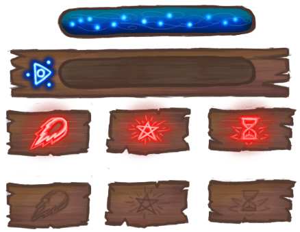
The second element we deemed important for the player to be shown at all times is the player’s mana. In our game, the player can collect mana in order to cast powerful spells, so we needed a way for the player to keep track of his mana. We decided on having a bar for the mana because that way we could convey a high value without overloading the screen with ui elements, and having a bar for menu is common game language for players. We also decided that the mana bar should be blue, as we didn’t have time for lengthy tutorial and a manual, and blue is almost instantly recognizable as a colour for mana. While I was working on the hearts, one of my teammates volunteered to work on the mana bar, and he made the initial version of it according to the guidelines we decided on.
After we had the essential UI elements in place I took it upon myself to design the rest of the UI for the game, continuing with the player spell icons that show the player when a spell is available to be used. I thought a simple yet effective way to show the player when they can use their spells is to just have icons for them on the screen at all times. These Icons would then light up when enough mana for the spell is available and can be cast. This is similar to how most MOBA games like “Dota 2” and “League Of Legends” do it. The benefit to having icons is also that additional information can be added next to it, such as the hotkey for the spell and the spell mana cost, and the player will immediately understand the context for them, as the player already has the context that the icon represents the spell. Keeping with the wooded theme established by the mana bar we had, I opted to make the icons look like they’re carved on wooden blocks, and they light up when they’re available. The icons when unlit have a low contrast, making them look a bit dull, but when they light up the contrast jumps and immediately demands attention, making it easy to understand that the spell is available. The icons themselves represent the spells which they activate. The left spell is a stronger version of the player’s shots, represented by a big fireball that looks similar to the player projectile. The middle spell icon looks like the pentagram effect that the spell causes on activation. And the right spell slows down time, represented by an hourglass, which makes people think of time. After I was done with the spell icons, I took the original mana bar made by my teammate and iterated on it myself to make the assets have the same art style. Around this time we also decided to make the mana bar horizontal in order to be able to fit it under the player’s hearts, so the player has all the information they need in one place.
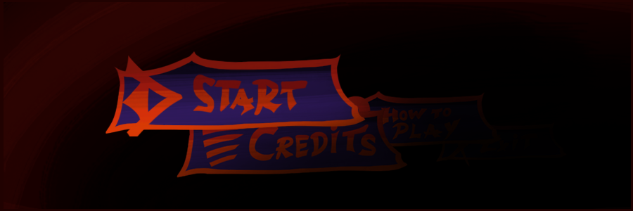
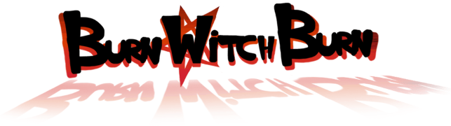
 Menu GUI For the menus of our game, I wanted all the buttons and graphics to fit together, and in order to achieve that, I needed to have a solid foundation to base all of the graphics on. I thought the best way to achieve this was by designing the logo for the game, and then base all the rest of the graphics on that. I started by looking at the colours most prevalent in our game. The game is all about witches and satanic spells that are all coloured with reds and blacks, so I thought these colours would also capture our the spirit of our game the most. After picking the colours I just tried to make an attractive font and incorporated the colours by making the text black and incorporating the reds into the shadows of the logo. I also added a pentagram to the shadow behind the “W” in witch, both to introduce a cool design element and also to further show the theme of the game inside the logo, with the placement of the design implying that the witch’s powers are satanic in nature. This was the first result:
After coming up with the first version, I encountered a problem. Our logo didn’t stand out on a black background, which our main menu had. I solved this by making the red shadows into a border instead and introducing colour into the font. I also gave more definition to the letters, thanks to a suggestion from a friend. This is the second version:

After I completed the logo, I designed the basic button for all the other buttons based on the logo and, for the main menu buttons, I added small vague icons in order to make the buttons more visually appealing. The small icons would always be accompanied by text, so they didn’t need to be overly symbolic, but they still had to make sense. The start button is accompanied by an arrow to indicate your are heading somewhere (the screen also pans right when you press the button, starting the game). How to play is indicated with a question mark to convey a search for information, which the button solves. The credits button simply shows lines which normally signify text or credits. The exit button is symbolized by an X, which is universally a sign for cancellation and quitting/stopping. It is also worth mentioning that the start button is bigger than the other buttons in the main menu, in order to guide the player’s attention to it so that they start the game. 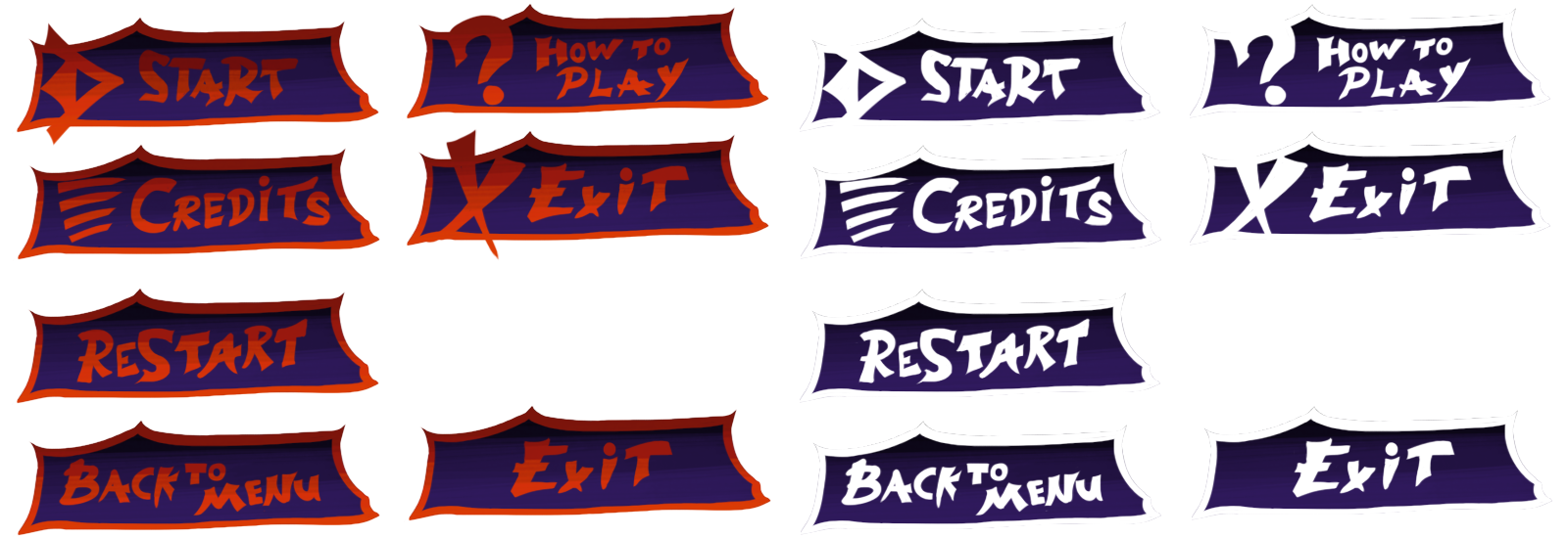
Conclusion During the process of making the GUI I learned a lot about how important it is to guide the player’s attention and not to split it too much. The UI needs to assist the player achieve his goals and not be a hindrance or a thing to wrestle with. I also learned that it’s not necessarily bad to use commonly used and well defined “language” like mana is blue, hearts are health, etc, because they can make the player grasp things instantly, as it builds on existing knowledge most players have already. Bye, さようなら!  |