Creating an Accessible User Interface
|
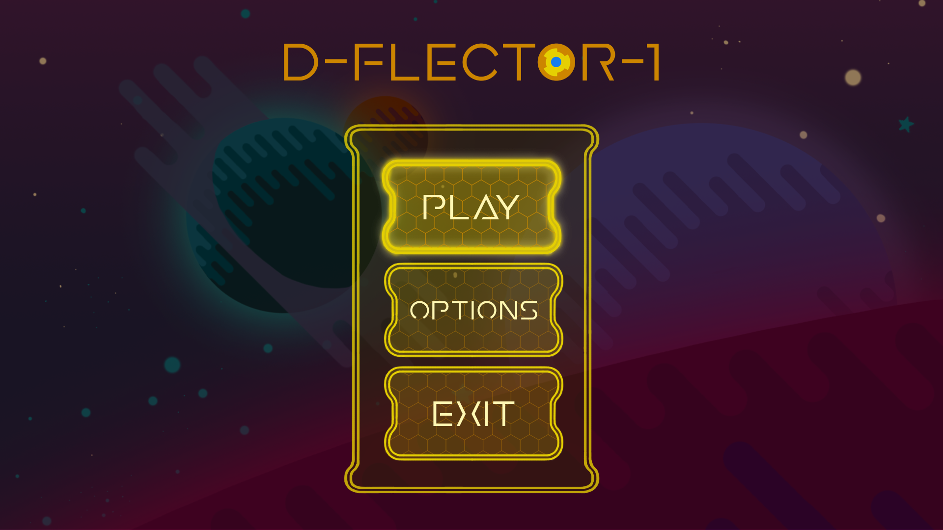
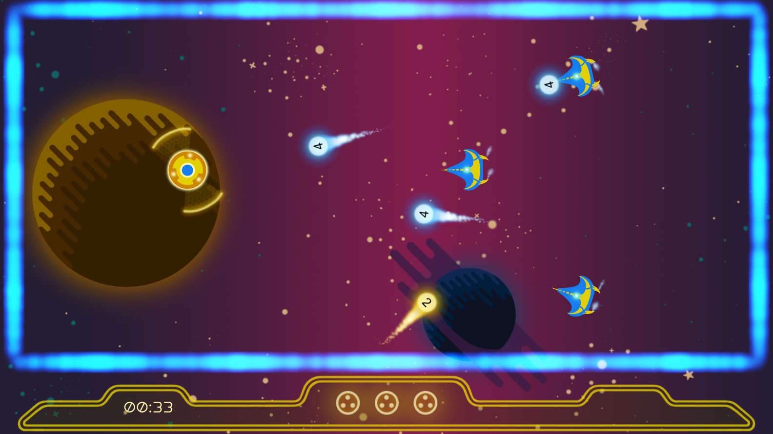
Author: Hanna Hagenmalm The past two weeks I have spent designing the user interface (UI) for the game. A cluttered, dense user interface can be difficult to navigate. For new gamers, who might not be accustomed to interpreting the information presented by a game, and for people with some form of visual impairment, it might become overwhelming; a barrier to actually playing the game. Given that the game I am working on is aimed at non-players and casual players, as well as strives to be inclusive, creating a user-friendly UI seemed like an imperative task. Instead of going through my production process, I wanted to highlight four aspects of the design I worked with to create a (hopefully) intuitive UI. In no particular order: 1.) Readability. Big fonts are usually associated with games aimed at a younger audience. However, big fonts increase readability for people with visual impairment. Our target audience is 40+, and at that age, it is reasonable to expect that a number of people are experiencing some form of impairment. I also added a dark overlay in the Pause and Main Menus, to make the light font stand out even more. 2.) Colors. Early in development, I picked yellow and blue as the game’s palette, based on the idea that people with red-green color blindness would be able to distinguish them easily. The team decided that the avatar should be yellow; blue was then associated with the enemies, to create contrast. I chose to design the UI in yellow as well, since it “belongs” to the player, just like the avatar. 3.) Distinguishing the UI. I used parallel lines to set the UI elements apart from the rest of the game. This is an idea I was first introduced to when reading about color blindness. The principle is that patterns, textures and contrast help people distinguish between different artifacts, regardless of colors. My hope was that the divergence in design would help new gamers read the UI and the in-game objects as two separate elements. 4.) Directing attention. After I introduced buttons to the UI, I realized that the frame was the most visible element. Initially, the lines of the frame were both thicker and more saturated than the lines of the buttons. I identified the properties I could control to create visibility, like saturation, contrast, textures, line thickness and opaqueness, and reserved them for the elements I wanted to emphasis. I believe that one of the methods to create a user-friendly UI, is to be conscious of what elements are grabbing the player’s attention. Putting emphasis in the correct places should help guide the players through the entire user experience. Designing a UI is a completely new undertaking for me, but it has been fun and educational to dip my toes. It has also made me aware of every single UI out there… and how difficult it can be to design a good one. Especially if it is supposed to be understood by anyone other than the designer. And finally… here it is:
Main menu mock-up of UI with mouse hovering over PLAY. (Draxel’s Journey has changed name to D-FLECTOR-1.)
In-game footage of UI. |