Game Development Update #4
|
Yo, yo, yo! Welcome back my loyal followers for another weekly update. It has been another ineresting week in the making of Samsara. What’s been so interesting? I know, sing me a song about your week! This week after recieving a new batch of feedback from a playtesting session one thing emerged as especially important for us to fix. I myself experienced this first-hand when I observed people testing our game. The game is rather complicated in terms of mechanics and features and they don’t come across as very clear for the player. The most obvious issue at the moment is the controls and what kind of actions the player has at his/her disposal. Ouch, huge problem right there, Ted. What have you planned to implement to solve this? 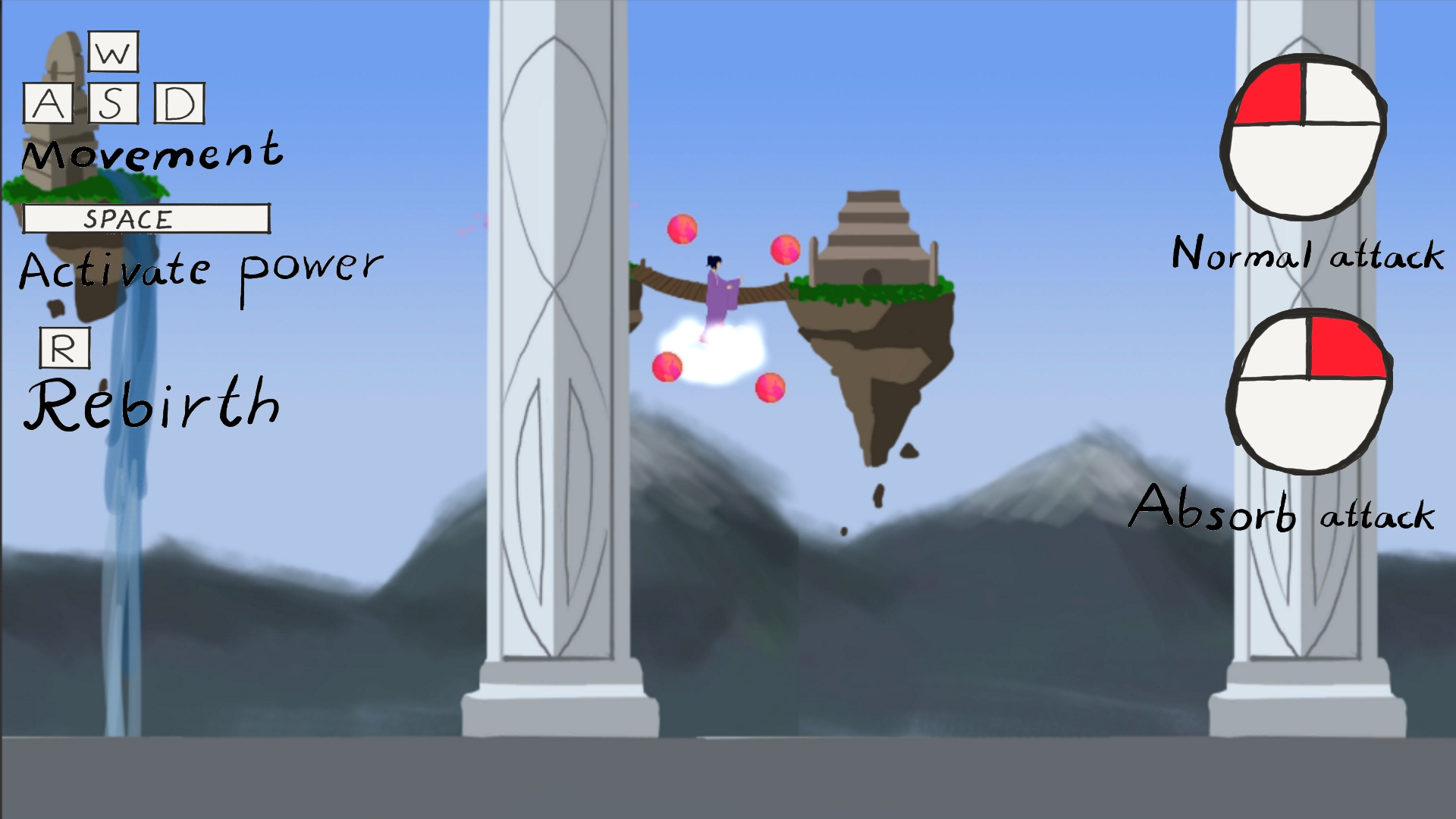 Eeem, okay; that’s kinda messy… Secondly, the information provided within the text itself isn’t clear enough either. “Activate power”, what kind of power? This goes together with the “Absorb attack”, which should be renamed to something along the lines of “Steal enemies powers” or “Power stealing projectile”. Then “Activate power” could be renamed to “Activate stolen power”. “Normal attack” could be more specific as well, for example “Normal projectile” or “Non-stealing projectile” to be more coherent. As you see this presents a big problem in extension to the visual aspects in making it readable. The textthe player reads should be concise and precise so the player instantaneously knows what everything does. The text can’t be too extensive either, it needs to just the right amount of text, otherwise it will cover up too much of the screen. The layout of the controls overlay will also be adjusted. If it doesn’t become too cramped and still readable, one version would be to have all the information to the left of the screen. This would provide more space for the introductory enemies that approach from the right of the screen. This is important so that the player can see and engage the enemies to try out the controls properly before the real challenge begins. Another solution would be to place the primary attack mouse icon at the top right hand corner and the secondary attack mouse icon at the bottom right hand corner. This would enable an enemy to approach from the right in the middle without making it into an ambush for the player. They would see the enemy but it could still become a mess because of the information surrounding the enemy. Also it asks of the player to cover a large portion of the screen with his eyes in order to read all the information. Limiting the information to a certain amount is key to provide an overlay which feels informative and neither cluttered nor scattered. Wow, that was some extensive s***. At least your blog post was informative, can’t fault you on that one. Yeah, totally man… So this wraps up my work for the week, if you’ve got any suggestions or thought, make sure to holler in the comments section below. From here on, you’re on your own… At least until next Thursday when I’m back again! See y’all! Sincerely, |